Understanding Colours

How is understanding colours going to help me? It is always helpful to know about the Colour Wheel for any common person as well as a professional. Clicking and posting pictures, decorating your home, choosing what to wear or working on good display and print graphic ; knowing your colour wheel will definitely give you an advantage over the others.

I did this story on Instagram and It was loved so much that my Insta friends wanted me to do another one on similar lines. Information on what is a colour wheel is readily available on the internet so this article is about understanding its relevance or where and how to apply this knowledge. Further instead of looking it up at different places this time you would have the information all on the same page.

Primary Colours : Red, Yellow, Blue are a set of colours that are used to mix and obtain other colours.

Secondary Colours : Orange, Green, Purple or Violet are obtained by mixing two primary colours.

Tertiary Colours : Yellow-Orange, Red-Orange, Blue-Green, Yellow-Green, Red-Violet, Blue-Violet are obtained by mixing primary and secondary colours.

RGB (Red Green Blue) the primary colours of light are used by monitors and screens of gadgets. Take a projector light, cover the screen with a translucent paper of a primary colour and cover it. Now project these coloured lights on to a white wall. You will see a secondary colour when two lights are projected at the same spot. Try it!

CMYK (Cyan Magenta Yellow Black) are primary colours of pigment. These are used in printers. See your print cartridges labelled in these. Now suppose you ask the printer to print a picture with multiple colours, the print machine prints using combination of these primary colours to get more colours.

A combination of RGB creates white while CMYK creates Black. That is why colours differ a little bit when you see them on screen and in print.

A colour box that contains primary colours and neutral colours Black and White is enough to mix and get other colours. Neutral means without any colour : Black, White, Grey. A colour mixed with white is called ‘Tint’, a colour mixed with grey is called ‘Tone’ and a colour mixed with Black is called a ‘Shade’. That is Tint, Tone, Shade of a Colour.

This should help you select colour schemes when painting your next masterpiece. So for summers if your designer says the collection is in Pastels or tints of various colours you will know it right away.

Contrasting colours are colours that are opposite on the colour wheel, that is they cancel each other and result in black or white when mixed. They are the most contrasting colours. So Red-Green, Orange-Blue, Yellow-Violet are contrasting colours. Oops! Did you get a very red pimple or scar on your face? Don’t fret, use a green colour corrector before applying the foundation. This should do the trick!

This was a quick, short tutorial on understanding colours. You must try some practical exercises or games with these concepts and you will never forget this basic understanding of colours.

Artist on the Go!

Ever since I can recollect my Art kit goes with me wherever I go. It evolved over the years, a few tools got added, a few subtracted but till date I have a pouch that has my pencils, pens and colours that go with me even if I am on a holiday trip. I don’t know how that sounds but it is like packing toothbrush and essentials for me. I guess that is what it is when you are passionate about Art.

A sketchbook or some paper sheets and some Art Tools is what my portable Art Kit includes. Initially the Art kit would include pencils in 2B, 4B and 6B lead tips and an eraser. This much is enough for making Art using the pencil shading technique.

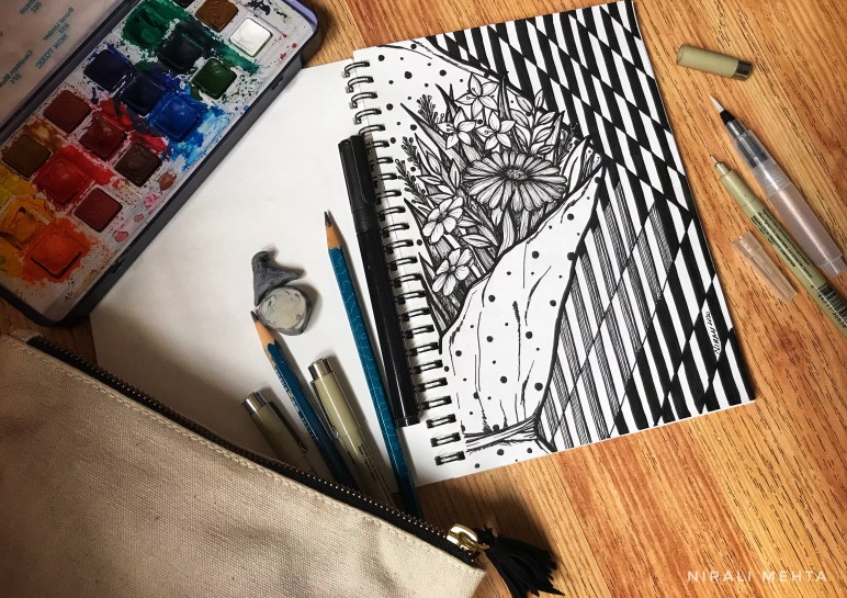
Then I added a box of watercolour cakes with primary colours and two round brushes – one in size 2 and another in 6 or 8, a black Ink brush pen or any outliner pen that you would like to use. This much is enough for making Watercolour Art. I understand you know that a pencil and eraser to draw or make some marking before colouring are already there.

The Art kit that I now carry along with me is a combination of the two above. It includes the three pencils, a magic eraser, Ink pens for Artists in three nib sizes along with my sketchbook. Sometimes I also take along the watercolour box and a brush. All this fits in a pouch or zipper pencil case. It does not contain water or any liquids so it is suitable to carry easily in the handbag while travelling. Something like a makeup kit. Pointed objects like compass or rounder and sharpeners are not allowed when you travel by air, so make sure you don’t carry them along if you are travelling by air.

There are trips planned for artists now a days and many artists do Art on the go. So the next time you see a beautiful scenery and want to put it on paper or just want to pass time at a waiting lounge you know your Art kit will come handy.

Sharing a some pictures from my A5 sketchbook done on the go!

My first Art

“What is the easiest drawing to begin with? I want my child to learn drawing, where and what should I start with?” This is a question I am asked often. In this article I will share two different drawings that are simple and easy for a child to begin with. These were the first pictures I learnt to draw and colour as well. Yes! I said colour and not paint. That brings me to the selecting the Art material.

Paper: Use large sheets. Drawing a small circle for an adult is often a big circle with the movement of hand for children. They tend to fill up colours better in larger drawings. Further use a sheet of paper that is prone to high erasing. I often used box board (white duplex board) sheets as my drawing paper during my earlier days of learning.

What else do I need? A good pencil and a good eraser. A new pencil that is big is better for grip. If they are still learning to hold a pencil it is all the more important to have a pencil the child would be comfortable using. Use a slightly rounded tip pencil, meaning don’t sharpen it to a very pointed tip. This would ensure the paper doesn’t have dents after erasing the extra lines. Now for the Colours – I recommend using Oil Pastels. I didn’t say crayons nor did I say paint. Oil pastels of any good brand but a large number of colour shade options. The more colourful picture they can make the better. Since they don’t know much about mixing shades, having more shades in the colour box helps the child make a nice attractive drawing. Now that you are ready with the materials let’s decide a topic.

1. Under the Sea

2. My Home

Under the Sea Drawing for Kids
My Home drawing for kids

I have shared a drawing for each topic. You may use it as a reference or idea to begin with. Once the pencil sketch is ready, colour it in your own way. Sounds easy! So let’s begin to draw 😀 Do share your finished Art piece with me, I would be happy to see it.