Selecting colours in Art for their meaning

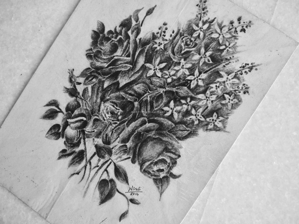
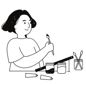
Learning to paint, this little child asked me “Ma’am why can’t I paint a green or pink sky? Yellow water or black rose? Isn’t art about the freedom to paint?” I was startled for a moment but then I tried to look at it from his eyes. Yes! The artist is free to paint whatever he wants and as he wants. Then why wasn’t I ready to accept his imagination? Did I consider it as a violation of the norms? Why does the sky have to be blue and the trees green? Has this thought crossed your mind too?

Art is about the freedom to express. We all draw and paint to express our thoughts. Worldwide, we associate colours with certain emotions. That is why when an artist paints a red rose it invokes a different reaction and when he paints a black rose it invokes a different one. Why? Because every colour has a meaning. Some meanings are accepted in general on a broader level by most people while some meanings are deeper or secondary and have more local communal interpretations.

For example, red as a colour of love is generally accepted by all. On the other hand red is also the colour of anger. Further, red as an auspicious colour is accepted only by certain communities. So you see one colour can have many meanings. How is this meaning derived? It is mainly because of our associations through our thought process. Colours which we see around in our environment and surroundings are colours we associate better with. Colours as symbols to indicate messages or mark goods in trade have been used since time immemorial.

In India, we have the white desert better known as the Rann of Kutch. Art that is traditional to this location is on a white background, just like the white desert. The locals have colourful dresses to be seen easily. They also have mirrors to reflect the sunlight. They like to use bright colours in their homes and clothing. The colour pigments are made locally by the artisans from materials in their environment. Over the years they begin to associate feelings of happiness and cheer with these bright colours like red, green and yellow. This story holds true in some way or another for art around the world.

A good piece of art is one that conveys the message well. All artworks require a good choice of colours. However, artworks like designs, patterns, abstract art and modern art tend to have a higher dependence on the colours used. Hence before choosing colours for the artwork it is always better to know about colours and their meanings. If you want to appeal to a certain audience, it is always a good idea to know their interpretation of colours.

The study of colours is a vast subject and many people have built careers on it. In this post, we will limit it to the use of selecting colours for drawing and painting – mainly to express ourselves well through our art. Almost all colours will have some meanings and emotions considered as positive and some meanings and emotions considered as negative. Depending on the emotion one wishes to invoke as an artist, one can decide the colours. Then of course there are the light and dark shades – tints, tones and shades for all colours.

There are colours clubbed as warm colours – these invoke a feeling of warmth. Shades on the colour wheel from yellow to red are warm colours. Colours that invoke a cool refreshing feeling in us are termed cool colours. These are the other portion of the colour wheel. What is this colour wheel you are talking about? I have shared it in one of my previous posts. You may want to read up a bit on it as well. It is called ‘Understanding Colours’.

Let’s discuss some colours and the emotions they invoke :

Purity, Innocence, Clean, Fresh, Simple, Good, Complete, New Beginnings.

On the negative side it is symbolic for blank, empty, cold, death or mourning. Secondary meanings include peace, calm and hope. Spiritual meanings like enlightenment or illumination, renunciation or disinterest.

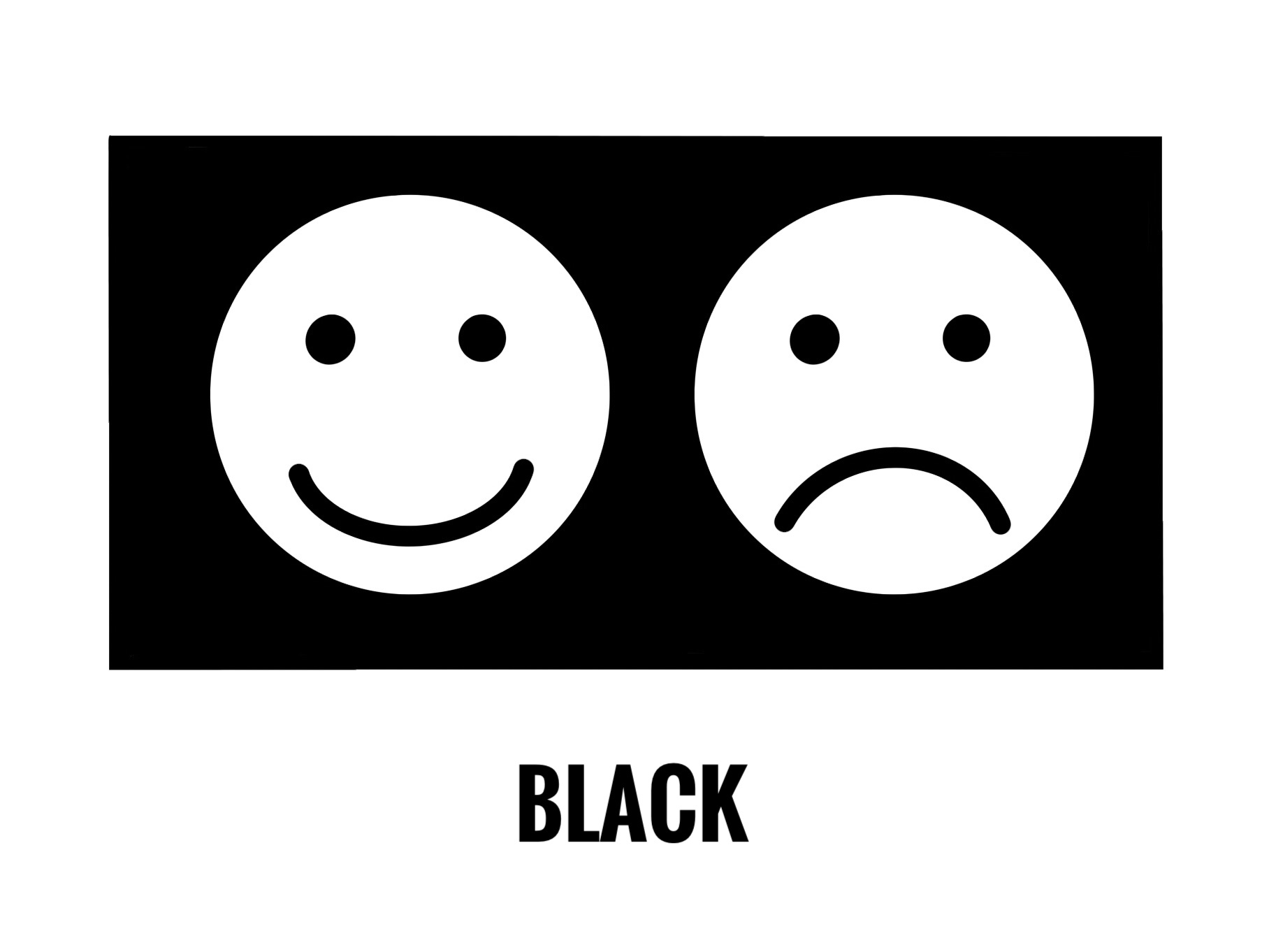
Power, Authority, Strength, Seriousness. Business or Law – Black and White.

On the negative side it is symbolic for dark emotions or opposite of white, sadness, mystery, night, evil, despair. Secondary meanings of sophistication, elegance and formal dressing. It is also the colour of death and mourning in some cultures.

Love, Passion, Fertility, Sexuality, Confidence, Health, Prosperity, Action, Energy.

On the negative side red being the colour of blood it is symbolic for anger, fire, danger, hurt, violence, warfare. Secondary meanings as an auspicious colour in some cultures.

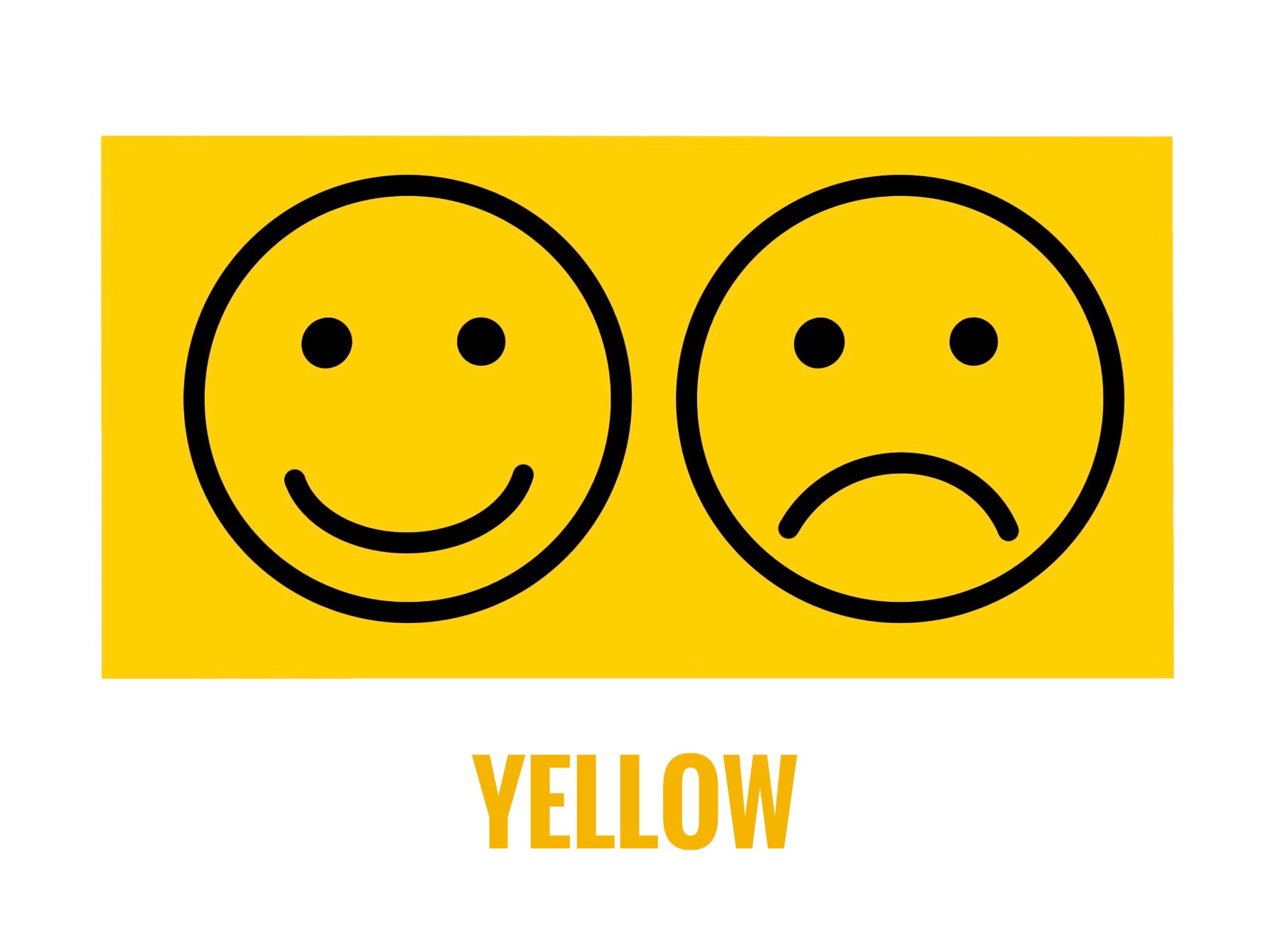
Happiness, Warmth, Sunshine, Brightness, Creativity, Hope, Positivity, Friendship, Knowledge, Laughter, Enthusiasm, Joy.

On the negative side it stands for cowardice, deceit, caution, sickness, illness, Secondary meanings in religious texts or associated with the Sun or god. Yellow is also for Gold.

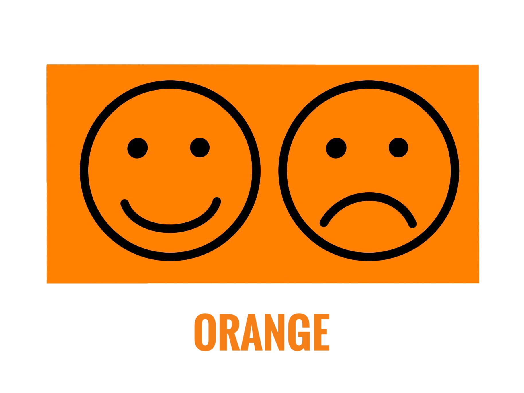
As a combination of red and yellow orange has similar emotions. Joy, Warmth, Sunshine, Energy, Creativity, Health. It is also a colour of movement and change.

On the negative side sometimes considered as superficial, aggressive, overpowering, rude and frivolous. Secondary meanings include its reference to fruits, vegetables or seasons.

Growth, Nature, Earth, Environment, Health, Good Luck, Harmony, Prosperity, Fertility.

On the negative side very often used to show jealousy and greed. Secondary meanings include its association as the colour of money. Often used in symbols for the environment or natural organic products. It is considered lucky in some and unlucky in some cultures. Green is also wisdom in some cultures.

Open Space, Freedom, Imagination, Trust, Loyalty, Intelligence, Wisdom, Flowing or Journey, Serenity, Stability.

On the negative side it means frozen or cold, unfriendly, suspicious, sad and depressed. Secondary meanings : Blue being the colour of the sky and water, it is a very popular colour worldwide. Most companies have their logos in blue. Blue is the colour for boys in some cultures.

Love, Kindness, Femininity, Romance, Youth, Charm, Sensitivity, Politeness.

On the negative side it represents lack of will power, lack of self – worth, over emotional. Magenta is a shade of Pink. Secondary Meanings : It is considered a girly colour.

Royalty, Wealth, Romantic, Wealth, Wisdom, Extravagance, Grandeur, Dignity, Nobility, Power, Independence, Beauty, Femininity,

On the negative side it is associated with pride, pompousness, mystery, sadness, frustration. Different shades have different meanings. Violet and lavender are also shades of purple. Secondary meanings : it is the colour of mourning in some cultures. It is also considered spiritual and magical in some cultures.

We don’t use any single colour for a particular meaning. It is a mix of colours and the shade also matters. How it is used and what is painted influences the message. All countries have different colours that are symbolic to them. For example Green is considered unlucky and associated with infidelity in China while red is considered as protective and lucky. Indigo is referred to as Japanese Blue because it is the most used colour in Japan. Red is auspicious while black is bad luck in Japan.

If we look at flags or national symbols of a country, we will understand their colours faster. Countries use colours they consider auspicious or representative of good luck on their flags. There is no one shoe fits all situation. We need to do our own homework and read up our bit.

The next time you are drawing or painting, think about the colours you are selecting. This is not an exhaustive list. You could even make your own list. I shared this because I felt just as this knowledge helped me make my art better, it could help you too. Have an Arty Week!

Oops! I made a mistake .. Eraser Stories

‘Life is the Art of Drawing without an Eraser’ I am sure you have heard this one before. But the truth is most of us cannot draw that well. We all make mistakes at some point in time. Nobody is born knowing it all. What we do after that .. how we correct it .. what we learn from it .. is important. Think! What is it that we could do differently so that the mistake is not repeated? We learn by asking questions and making mistakes. We grow as we learn. It is a part of the process.

People can be a bit too hard on themselves. They discard things with the slightest flaw or even a single mistake. In Art, we can either incorporate the mistake into the design or erase it. Then it is about how big or small the mistake is. My Art teacher always said, “It is ok to make a mistake. What you should also know is how to correct it. You cannot keep throwing away everything or stop painting altogether because of them.”

Reflecting, I realised I had made mistakes on my art journey as well. Sharing them with you could help you avoid them, rectify them or at least feel that you are not the only one. Here’s a list of the ones I could recollect.

  1. If one uses a very sharp pencil or a hard graphite pencil on paper, it creates a dent. The pencil graphite can be erased but the dent or mark will stay.
  2. Excessive erasing can peel off the paper. Hence it is important to select a good eraser as per our use.
  3. Erasing when the paper is slightly wet will erode the paper. Literally!! There will be a hole. This happens if we use pencils along with watercolours. It is best not to draw with a pencil before using watercolours. If at all we do use them, make sure it is very light and will get covered in paint. We won’t have a problem if we use gouache colours because they are thick and opaque.
  4. Drawing with a pencil on a canvas and erasing it is a big no-no. The graphite will mix with the paint and the colour will change to dull and dark. It is a good idea to draw with a paintbrush on a canvas. We can use a very light shade (almost white but visible to the naked eye) for drawing or making the markings. This will get covered up when we paint on it thereafter.
  5. We do get ink erasers. Pencil erasers can be used for colour pencils too. I tried erasing a little pencil mark when the paper was almost dry but not completely dry and the paper peeled. This was because of the moisture in the marker. The idea is that once we paint or colour on the paper, the pencil mark goes under it. Hence it cannot be erased even after drying. Whether we use pencils, markers or paints it is best to erase all the extra markings before painting. We can always keep the outlines that will get covered with thicker outlines or enhanced after painting.
  6. This is one of my favourites – Give a light wash in the background and then detail and then more detail. Same way in pencil shading. Do the light tone, then darker and then darker as and where necessary. Work on the whole piece simultaneously, so that the colours of the artwork mix and match well. Also, there is a complete flow in the picture. By any chance, if we make any mistake or want to make changes after doing the other portion we will be able to correct it. Once the dark or final touch is done, it becomes a lot more difficult to correct it. That is why it is always better to work in layers.
  7. Spilled a colour and ruined the spot? Lighten the colour by removing the pigment by lightly dabbing on that portion. Let it dry completely and then paint over it. That is what I meant by it can be easily corrected in the beginning. That is why nobody paints one part of the art to the finish while the other part doesn’t even have a base wash. That’s 99% a digital edit.
  8. Want to remove dried paint? Acetone works well to remove Acrylic paint on surfaces like glass or plastic. I have used it on canvas too. The cotton in the canvas will have to be treated with gesso once again before painting.
  9. The paint water glass tipped and dripped water onto the paper. This happens a lot when we work in small spaces or a hurry. Especially during art exams. For many of us, it can even be a horrifying experience. Don’t worry this can also be corrected. Take a dry cloth and lightly dab on the paper to soak up the excess water. Some paint will come onto this cloth. It will be back to the light wash stage. Let it dry and repaint only that portion.
  10. Last and very important – In the process of correcting the mistake, don’t try too hard. Sometimes people focus so much on the mistake that it ends up becoming the highlight instead of blending or fading away in the picture.

One thing I clearly understood is most of the times we are the only ones to know what the mistake is and where. The onlooker doesn’t know it unless we specifically point it out or highlight it or in any way make it very obvious. If we manage to blend it and make it flow along with the rest of the painting it can add to the beauty. Yes! Some mistakes can be beautiful. A little here or there adds to the beauty of handmade. It makes it different and unique. It makes it special.

What if none of these methods works and we have to do a re-do? Then think of what Thomas Edison said ‘I haven’t failed, I just found 10,000 ways that won’t work.’ We are all human. To err is human. I like to wear my bruises as my badges of honour. So if at all we make a mistake, there is nothing to worry about. It is ok to make mistakes.

Fortunately, we have erasers for art. And there are different types of erasers too. Hehe.. Yes! There are different types of erasers. And no please don’t call it rubber. It is called an eraser. We all have this one vinyl eraser or a regular soft eraser (with a brush to clean the dust) for regular use. This can be used for Art as well. A pencil eraser for erasing precise lines (this is an eraser pencil, see the picture) and a kneaded eraser (magic eraser as I call it) that absorbs graphite and charcoal is something every artist should include in their toolbox.

Erasers
Different types of erasers that I use for my Art Projects

Having a good eraser and more so the right ones can be very helpful in drawing and painting. I don’t use erasers that are hard on the surface such as the sand eraser and the pink eraser. An eraser mounted on the pencil is a big no for me. It is not for drawing or sketching. One can use it for regular writing work. We also get changeable erasers and electric erasers in the market. These erasers are more pricey and better suited for specialists or professionals.

Do you also have eraser stories? Feel free to share them. We could all learn from them. Have an Arty Weekend!

A Trip Down Memory Lane : Sketching With Charcoal And Soft Pastels

Hey! Look! I managed Pencil Shading. I am confident that I can handle it well. May I try Charcoal now? Hehe…If that is your question “Sure! Why not!”. Charcoal sketching is very similar to pencil shading but in ways, it is also different. We use charcoal pencils or charcoal powder instead of graphite. In pictures, graphite looks a little greyish while charcoal gives a distinct black colour.

Would you like to join me down memory lane? In this post I am sharing my artworks I did years ago. Some while learning at the class and some afterwards. Soft Pastels (chalk) is also a similar medium. It has colours and is easier to handle. I couldn’t take formal training for Soft Pastels but I can decently manage with it. In fact, I really loved the medium once I started working with it. One can do much with it. Paintings with Pastels are quick and can look very realistic.

Charcoal Sketch Flowers
I started with Flowers
Charcoal Sketch Cheetah
Then tried Animals
Charcoal Horses
These are done with Stumps and Charcoal Powder
Charcoal  Sketches
Sketching Human Faces – Basic
More detailed Sketches – Portraits

Those are charcoal sticks in the picture above. They very are useful for filling darker tones in large spaces. All the pictures here above are of my artworks that I learnt and did in the class. Charcoal Sketching wasn’t exactly my strength but I enjoyed it and I think I did pretty well. Finding a good teacher is a blessing. So many can draw and paint but not all of them can teach.

Many people think pencil shading or charcoal sketching means making something exactly like that in a photograph. Please understand we are not competing against computers. Earlier when we did not have cameras people liked to have portraits and landscapes for memory. That is why artists tried to paint those pictures. That is replaced with photography. The cameras we now use are so amazing with details and precision that we need not paint the same.

Charcoal  Sketching
I think this one turned out really well

Some people edit photos and add effects to make them look like sketches or paintings. For me, if the computer can do it better, I feel it is better to let them do it. Personally, I like sketches that have a hand-drawn touch or twist to them. For my exams at the classes, we had to draw a sketch of a student sitting around: first in a pencil and then a charcoal sketch. That was my attempt at ‘live study’. I was happy I cleared the exam with pretty a good score.

Storing Charcoal Artworks can be a little tricky. The powder continues to dust off. It can spoil the other artworks stored with it. Store it in a cello envelope or sleeve. Once it is final, spray it with a fixative to fix the powder. Not only will the Artwork stay well, it won’t dust off and spoil the other papers it is kept with.

Charcoal Pencils
In the making with Charcoal Pencils
Charcoal  Sketch Girl Horse
One of my more recent works

Soft Pastels are more like chalk. They work very well for shading large surfaces. We can use the broader side as well as the pointed side. We also get Pastel Pencils for more precise finishing. More the shades in the colour box, the better for shading. Blending done with the finger works best.

Pastels on Paper
Pastels on Paper
Pastels and Charcoal Sketch
This is a mix of Pastels and Charcoal Powder

Nostalgia! I am all ready to paint with charcoals and pastels all over again. I would like to make a new artwork and see how it turns out. Would you like to give Charcoal Sketching and Soft Pastels a try? Have an Arty Weekend!

Related Posts that you may want to read :-

A Beginners Guide To Pencil Shading

Pencil shading is creating artworks using pencil strokes. I did my first artwork in pencil shading during my school days, probably in the 5th or 6th grade while preparing for my art exams. Later, after the 10th grade I took up a course in Charcoal Sketching. It was a vacation batch and as a preliminary step to Charcoal Painting my teacher took a few classes in Pencil Shading first. I learnt a lot both about Pencils and Charcoals in that class.

A pencil is the most easily available drawing tool. Learning pencil shading can teach a lot about shade and light in a drawing. Pencil Shading as a subject will be a part of every curriculum – at every Art School or University or College or a Masters level study. Traditionally ‘live study’ meaning the subject to be drawn or sketched is actually in front of you and you have to draw it was the way to sketching in Art.

It would be a good idea to invest and buy a few books on Pencil Shading and Sketching. It will be helpful to observe works by different artists and study their styles. We can practice and draw from the drawings in books. One can draw from photographs or online drawings at a later stage. Beginning from a book or with a tutor guides us stepwise and covers all the subtopics. Artists who wish to take up Pencils as their main medium of Art require training of an advanced level.

Begin with simple ‘Landscapes’ to more complex ones, followed by ‘Object Drawing’ and ‘Nature Drawing’ and finally to ‘Human sketches’ and ‘Portraits’. That is how I did them. Drawing and sketching always helps and is important even if you take up any other medium. I really think everyone can draw and everyone’s drawing will look different.

Here’s how I learnt it or what I learnt about Pencil Shading:-

  • To start with, select a simple single subject like a flower or leaf or a pot or a pan. (Picture 5)
  • For the first one, try to shade using only the 2B pencil. Observe the strokes, texture and blending (Pictures 1 and 2)
  • Add darker tones with 4B and 6B pencils (Picture 3)
  • Can blend using the finger, stumps or cotton buds (Picture 4)
  • Use a kneaded eraser. It helps erase a clean line when pointed and used. If you just tap it on the shaded area it will absorb the graphite like a magnet making the shaded area lighter but keeping the strokes. That is why I call it a magic eraser. (See pictures 6 to 8)
Learning Pencil Shading
Pencil Shading Explained

A beginner can start by looking at artworks and reference images in drawing books. I wouldn’t advise looking at images on the Internet because sometimes they are a bit too much for a novice. One can barely differentiate between a hand-drawn and digital artwork. Some of these are genuinely handmade artworks by professional artists, while some are computer edits. Don’t be disheartened looking at them or set the benchmark too high. That is why I suggest books or taking up formal training.

Learning  pencil shading  2
The strokes will improve with time. See bottom images and top images.

Pencil shading is the foundation to a lot of methods in drawing and painting. Once this is aced, the other methods become easier to learn. With time and practice the shading will improve. Like in this picture the leaves in the bottom images are my previous works and then with time it improved as the top two images. All the four are from my early days of learning pencil shading. Then as we feel more confident, we can take up advance levels.

I felt sharing my experience might help beginners taking up Pencil Shading. One can use Coloured Pencils for colouring as well. I have seen artists doing realistic colouring using coloured pencils. One small but important point that I would like to make here is ; with the advent of such amazing digital tools for drawing, even the best artists can get fooled as to whether the art is hand-drawn painted or digital. So please be honest with yourself and learn it without using the digital tools.

Pencil Shading Trees
Trees done in Pencil Shading

There are some additional things one needs to know about Pencil Shading. Knowing these can sort out some problems that may pop up while learning :-

1) Create strokes or lines to shade in the direction of the object surface. Rounded for the pot. The direction shows the rounded ness of the object. (Picture 9 and10) Some people create bold strokes in pencil shading like this but they should be in the flowing direction of the object. That is how they show movement also.

2) The Paper matters. The thickness, grains and texture of the paper influences the finish. I suggest Cartridge Paper of 160-200GSM if you don’t know which one to go with. After a few trials, you will surely be able to select the paper that works best for your style. (Picture 10)

3) The graphite powder can stick to the hand ruining your work. Keep a plain paper under your hand while shading to avoid this. (Picture 11)

4) All artworks in Black and White look best with contrast. There must be a distinctly dark tone, mid-tone and a light tone in the artwork. The whole artwork could be done using only one pencil. However, there should be areas you can distinctly call dark, mid and light.

Pencil shading tree
The light, mid and dark tones must be clear.

5) For a white, we either erase a portion or leave it as it is. Shade the area around that with a mid or dark tone to give a contrast. (Picture 12 and 13) The white looks whiter when there is a dark colour around.

Pencil shading techniques
Some additional points to note

So let us start! Make smaller objects first and then an entire picture. Think of Pencil Shading as learning the ABC to Art. We don’t need to be professionals at it but we definitely need to know it – Pencil Shading. Have an Arty Weekend!

Related Posts you may also want to take a look at :-

  1. Selecting Pencils for your Art
  2. Five ways to fine tune your Art
  3. Drawing without using a scale or ruler

Let’s get you in a Frame! Selecting a suitable Frame for your Art and Creating an Art Wall

Looking for some Art to up the aesthetic appeal of your space? You did a search and found something that you just couldn’t take your eyes off. “It is so me! I think it will look fantastic on that wall in our room. Just what we needed!” Ta-da! Bought!

Now comes the difficult part – selecting a Frame that goes with it. The task isn’t as difficult as it seems but many people find it stressful to make up their minds while selecting a Frame. A lot of questions and confusion. Have I made the right choice? What if I had selected another Frame? Matt or not? Vintage or Classic? Metal or Wood? After all, the Frame can make such a big difference to the final look.

Shipping Framed Art can be difficult which is why most Artists sell their Art unframed. I am an Artist and I also sell most of my Art unframed. I do upload Framing ideas on my social media accounts regularly so as to assist potential buyers. Framing is an additional service that I provide to close friends & family as well as local buyers upon request. At online shops, my Artwork is shown with and without Frames so the onlooker can imagine how it would look once it is framed. I usually show Frames that are common and easily available or standard market Frames.

With the advent of 3D and AR (Artificial Reality) a cool new feature will soon be available – We can scan our wall or space using the camera in our phone and the software will project and show us how the Art will look framed on our wall, like on that wall in your house, like what if you bought it and put it there how would it look? All this in real-time before buying. Although it seemed unbelievable at first, this feature is currently in the beta testing phase and very much implementable.

Art is to everyone’s taste and choice. It isn’t a one shoe fits all formula. Some may like a minimal wall with just one big Art while others may want many Frames filling up the whole wall end to end. I totally agree ‘Beauty lies in the eyes of the beholder’. I am not an expert at Framing but I can definitely share whatever I have known or learnt so far about ‘Making an Art Wall and Framing your Art’.

These are basically ideas and suggestions that would help anyone make a simple ‘you cannot go wrong with this’ kind of choice. It works best for people who wish to decorate their spaces with Art but on a budget. Yup! Definitely recommend expert help from a professional if it suits you. Even then this information will help. When the Frame maker asks you questions to understand your requirements, you would know what exactly is he talking about. So here’s answering some of the questions I usually come across about selecting Frames and putting up Art on the wall.

1. Edges of the Art – A minimum of half inches on all the sides gets enveloped into the frame. Even in a plain classic thin black or white frame without matting the edges get hidden into the portion of the frame. An artist paints these edges knowing well that it will get covered up or may leave a white border edge for it.

Framing Art
Two Artworks – One painted to the end and other with white border left out. Thick white panel is the Matt Board.

If the Art doesn’t have a blank border and you don’t want to cover up the edges then select a Floating Frame or a Sandwich Glass Frame. In a floating frame the Art is put above the matt making it look like it is floating, while in a double wall glass frame the Art is sandwiched between two glass panels. Only the glass touches the frame and the Art looks floating. See the picture below.

Wall Art
A double wall glass frame giving a floating effect.

2. What is Matt – A Matt or a Mat or a Mount is an additional border around the Art cut from a sheet of paper or board. Although it has a decorative purpose, it is more to preserve the Art by avoiding direct contact between the Art and the edges of the frame and glass. They recommend using an acid free material for it. A window for the Art is cut out. We can have any colour mat. Black, white and off – white are standard colours.

Frames that are available at shops include a mat or we can make one from paper sheets available in the market too. A mat is preferred for photos, prints and Art on paper that is otherwise small. The matt makes the frame look bigger while keeping the focus on the Art. Art Galleries and Museums have Artwork with matts.

There are double matt frames too. It means the Art encased in the first matt and then another matt and finally the frame. Looks like multiple frames inside each other. Ready Frames in the market will have only a single matt option.

Framing  your Art
Half inch Black Frame with One inch Matt on all sides

3. Size of the Art – How big is the wall? What is the size of the Art? Take a scale (ruler) and approximately measure the size of the Art that you will be putting up. How much space you want to cover or leave out? In case you are going to put up multiple Frames then space them out well. How many of them are landscapes and how many portraits? Visualise!

Placing a paper of the same size as the Art on the wall to visualise the Framed Art can help map the space for a beginner. Any Frame adds to the size of the Art and if you get a frame done with matting, it adds even more. The chances of a miscalculation in the size can be reduced if we understand this.

Explaining it with the help of an example : Let’s take an art on paper that has a finished size : 8 inches width and 10 inches height. We find a Frame of 11 x 14 inches. So for the 3 inches in width and 4 inches in height we can add a matt OR we add 3 inches equally and get a custom Frame of size 11 x 13 inches.

Art Wall
All the frames have same size plain black simple classic Frame. No Matt.

Even without the matt, it would be about 8.5 x 11 inches. The Frame moulding would add about an inch or more depending on its design, bevel and thickness. Always check the finished size written in the info when buying a standard market Frame. As for custom framing, you can control this better. This applies for all paintings on canvas or on paper, photos and prints that you can Frame.

It makes complete sense in buying the Art first and then selecting a suitable Frame. Also always calculate an approximate finished size on the wall before clicking the purchase button. We may not be able to make an exact calculation but the nearest can be rounded off to the next number on the higher side to avoid any bloopers.

4. Matching the Canvas with Frames – A board canvas needs to have a frame. With glass or without is ok, but a moulding around defines the Art. Paintings with acrylic paint can be used as wall mounting Frames. In this case the wooden frame in the stretched canvas is itself the final frame and it can be hanged on the wall directly. In case you wish to frame such a canvas you would need a Box Frame because this canvas is 1 or 1.5 inches thick like a box. For a canvas we have to consider the thickness also. The glass must not touch the canvas. A regular Frame wouldn’t fit so we would have to opt for custom framing. That is why wall mounting canvas frames are popular.

Ready standard size Frames work best for prints, art and photos on paper. They have a chart with common sizes for photos and A4 or maximum A3 size. Frames for Art larger than that may be difficult to source. The cost of framing an oil painting is the highest. It is high maintenance and must be done by a professional so that it is airtight and avoids contact with the glass. Even if it is custom framed, it needs a very experienced Frame maker or the Art can get spoilt.

5. Glass or Acrylic – Here they don’t mean the Acrylic paint. They are asking if we want the transparent panel in the frame that is made of glass or acrylic material. Acrylic is lighter in weight. It is cheaper too. A glass Frame will always cost more. The advantage with glass is that it doesn’t develop scratches. Acrylic does not break or chip off easily. Most over the counter Frames that are available for prices as low as a few dollars have acrylic panels.

Art Wall
Art Wall : All of them have a Matt and different Frames.

6. Material and Type of the frame – It can be metal, wood or plastic? Vintage or Classic? Thin or thick? This selection is based more on the look and the cost. Only thing to remember is that the Frame shouldn’t be more than the Art itself. We want to Frame the Art to preserve it longer and be able to hang it on the wall. Other than that the Frame should add to the decorative factor of the Art and not the other way around. A simple suggestion would be to consider the other factors of the space. Some frames may look too heavy or cheap and not in sync with the other things around. A simple elegant black or white Frame with or without a matt or a nice wooden Frame in dark or light brown polish that matches the rest of the room works very well.

7. Changeable – Frames where we can remove and change the inserted Art by opening them are changeable frames. If you don’t want to go through the hassle of getting a Frame and putting a nail each time, this is also a good option. Also when you want the same Frame for all the Art on that wall, one would opt for a changeable Frame. In future when you buy new Art you can use the same Frame and all of them match each other. This is because if we buy Frames over a period of time then there are chances that all will not be the same. Besides it is a one time investment. In this case the frames should be more sturdy and of good quality to last for years.

Frames for Art
Changeable Glass Frame made of Plastic.

8. Hooks to hang the frame – Don’t miss this out when selecting your frame. Some Frames have movable hooks, some have a single hook, some double and the distance between these hooks matter. The hook may be small or fitted to the same level as the frame or could be coming out a level higher. These things we can’t determine while looking at the Frame in pictures. Only when we actually go to put the Frame up on the wall we realise that the Frame doesn’t sit well in place and it is because of the hook.

That was the hook on the Frame and now to put it up on the wall, we have to put a suitable nail. Now a days we get adhesive hooks that stick to the wall. No need to put nails that damage the wall. Works best if you don’t want to put a nail in the wall but select these as per the weight of the Frame. The options are vacuum hooks, velcro hooks and hooks with tape or adhesive. They will not damage the wall and no need to drill either. They are called ‘no nail or no damage hooks’.

Photo Wall
Photo Wall with different sized Frames on a printed Wallpaper background

9. Selecting the Wall – What I have learnt is that the Wall stands out when it’s made into an Art Wall. Basically when you want to highlight a particular wall or want a wall to grab attention in a room, it is the wall to select and make an Art Wall. Single large Framed Artworks on a single colour painted wall work best for abstract or modern Art. These look beautiful on wall mounted canvas without any frame or glass.

A small cluster of about two or three same sized Frames on a wall gives a classy contemporary look. The only big no-no here is having Frames on all the walls in a single room. That makes it look like a library or a museum or an Art gallery. The walls of staircases and passages are good for memory walls or photo walls. A little light that illuminates the Art is better than a dark space. Then again it is more to your taste.

10. Wallpaper and Decals : Often used for a photo wall. For a nursery or a commercial space it would be a good idea to have Framed prints or posters and decals around. Decals are vinyl stickers that we can stick on the wall. They are available in many designs. Having a nice background with a printed wall paper and Art frames on it also look good for some Art. Mixing these along with Art give a very different new look. It isn’t the traditional style and may not appeal to some.

I hope this clears most of the doubts on Framing and creating an Art Wall. If you have time, please visit my Pinterest account. I have an album for ideas on creating an Art Wall. Have an Arty Weekend!


Photo Credits: Pictures that I have clicked have my name and the others are from the WordPress Library.

Selecting Art Materials : Canvas and Paper, Paintbrushes

Most of the people I know buy brushes that are labelled as watercolour brushes and art paper that is mentioned as suitable for watercolour at the store and they are sorted. “Look! the company says I can use them for watercolour painting, so I bought them.”

They bought it either because someone told them, they saw someone using it or the brand company had written so on the product. Very few people bother to find out the product details and know if it is the right product for their use. Many a times we don’t want to stock different materials for different Art and so we use the same brush or paper for all. The selecting pattern is same for them and so I grouped canvas and paper with paintbrushes.

For beginners it really won’t matter; however artists and professionals will be equally choosy or selective about these materials. It makes a difference in their work and once we are used to a particular one, we only use that. Most artists start off with the trial and error method and once they like a particular brand or product, they stick to it.

Different kinds of brushes, what they are called and their suggested uses are printed on packs. As always a lot of information is available on the Internet. So I will not get into repeating that printed knowledge.

We have discussed ‘Selecting Art Materials’ in our previous posts. On the same lines I will share about selecting paintbrushes, art paper and canvas in this post. I do not endorse any brand and this is not an advertising or promoting post. I share about my understanding of these materials so that it helps others make an informed purchase decision.

Canvas
Selecting a Canvas

Canvas

Any surface we paint on is called the canvas. So if we are painting on fabric or wood or paper, all of them are actually our canvas. However when we go to an Art store and ask for a Canvas we usually get this fabric like drape wrapped on a board called BOARD Canvas, a stretched drape pinned to a wooden panel frame called STRETCHED Canvas and a ROLLED Canvas which is a roll of the drape. All three have the same material, only the mounting is different. Once the painting is complete we have to get it framed before hanging the painting on the wall.

The board canvas is a hard and flat painting surface, the stretched canvas is mounted on a frame and has a slightly bouncy feel while the roll canvas more floppy like a loose fabric. A stretched canvas can be directly hanged on the wall using the existing wooden frame. Hence it is also called wall mounting canvas. A canvas sheet that is cut from the roll will have to be stretched or mounted before painting.

Canvas was traditionally used more for oil painting. Earlier when I learnt mural painting we would have to apply oil and colour to prime the canvas. Now a days canvases are already coated and primed. Cotton is the main fibre of a canvas. Did you know? We also get paper sheets made from cotton linen pulp which are used as canvas for oil painting and acrylic painting. They are like a sheet cut from roll canvas: have the same texture and feel but are relatively sturdy and stiff like paper.

All of them will be acid free and primed and have some treatment or coating for protection against pests. It really won’t matter which one you buy, almost similar. Only the tension of your canvas will differ. That would be the basis of your selection. If you are using them for acrylic painting a canvas primed with gesso works well. You can use others too. If you are into oil painting you may be more selective while choosing the canvas.

Not all art supply stores stock all sizes of canvas. It is a good idea to buy the quantity together if your project uses multiple canvases. In case the size you need is not market ready, you can buy the roll canvas and get it custom made or mounted to your required size. Canvas is also used for Art prints. Digital prints of artwork is quite common. Flex banners are also a type of canvas.

Paper
Selecting Art Paper

Art Paper

We get sheets of art paper in bundles as well as bound in books. Books have perforated sheets which can be pulled out. Smaller sizes such as A4 and A5 sketchbooks are very popular and will be easily available everywhere. Art Paper is used for all mediums including pen drawing, pencil shading, acrylic painting, pastels painting, charcoal sketches, watercolour painting and oil painting.

In the info section they print the size in inches and cm. They print the thickness in ‘GSM’ or lbs. GSM stands for grams per square metre that is the weight of the paper or pulp for every square meter. It is how the thickness is measured. How does that make a difference? The thickness of the paper is an important attribute because for watercolour painting we need thicker sheets like 250-300GSM that will absorb water but will not tear while for ink art we can work with 120-180GSM.

Next we look for textured or plain. The grains on the surface. Depends on the artwork one is working on, whether they want a textured feel (a rough surface) or a plain background. For pastels and charcoals a little grain or texture is required. It helps hold the powder while for ink and watercolour art a smooth or plain surface can be selected. This gives a plain edge or a straight neat line finish while painting.

Artists usually use ‘acid free’ meaning paper that has been neutralised. In simple words if the paper is acid free it will not turn yellow with pitting and can be preserved longer. Paper made from cotton will have more absorbency for water based painting. It can be 100% cotton or mixed with other natural fibres like cellulose. I select the ones with 20-30% cotton for my artworks.

Paintbrush
Selecting Paint Brushes

Paintbrushes

Selecting paintbrushes is very simple. Each of them are built as such for a purpose or for a particular style of painting. It may sound weird but some artists manage to get fine lines with a thick brush of size 8 and a thick like with a brush of size 4. With years of practice we don’t change brushes for each size. So buying them in odd numbers like 0,2,6,8,10 is enough. For finer lines and intricate work I use finer brushes of size 0, double zero 00 and triple zero 000. These are smaller or finer than zero size brushes.

For painting on a canvas on the easel we require long handle brushes. Regular size handles are good when we are working on paper. Further we would need a mix of round and flat brushes in our art tool box. Flat brushes are used to paint backgrounds, round brushes for fills and riggers for fine lines. Filbert brushes are useful for one stroke painting or creating visible strokes and design. I even use the back of the brush handles as round stumps for dot painting.

Brushes can be made from natural animal hair or synthetic fibres. Use brushes with soft thin bristles when you want the colour to be applied evenly. It gives a smooth neat finish. Thick bristles cause an uneven finish with lumps of colour which can be left as it is or smoothened by using a roll over it. Bristles of brushes made from natural hair expand when soaked. They are best suited for oil painting. For painting using acrylic and watercolour paints we can use brushes made with natural or synthetic bristles. Watercolour and Acrylic, both being water based paints we can use a common set of brushes. No need to keep another set.

One special kind of brush is the water tank brush. This brush has a plastic body with a water tank attached to it and bristles of the brush are synthetic fibres. When we press the tank, the water drips to the brush tip and soaks the bristles. It works very well for quick sketches and on the go painting using watercolour cakes.

Paint Brushes
Just bought new Paint Brushes

I was surfing the Internet the other day when I came across a video titled ‘How it’s made – Paint Brushes?’ ‘How it’s made’ is a very popular show and I like watching it. They show how various products of our daily items are made. Helps us understand about the products, their usability and the thought process of the maker in creating it.

I understood which problem faced by artists are they trying to solve by offering a particular type of brush or why it is made the way it is. Every product is manufactured keeping in mind a certain use. Similarly they also have videos on ‘How it’s made’ for canvas, paper and many more products. If possible do take out some time and see them.

Painting
Selecting Art Materials

Links to posts related to this topic are listed below. Click on the title to open the post in a new tab. Have an Arty Weekend!

Wildlife through my Lens: Photography – by Guest Blogger Mr. Himanshu Jain

February 2020, I embark upon a journey. A quest for the grey ghost of the Himalayas ; the elusive Snow Leopard takes me high up to the snow clad peaks of the Himalayas on the Kibber-Kaza Belt of the Spiti Valley, northern region of India. Located at an altitude of 15000 ft above sea level this area is an endless sea of snow all around during winter and the mercury level drops to as low as 30 degrees celsius below zero.

After days of battling such extreme conditions we found no signs of the elusive predator. It was physically and mentally challenging – like the worst form of punishment, particularly the splitting headaches caused by lack of atmospheric pressure at extreme altitudes. However our gracious hosts for the trip left no stone unturned in keeping us warm and motivated. They were confident we will soon find what we came for.

Blue Sheep Himalayas
While waiting for the Leopards.. it’s the Blue Sheep

Day 4, finally the news came in! Our trackers had spotted some fresh paw prints. We rushed to the spot after a difficult trek of about 2 hours. Upon reaching, our joy knew no bounds. We saw them! We saw them! Not one, not two but a whole family! A family of Snow Leopards on the opposite cliff at a distance of about 300yards. It was a beautiful sight, difficult to express in words.

Mother with her cubs – Snow Leopards all cuddled up
Male Snow Leopard
Male Snow leopard. This image was clicked at over 300 yards distance.

Photography trips to remote areas like these are a splendid learning experience. Think of it as an opportunity to live with people from very different cultures, eat their local food, learn their way of life ; and then come back home with a pot of gold- a bag that is full of memories and photographs. They say ‘A picture is worth a thousand words’ and a well taken photograph can create memories that last a lifetime- making that moment immortal. It is for these breathtaking moments that I think I took up Wildlife Photography as a hobby.

In the current era of high quality cellphone cameras, almost everyone has already been practising Photography at one level or another. Then it could be selfies, family pictures on holidays or photos for social media. Photography is a hobby that anyone can take up, at all levels, no special skills or complex technical training needed. Easily accessible most of the times a good camera phone or a point and shoot camera is enough to capture some first basic clicks.

However if you are serious about the Art of Photography I suggest you must strongly consider investing in a DSLR. Specifically for the purpose of low light Photography or Wildlife photos that need a strong zoom lens. One needs to consider the fact that despite having millions of pixels, the image sensor of a cellphone camera is about the size of a fingernail, while that of a DSLR is generally over an inch in length. A basic DSLR with dual lens (wide angle and zoom) can be purchased at most electronics stores for as low as US$400. Additional equipment can be rented at reasonable rates.

The importance of a hobby in our lives can be highly underestimated sometimes. Particularly by the city dwellers who hardly have any time, even for themselves in all the hustle bustle. I learnt this the hard way after suffering from severe anxiety and panic attacks. Thereafter, once I took up Photography; there was no looking back. The positive vibes were noticeable in my physical, mental and spiritual health. To lead a happy and peaceful life, one needs to have something to look forward to, something that brings the energy to bounce back on your feet. 

It all started with a small adventure trip to the Pench National Park, the location of the famous ‘Jungle Book’. We sighted a Tigress and managed some pretty decent photos with a point and shoot camera. Encouraged! By the next trip, I decided to buy a beginner level DSLR. This time I was lucky to spot a huge male Tiger at a close distance in perfect light. It is interesting to note that if the light and distance are in favour, even a basic DSLR and lens combination is more than enough to produce a high quality image.

Male Tiger
Male Tiger – One of the photos Himanshu clicked with a DSLR in the fully automatic mode during his early days of photography.

Imagine! Tracking down a Wild Tiger in a dense jungle can be such a thrilling experience. Pitting down your senses against the ultimate killing machine – total adrenaline rush. Known for it’s strength and enormous power ‘The Tiger’ is also the national animal of India. What makes wildlife Photography so challenging is the fact that the subjects are hardly co-operative. They hardly show themselves, specifically when the light is ideal for photography. This makes a good image a very satisfying reward.

Like every artist even a photographer wants to improve his work each time. Can’t help but think- I want a photo with better eye contact. Next, I want to photograph of the Tiger drinking from the pond of water with reflection. Until it becomes a never ending process of multiple trips to the jungle while upgrading the camera and lens kits.

Tigress
Tigress Maya Head on

Sharing some of the things I learnt with time. I think these can help budding photographers wanting to take up Wild Life Photography.

1) Do as many field trips as possible, if targeting Tigers, do multiple core zone safaris. Photography is best learned through experience on the field and not by just reading.

2) A bit of homework always helps though, like a basic understanding of concepts such as the ‘Exposure Triangle’. This consists of 3 Variables. Shutter Speed, Aperture and ISO. The way a digital camera works is; the lens casts an image onto a sensor, which has individual receptors for each pixel. These are then put together by the processor to create a digital image.

a) Shutter speed :- This is the amount of time the scene, or image is imprinted on the image sensor. Faster shutter speeds (around a thousandth of a second) freeze motion and are desirable for action shots, while slower speeds will cause a motion blur when the subject is moving, or due to vibrations of photographers’ hands. Slower speeds are desirable in situations like low light photography, or when one has to show movement in the photograph. Like flowing water, or mist effect on waves. It is called long exposure Photography and must be done with a tripod as it is impossible to hold a camera still for such a long time.

Waterfall in jungle
Waterfall – Long exposure Photography

b) Aperture :- is the opening in the lens through which the light passes. Smaller the aperture (meaning larger f number), the lesser the light will pass means a greater depth of field (more part of the image in sharp focus), while a wider aperture (smaller f number) means more light passes, a brighter image but only a small part will be in sharp focus. Wider aperture means narrower depth of field producing a bokeh effect, where only the subject is in sharp focus with a blur background. The effect is often desirable for wildlife.

Green Bee eater
Green Bee eater – Location Jhalana Leopard Park Jaipur

c) ISO :- is the sensitivity of the sensor to light, higher ISO will produce brighter images, but with low sharpness and with digital noise (those dots that appear on images clicked in low light). ISO typically shoots up in low light, super fast shutter speed or very narrow aperture.

Snow clad Himalayas  in low light
Snow clad Himalayas clicked in low light conditions

It is critical to balance these 3 factors to have enough light onto the sensor. Too much light means an overexposed image with burned overly bright pixels, and less light means an underexposed dark image. Both overexposed and underexposed images will lose out detail in the photo. Fortunately most modes on the modern camera will balance out these 3 variables to get perfect level of exposure.

Vulture soaring the skies
Vulture clicked in the clear skies

3) Discipline is the key both in terms treating the camera kit well, as well as punctuality. Reading the camera manual from cover to cover can provide invaluable tips regarding cleaning and maintenance of cameras, as well as finer details of photography. Good sleep is equally critical. Early morning hours are important, in terms of movement of the larger Carnivora, and one must be alert in these hours.

4) Most important factors for good photo in the correct order are :-

  • Light Angle
  • Distance to Subject
  • Lens
  • Camera

It is desirable to light up the subject well, specifically in wildlife to attain higher shutter speeds for a sharp image. Hence it is best when the sunlight is behind the photographer lighting up the subject. Also, in case of animals in movement, it is better to project their path and position oneself in advance to get a photo with face and eyes rather than following the animal. Against the light photos can be taken as silhouette shots.

Silhouette  of  vulture
Silhouette clicked by Himanshu

5) In case of a beginner using a DSLR, it is OK to start with Automatic mode, but when possible, get to the manual mode, experiment and see the result of different settings in terms of Shutter speed, Aperture and ISO.

6) Image composition is critical, spend some time reading about the rule of thirds. According to this guideline, the subject must be placed on left or right one third of the image, facing the negative space in the other two thirds. This composition typically draws greater attention of the viewer’s eye rather than placing the subject in center.

Tiger crossing river
Tiger crossing the River – Rule of thirds

7) Remember when we visit the Jungle, we are going to the home of the animals and birds. Let us be responsible eco tourists, and do our best not to disturb or adversely affect the inhabitants.

Photography can be a fun learning experience and a very addictive hobby, especially for those who like to travel. One may specialize in a specific form of photography based on personal interest and choice. It is a great idea to showcase one’s work on various platforms and social media, which enables interaction with like minded individuals, and provides motivation to take one’s skills to the next level.

Have an Arty Week!


Guest Blogger – Mr. Himanshu Jain

Passionate about Wildlife Photography Himanshu is a Businessman from Mumbai. He took up Photography as a hobby in 2018 and has been on a number of wildlife trips since then. His interests also include Cars and Coffee.