How is understanding colours going to help me? It is always helpful to know about the Colour Wheel for any common person as well as a professional. Clicking and posting pictures, decorating your home, choosing what to wear or working on good display and print graphic ; knowing your colour wheel will definitely give you an advantage over the others.
I did this story on Instagram and It was loved so much that my Insta friends wanted me to do another one on similar lines. Information on what is a colour wheel is readily available on the internet so this article is about understanding its relevance or where and how to apply this knowledge. Further instead of looking it up at different places this time you would have the information all on the same page.
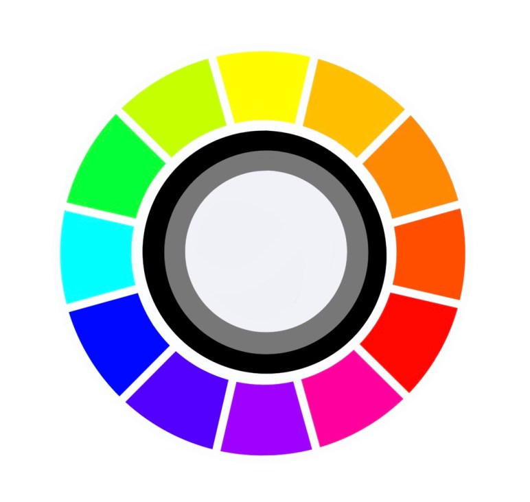
Primary Colours : Red, Yellow, Blue are a set of colours that are used to mix and obtain other colours.
Secondary Colours : Orange, Green, Purple or Violet are obtained by mixing two primary colours.
Tertiary Colours : Yellow-Orange, Red-Orange, Blue-Green, Yellow-Green, Red-Violet, Blue-Violet are obtained by mixing primary and secondary colours.
RGB (Red Green Blue) the primary colours of light are used by monitors and screens of gadgets. Take a projector light, cover the screen with a translucent paper of a primary colour and cover it. Now project these coloured lights on to a white wall. You will see a secondary colour when two lights are projected at the same spot. Try it!
CMYK (Cyan Magenta Yellow Black) are primary colours of pigment. These are used in printers. See your print cartridges labelled in these. Now suppose you ask the printer to print a picture with multiple colours, the print machine prints using combination of these primary colours to get more colours.
A combination of RGB creates white while CMYK creates Black. That is why colours differ a little bit when you see them on screen and in print.
A colour box that contains primary colours and neutral colours Black and White is enough to mix and get other colours. Neutral means without any colour : Black, White, Grey. A colour mixed with white is called ‘Tint’, a colour mixed with grey is called ‘Tone’ and a colour mixed with Black is called a ‘Shade’. That is Tint, Tone, Shade of a Colour.
This should help you select colour schemes when painting your next masterpiece. So for summers if your designer says the collection is in Pastels or tints of various colours you will know it right away.
Contrasting colours are colours that are opposite on the colour wheel, that is they cancel each other and result in black or white when mixed. They are the most contrasting colours. So Red-Green, Orange-Blue, Yellow-Violet are contrasting colours. Oops! Did you get a very red pimple or scar on your face? Don’t fret, use a green colour corrector before applying the foundation. This should do the trick!
This was a quick, short tutorial on understanding colours. You must try some practical exercises or games with these concepts and you will never forget this basic understanding of colours.

4 thoughts on “Understanding Colours”