Learning to paint, this little child asked me “Ma’am why can’t I paint a green or pink sky? Yellow water or black rose? Isn’t art about the freedom to paint?” I was startled for a moment but then I tried to look at it from his eyes. Yes! The artist is free to paint whatever he wants and as he wants. Then why wasn’t I ready to accept his imagination? Did I consider it as a violation of the norms? Why does the sky have to be blue and the trees green? Has this thought crossed your mind too?
Art is about the freedom to express. We all draw and paint to express our thoughts. Worldwide, we associate colours with certain emotions. That is why when an artist paints a red rose it invokes a different reaction and when he paints a black rose it invokes a different one. Why? Because every colour has a meaning. Some meanings are accepted in general on a broader level by most people while some meanings are deeper or secondary and have more local communal interpretations.
For example, red as a colour of love is generally accepted by all. On the other hand red is also the colour of anger. Further, red as an auspicious colour is accepted only by certain communities. So you see one colour can have many meanings. How is this meaning derived? It is mainly because of our associations through our thought process. Colours which we see around in our environment and surroundings are colours we associate better with. Colours as symbols to indicate messages or mark goods in trade have been used since time immemorial.
In India, we have the white desert better known as the Rann of Kutch. Art that is traditional to this location is on a white background, just like the white desert. The locals have colourful dresses to be seen easily. They also have mirrors to reflect the sunlight. They like to use bright colours in their homes and clothing. The colour pigments are made locally by the artisans from materials in their environment. Over the years they begin to associate feelings of happiness and cheer with these bright colours like red, green and yellow. This story holds true in some way or another for art around the world.
A good piece of art is one that conveys the message well. All artworks require a good choice of colours. However, artworks like designs, patterns, abstract art and modern art tend to have a higher dependence on the colours used. Hence before choosing colours for the artwork it is always better to know about colours and their meanings. If you want to appeal to a certain audience, it is always a good idea to know their interpretation of colours.
The study of colours is a vast subject and many people have built careers on it. In this post, we will limit it to the use of selecting colours for drawing and painting – mainly to express ourselves well through our art. Almost all colours will have some meanings and emotions considered as positive and some meanings and emotions considered as negative. Depending on the emotion one wishes to invoke as an artist, one can decide the colours. Then of course there are the light and dark shades – tints, tones and shades for all colours.
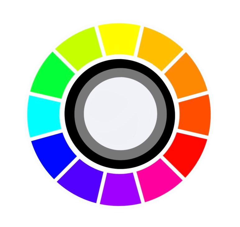
There are colours clubbed as warm colours – these invoke a feeling of warmth. Shades on the colour wheel from yellow to red are warm colours. Colours that invoke a cool refreshing feeling in us are termed cool colours. These are the other portion of the colour wheel. What is this colour wheel you are talking about? I have shared it in one of my previous posts. You may want to read up a bit on it as well. It is called ‘Understanding Colours’.
Let’s discuss some colours and the emotions they invoke :

Purity, Innocence, Clean, Fresh, Simple, Good, Complete, New Beginnings.
On the negative side it is symbolic for blank, empty, cold, death or mourning. Secondary meanings include peace, calm and hope. Spiritual meanings like enlightenment or illumination, renunciation or disinterest.
Power, Authority, Strength, Seriousness. Business or Law – Black and White.
On the negative side it is symbolic for dark emotions or opposite of white, sadness, mystery, night, evil, despair. Secondary meanings of sophistication, elegance and formal dressing. It is also the colour of death and mourning in some cultures.

Love, Passion, Fertility, Sexuality, Confidence, Health, Prosperity, Action, Energy.
On the negative side red being the colour of blood it is symbolic for anger, fire, danger, hurt, violence, warfare. Secondary meanings as an auspicious colour in some cultures.
Happiness, Warmth, Sunshine, Brightness, Creativity, Hope, Positivity, Friendship, Knowledge, Laughter, Enthusiasm, Joy.
On the negative side it stands for cowardice, deceit, caution, sickness, illness, Secondary meanings in religious texts or associated with the Sun or god. Yellow is also for Gold.
As a combination of red and yellow orange has similar emotions. Joy, Warmth, Sunshine, Energy, Creativity, Health. It is also a colour of movement and change.
On the negative side sometimes considered as superficial, aggressive, overpowering, rude and frivolous. Secondary meanings include its reference to fruits, vegetables or seasons.

Growth, Nature, Earth, Environment, Health, Good Luck, Harmony, Prosperity, Fertility.
On the negative side very often used to show jealousy and greed. Secondary meanings include its association as the colour of money. Often used in symbols for the environment or natural organic products. It is considered lucky in some and unlucky in some cultures. Green is also wisdom in some cultures.

Open Space, Freedom, Imagination, Trust, Loyalty, Intelligence, Wisdom, Flowing or Journey, Serenity, Stability.
On the negative side it means frozen or cold, unfriendly, suspicious, sad and depressed. Secondary meanings : Blue being the colour of the sky and water, it is a very popular colour worldwide. Most companies have their logos in blue. Blue is the colour for boys in some cultures.

Love, Kindness, Femininity, Romance, Youth, Charm, Sensitivity, Politeness.
On the negative side it represents lack of will power, lack of self – worth, over emotional. Magenta is a shade of Pink. Secondary Meanings : It is considered a girly colour.

Royalty, Wealth, Romantic, Wealth, Wisdom, Extravagance, Grandeur, Dignity, Nobility, Power, Independence, Beauty, Femininity,
On the negative side it is associated with pride, pompousness, mystery, sadness, frustration. Different shades have different meanings. Violet and lavender are also shades of purple. Secondary meanings : it is the colour of mourning in some cultures. It is also considered spiritual and magical in some cultures.
We don’t use any single colour for a particular meaning. It is a mix of colours and the shade also matters. How it is used and what is painted influences the message. All countries have different colours that are symbolic to them. For example Green is considered unlucky and associated with infidelity in China while red is considered as protective and lucky. Indigo is referred to as Japanese Blue because it is the most used colour in Japan. Red is auspicious while black is bad luck in Japan.
If we look at flags or national symbols of a country, we will understand their colours faster. Countries use colours they consider auspicious or representative of good luck on their flags. There is no one shoe fits all situation. We need to do our own homework and read up our bit.
The next time you are drawing or painting, think about the colours you are selecting. This is not an exhaustive list. You could even make your own list. I shared this because I felt just as this knowledge helped me make my art better, it could help you too. Have an Arty Week!


