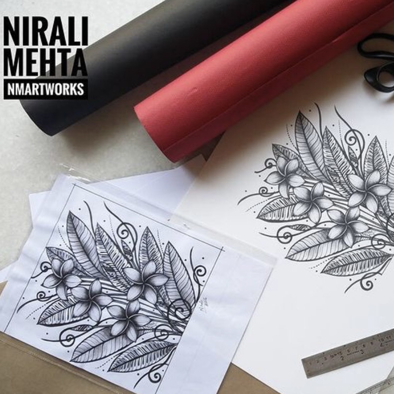
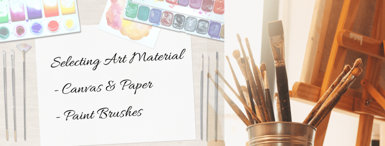
There are different ways to add the sparkle to your artwork. One of them is ‘Gilding’. It creates a nice embossed sparkling effect. It could be a simple outline or dots or stars or more in that shiny effect. Embossing with the gilding method is best suited for greeting cards as well as art and craft projects in school. In this post, I am going to share some tips to get this process right!
Materials used – Gilding Glue & Gilding Flakes
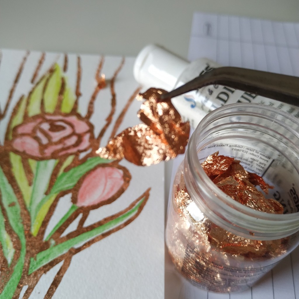
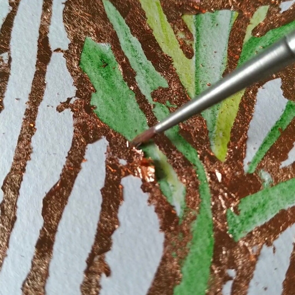
What is the material required? Gilding Glue and Foil Sheets are the main materials. Since I had Gilding Flakes at home, I used them. Gilding Foil Sheets are like cheese slices while Flakes are like crumbs or grated cheese. Hehe..I didn’t know how else to explain it without showing the product. The flakes give a crackled finish while a foil sheet gives a very smooth finish. Other than that we need a brush to apply the glue and dust off excess. Last but not least tissue paper or cloth. Gilding method is a highlight or add on to your existing artwork.
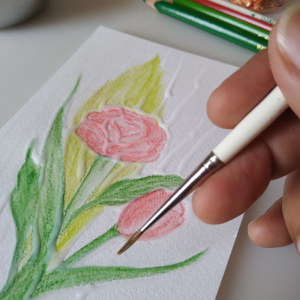
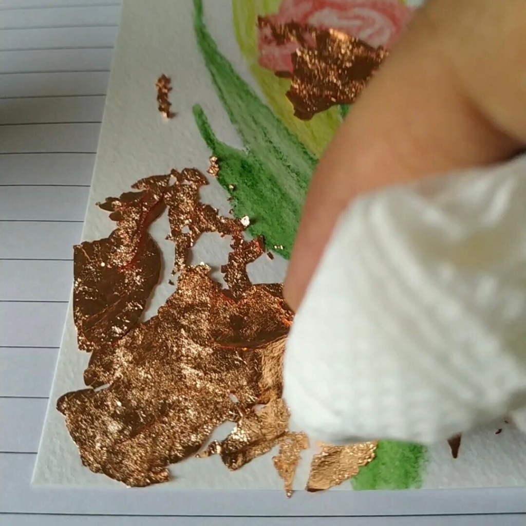
Next, let’s discuss the process. The process is simple. We apply the gilding glue using a brush. It becomes transparent as it dries. It is tacky or sticky for a few hours once it dries. Carefully transfer or lay the sheet on top of the artwork. The foil will automatically stick to this sticky base. Areas in excess where the glue was not applied but the foil fell can be dusted off later.
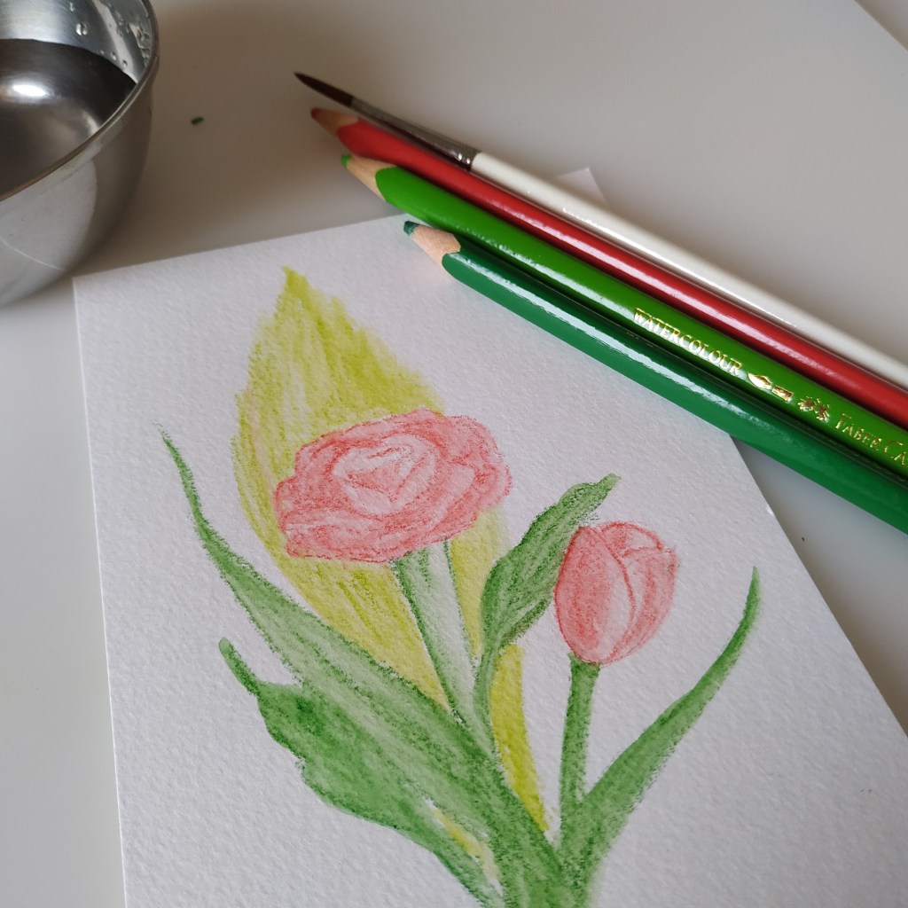
Basic Art with Colour PencilsThe White line is the GlueGlue and Gilding FlakesCloser look at Gilding FlakesDabbing the FoilDusting Off Excess
Gilding gives that metallic embossed look. Unlike ‘Embossing’ which requires a heat gun ‘Gilding’ is a natural drying technique. We use embossing glue and stick fine glitter powder in embossing method. Then we use a heat gun to fix the powder. The powder melts with the heat and sticks to the surface, giving the embossing effect. The look and finish may be similar for both methods. Best to choose the one you like. Depends on the purpose, material and your use.
Five tips for getting the gilding method right :-
Apply a sufficient amount of glue neatly like a thick outline. Points where the glue was less, will not get sticky enough to stick the foil. This will result in breaks in the line or flow.
The glue remains tacky for a good number of hours to work with. No need to hurry. Take your time.
Open the flakes like a sheet or use sheets for a neater look. Rolled or crumbled flakes give a lumpy finish.
Keep a paper or extra tissue below your artwork to collect the excess dusted off. It can be put back into the box for use next time.
Switch off the fan while working on it. The dust flies off very easily. Even if you breathe, the foil or flakes fly off. They are so light in weight.
Artwork using Gilding Glue and Flakes from JAGS store
I tried it on a small postcard first to understand how to use the material. You could do that too. For the background, I drew flowers using watercolour pencils. I am aware that we do get a home-use heat press that works on this principle and gives a more professional finish. The print is like glue, we then insert the foil with the paper in the heat press which sticks the foil to it. I had that machine earlier as a kid. The finishing that I could manage with the heat press was similar to the one that I managed here when I did the process by hand.
Hence if your use is sparing, you need not invest in the heat press or the heat gun. The gilding method will work wonders. For lettering or calligraphy artists, ‘Gilding’ could add that zing to your next artwork. Let me know your views if you have tried this technique. Have an arty week ahead!
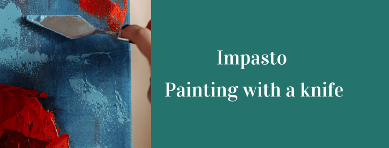
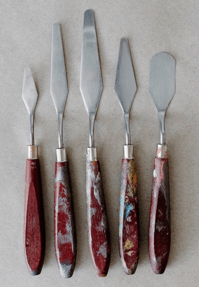
Yes! That is the term used for a painting technique – ‘IMPASTO.’ Impasto technique in simple words is painting with a knife. A painting knife is different from a regular knife. The blades come in different shapes and sizes to create different textures. You could relate better if I named a famous artwork created with this technique – ‘Starry Night’ by Vincent Van Gogh.
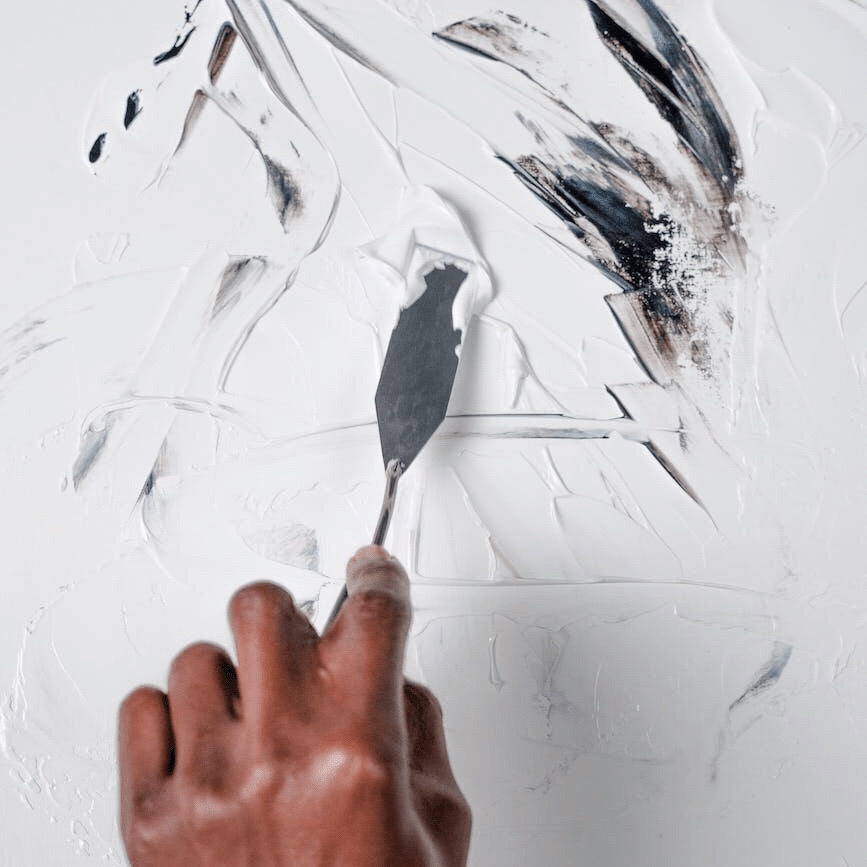
Impasto technique is commonly used in paintings of the ‘Abstract and Impressionist styles’. Instead of using a brush to apply paint on the canvas, we use a knife. It is a metal piece (flat) not exactly sharp but more of a shaping tool with a wooden handle. We can create a variety of textures using it. The texture created will depend on the pressure applied and how the knife is held by the artist.
Holding the Knife to Paint
Hence, the texture created by two different people using the same materials can be different. The method of application is what matters. This method is not exactly taught. The artist must try different strokes to see which one he/she is most comfortable doing. Like they say each one of us has that one special movement in which, only we can do best.
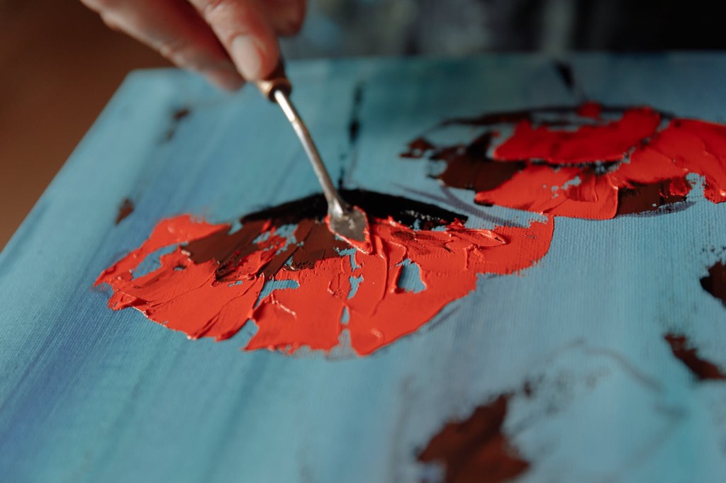
Painting on the canvas
Initially, when I learnt this method during school days, we referred to it as ‘texture painting.’ This term expands the scope to use other tools for application to create textures with paint. For example, we can use the blade of a cutter or a simple piece of ply laminate. These can be sharp, so please be careful while using them. Ever noticed a worker applying a white base (putty) or cementing the cracks in the wall?
Different blades of painting knives create different textures
I know, to be safe please use knives and not these other things. All I meant was that we can create textures with anything, even combs. It’s like the application of icing on the cake. In this case, think of paint as the icing that we are using. I gave that connection on purpose. The consistency or feel of how the paint should be for a good output can be understood through this connection- soft, quick drying and thick.
Painting with a Knife
This painting technique gives a 3D-like output. There is no need to paint various layers. We only need to give a background colour to the canvas and then we can paint directly on it. Impasto is originally done with oil paints. But it’s expensive and takes very long to dry. I have tried this method with gouache paints (on paper) as well as acrylic paints (on canvas). Both work very well in their way. The paint dries quickly and the artwork can be completed in one go. We also get various mediums that we can add to acrylic paint in order to enhance this work.
My Painting using the Impasto Technique
Textures can also be created with ‘Guesso’ at the beginning for the background and then painted. However, most of the time we just directly apply a nice rich thick coat of paint directly to the canvas. Please note, this method uses a lot of paint. So make sure you are stocked up with enough paint in the colours that you need. The exact amount depends on the artist’s usage but the amount of paint that is used in a painting with this method is almost 3-4 times more than a regular method.
A trending art that uses this technique but with different material is ‘Russian Sculpture Art’ or ‘Russian Sculpture Painting.’ Readymade ceramic pastes in various colours are available in the market. These are used to make florals. Do check this art on the internet if you heard it for the first time. It isn’t exactly sculpting but it uses ceramic paste with the painting knives.
Try different textures on small pieces
And finally, where will I get these knives? In earlier days artists would make their knives but we are in the modern world now, right? That means it is available at almost all stores selling art material. It is also called a ‘palette knife’. It is barely sharp enough to cut the paint. So even children can use it under their parent’s or teacher’s supervision. Go ahead and try a new technique of painting this week! Have an Arty Week ahead!
Bold and expressive brushwork to convey the beauty of the mundane ordinary subjects around us is what I love to do. Hello! I am Dr Shaazia Hawai, a dentist by profession and an artist at heart.
Art, for centuries, has been a means to express individualistic creativity. To me, art is a language that I intend to speak fluently. It thrills me when I see someone who has mastered the language of art. It intrigues me when I discover someone adding new layers to its tapestry of possibilities.
Being a dentist, I was miles away from indulging in anything creative. Science and Art are very different after all. I started painting as a means to explore my creativity after a visit to an art supplies store.
I felt overwhelmed looking at gorgeous landscapes, realistic portraits and stunning abstracts. ‘Still Life Painting’ or ‘Object Drawing’ had this strange attraction for me. It was something that I felt I could dabble with. And that is how my journey as an impressionist still life artist began.
Paintings by Dr Shaazia Hawai
I enjoy painting with acrylics as the medium is versatile and allows room for experimentation. Painting still life has its advantages like the subject doesn’t get tired, doesn’t move and it’s so easy to procure ( just raid your kitchen). I suggest painting one new object daily.
For the initial few months, I used to paint only in my spare time. As time progressed I started dedicating more time to paint because I was enjoying the process. I set up a small workspace in the corner of my bedroom for painting. That really kickstarted the daily morning ritual of painting. The ritual then became a habit. It got me focused and gave me clarity with regard to what I needed to do with my art.
If you are beginning your journey as an artist my suggestion to you is to form your own daily routine. I saw massive progress in my painting style and brushwork with this system of practice. I started posting my artwork regularly on social media.
I was approached by an art supply store to conduct online workshops for them. I had not learnt painting the formal way and so teaching art or even painting in front of a live audience gave me goosebumps. Overcoming my fears and conducting the first workshop was a game changer for me.
Not only was the workshop a success, but I also had a blast interacting with fellow artists. This gave birth to my Saturday live paint-along sessions on Instagram. I still conduct them. You may drop by and check my page to join the party.
The idea of being around like-minded people enhances creativity. We challenge and help each other by supporting the artist community.
My paintbox consists of primary colours (red, blue & yellow) and white. A few flat and round brushes ( I use mostly 6,4,2 flat brushes & 6,2 round ones) a substrate on which you will paint ( paper, canvas, wood, cardboard, etc)
A great tip that I have learned is that – acrylic paints tend to dry dull if diluted with water, so I usually use a medium (gloss/matte) to increase the flow of the paint and limit the use of water to only for cleaning brushes. (Note: Wash brushes immediately while painting with acrylics)
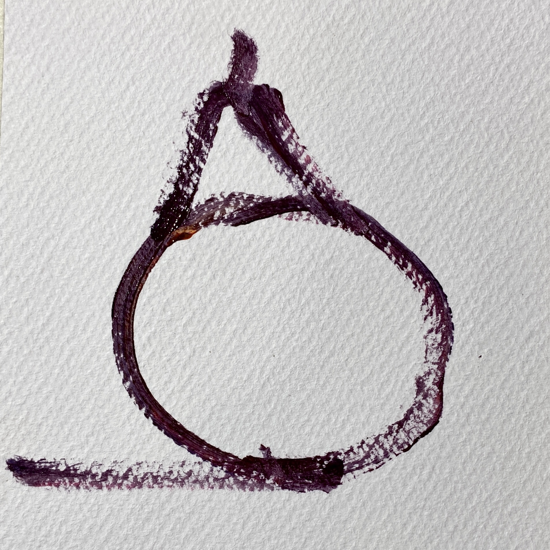
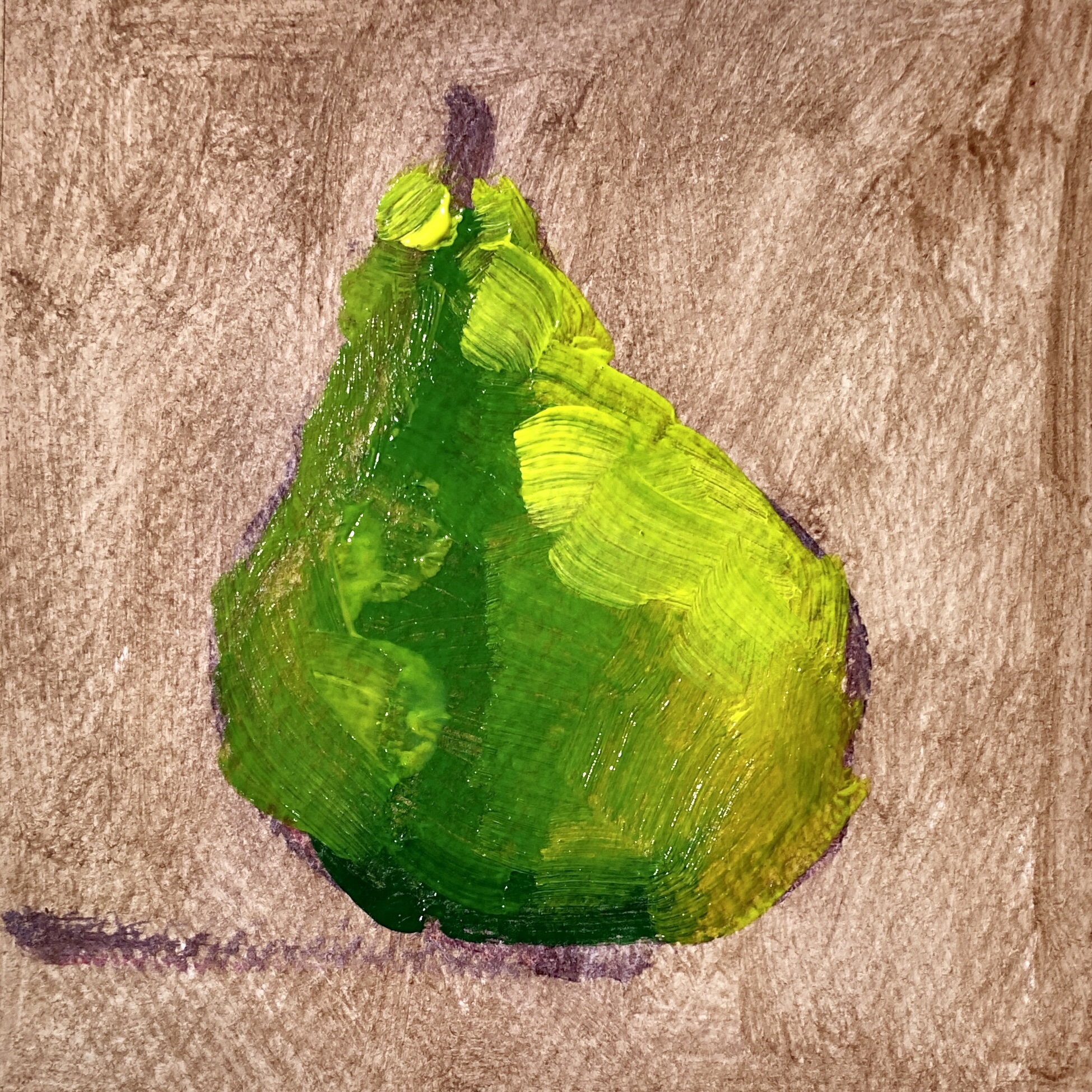
Let’s Paint ‘A Pear’
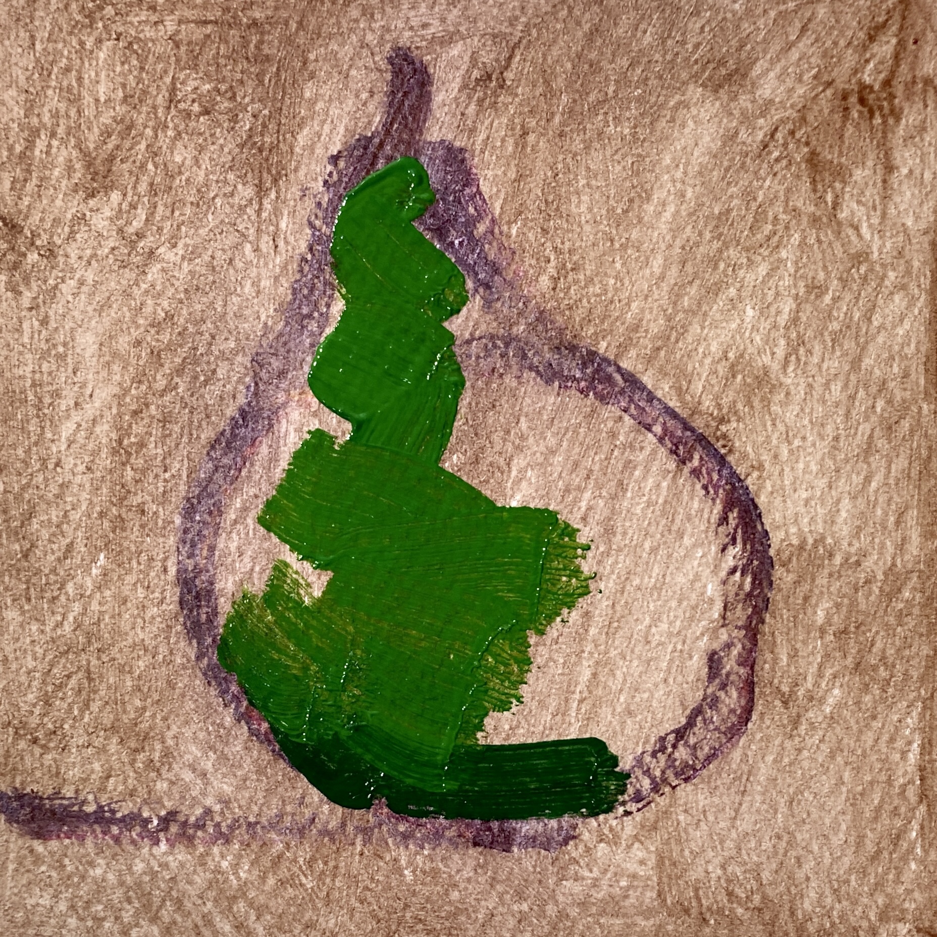
It is best to simplify the object. A pear looks like an alphabet ‘A’ or a triangle over a circle. After establishing a loose sketch, I apply a thin wash of neutral colour. This underpainting helps eliminate the whites of the paper and creates depth in the painting. Next, I establish the dark tones in the painting and paint from dark to light. You can also paint from light to dark. It depends on your chosen medium.
Simplify the objectMark the outlineGive a background Fill the colourAdd highlights Complete the artworkStep by Step Painting with me
A loose brushwork like mine can be achieved by holding the brush at its tail end. Then I add the highlights, background and fine details to bring out the likeness of the subject. One can always add more details and finer brushwork to make the subject more realistic. But if you prefer an impressionistic style like me, leave it in a loose expressive state.
I am a firm believer in what Van Gogh said, “Paintings have a life of their own that derives from the painter’s soul.” An artist paints from his soul to produce magic on canvas. That’s why a true artist’s work is easily recognisable such as Van Gogh’s starry night, Monet’s lilies, Cezanne’s still life & Klandinsky’s abstracts.
My suggestion to all beginner artists is not to copy styles or trends on social media. Paint what your heart desires, and you will make mistakes but keep practising because Bob Ross said, “There are no mistakes in art, only happy accidents.” And as you embrace these happy accidents, you will evolve as an artist.
Dr Shaazia Hawai is a dentist, who spills her love for colours onto the canvas. She is also adept at Arabic Calligraphy and Paper Quilling.
Taking imagination and fantasy from the world of magic and transforming it into something beautiful in this world; is what I do every day. Does that sound interesting? Hello everyone, I am Radha, a clay artist. Doing something creative by shaping earth with your hands can be an incredibly humble, joyful and healing experience. I enjoy working with clay. Minutes to hours and hours to days, I do not realise how time flies when I am working.
My journey as a clay artist started in 2012. I was highly impressed by a clay artist named Iris Mishly and her clay crafts. Indian clay crafts – terracotta jewellery has always been my personal favourite. Yes, I am a self-taught artist. I have not taken any formal training in clay modelling. But arts and crafts were always my hobbies since childhood. I like all kinds of painting: including oil painting, fabric painting and mandala painting. Anything challenging and creative, I do not mind trying.
Initially, I made jewellery for myself – mainly small earrings and pendants. Friends and family loved it as I made a few for them too. Then as I learnt more complex patterns and forms, I made more designer fashionable jewellery. Learning, designing and creating more and more new projects in clay continued for a few years. And by now, I had developed a steady hand and good speed in working with clay. What started as a hobby is now my full-time profession.
Radha making her clay creations
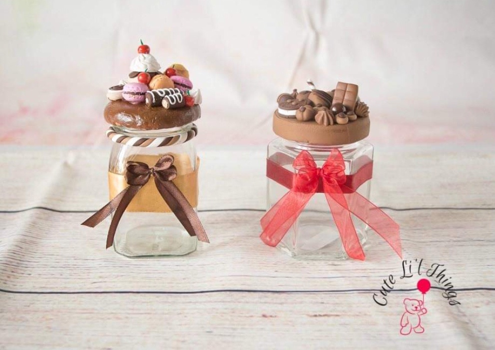
Later after a few years, making small figurines or dolls from clay interested me a lot. Then I started making dolls for the shop. The appreciation for them was overwhelming. Everyone liked the new dolls. They were a great success. It has been 10yrs since I set off on this journey. Now I have a store online where I design, make and sell clay dolls as cake toppers, fridge magnets, pencil toppers, keychains, jewellery and more. You might want to take a look at my work. They make great gifts too!
Creations by Radha
‘Clay’ has many forms; air dry clay, polymer clay, wet clay, and porcelain clay. And among them, a personal favourite to work with is Polymer Clay. It is more versatile and flexible to work with comparatively. Earlier I used this clay for most of my works. However, later as I started making figurines, polymer clay did not give me the option to produce it in large quantities. Hence I chose to create using air-dry clay. To make a clay model, we would need clay – Polymer or Air-dry (whichever one would like to use), moulds, acrylic paints and brushes. Clay modelling tools if and where required. Glue and embellishments if you wish to decorate them further.
Materials that are available locally and with ease make it an attractive hobby to take up. Other than that, it involves a lot of finesse and patience. It does not require much space either. I design the model on paper, select the clay and material and then begin to create it. Even I got stuck while converting the design on paper to the model. I needed to make modifications or rework some of it. Finally, the Clay project is ready to be shipped after a week of hard work. Shipping an article that is this fragile and hoping it reaches the customer perfectly the way it is, used to give me nightmares. With time I learned to wrap it up with enough cushioning, to ensure the clay model reaches the buyer safe and sound.
I like to personalise and customise my orders. ‘Cake Toppers’ are my best sellers. There was one order that I distinctly remember. It was quite a challenge to design a doll sitting on a swing, while the swing was hanging from a tree. It was sweet, cute and delicate. I was on the edge of my seat waiting to know the customer’s reaction when she receives it. The wait finally ended when she replied “I have received it. It is in great condition and I simply love it. It is exactly what I was looking for!” I was so relieved. It made my day.
There are a lot of things that one can make using clay. Food miniatures are a trend picking up very fast. Realistic-looking miniature pieces of foods to create displays or for the dollhouses are called food miniatures. Wedding Memories of a couple, decorations for gift hampers as well bottle caps are all popular clay figurine models. If you are thinking of taking up clay crafts as a hobby, I suggest you stop thinking and take it up. It is something I feel all creative artists will like and can give a try.
Make a simple clay model with me
Make a simple clay model with me :-
I use air dry clay for my project. Most of them are available in different colors or you can mix them accordingly to your project design.
For the face I use skin color, hair black color and for the dress use colors as per your choice.
If you have a mould simply press the clay into the mould as required. Clean up the extra. It helps to make multiple pieces.
Once the desired design is complete, unmould the design and smoothen the edges. For the hair I use black clay depending upon the hairdo, I use resin eyes or acrylic paints for the eyes and eyebrows.
Now let the clay air dry for the next 24 hours or until it’s solid.
And it’s ready! Your first easy clay project. Have an Arty Weekend!
Ms. Radha Srikanth is a clay artist and the owner at ‘Cute Li’l Things’. A mother of two, Radha manages to keep a balance between work and home.
Hmm.. the aroma of a freshly brewed coffee can be so refreshing, isn’t it? Sniffing coffee beans can almost reset your sense of smell. When we sample different perfumes and a particular strong smell gets to our head, it lingers. How to clear it? Take a few coffee beans in a cup and smell them. After sometime smell another perfume.
We can creatively use coffee for many things other than just sipping a nice cup of coffee. You may have come across or tried these. In this post I am sharing three artistic creative ideas of arts and crafts with coffee. I have tried my hand at all the three and they can be wonderful creative outlets for anyone, especially coffee lovers. It is the skill and material that make this art unique.
Latte Art (Photo Courtesy WordPress Photo Library)
The first one is using coffee beans – I had some coffee beans left in the pack. They were way past their expiry date on the packet. I wasn’t sure if these were safe for consumption. So I decided to do some art craft with them. The method is selecting a drawing of your choice and creating a design by pasting these beans on the paper. It’s like ‘button craft’. Draw the design and paste the coffee beans. Jute pieces or jute strings make a good combination with it.
Alternatively they can be decoratively filled in bottles or jars to make showpieces at kitchens, coffee shops and restaurants. Choose a simple design with distinct lines. The artwork can be framed in a box frame and kept as wall art. However, Coffee beans are natural and perishable. They can get infested in future and the artwork may get spoilt. This thought made me go a step further.
Designs with Coffee Beans (Photo Courtesy – WordPress Photo Library)
I made coasters with coffee beans and resin. We can use the coffee beans with resin to make decorative clocks, trays, coasters, jar lids and everything else that we make with resin otherwise. This way, they have a protective covering and they are air tight. Do check my posts on resin art for more ideas. It is the same process. We use coffee beans just like any other embellishments or materials. We can combine it with resin colours and other materials too.
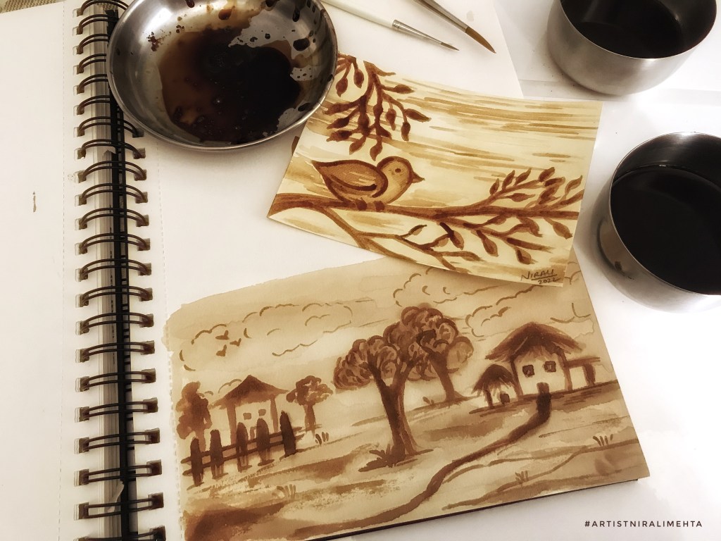
Second one is Coffee Painting. Yes! We can paint with coffee just like we paint with any other paint. The painting technique is very similar to watercolour painting but in monochrome. ‘Sepia tones’ is the correct term used for artworks in shades of brown. We often use this palette to show something as ancient or old or aged.
I used to make ancient historic looking scrolls using this method. To make it, we take a sheet of paper and paint with coffee paint. The light yellow brown will make the paper look aged. Darker paint on the edges and lighter in the centre. Cover the whole page. Blocks or patches of dark light shades look natural. We need a thick paper for this, more than 200gsm or at least 200gsm watercolour paper. Give the edges a slight burn with candle. Write the scroll in calligraphy to make it look authentic. It could be a treasure map too!
Coffee Paint and Sepia tones (Photo Courtesy WordPress Photo Library)
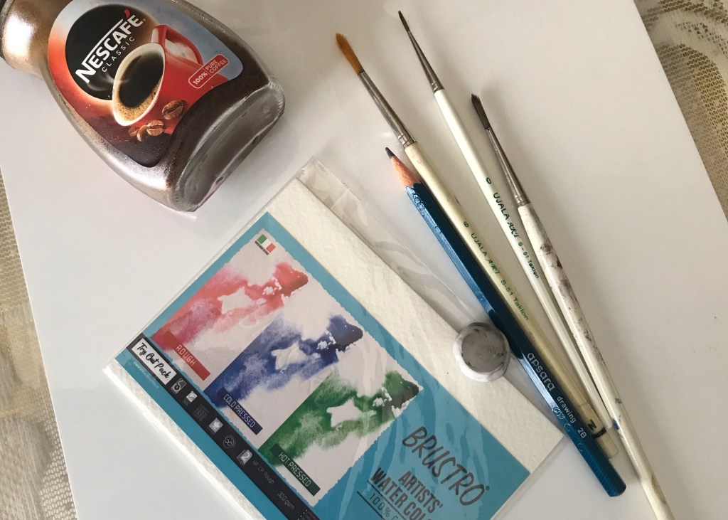
If you have artistic skills, we can actually paint with coffee. Take two bowls. In the first one add one spoon coffee powder and two spoons water. In the second bowl for a darker thick concentrate take one spoon coffee powder and one spoon water. Mix it. The painting and blending art style is like painting with watercolour. Other than that painting with coffee is a very different experience. To create the coffee paint we need instant coffee powder. I used Nescafé powder as it blends well in water. No lumps or chunks.
Actual Picture of the materials I used
Creating an actual artwork using coffee requires prior experience and skills in painting. That is why I suggested the scroll design which is very easy and will always look good. I recently bought some art material from ‘Creative Hand Art Materials’. They sent me a small sample pack for watercolour paper. The paper is 300GSM. I painted the Bird Artwork on it. The scenery is painted in my regular Art journal.
My artworks – Coffee Painting. First I painted the scenery then the Bird.
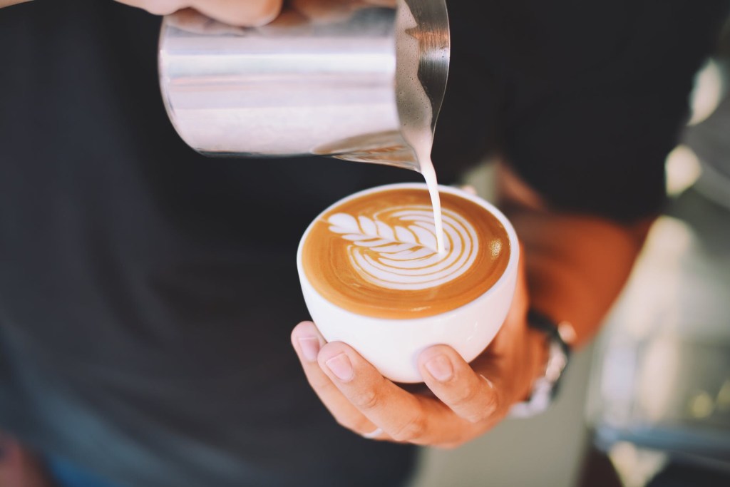
Third and last is ‘Latte Art’. It is a very skilled art but many coffee shops let you try it. The coffee is first poured in a particular manner and then designs are created on the surface. Originally, ‘Pouring’ was the only technique to create designs. Designs were created by pouring the cream in a particular way. Now there are more techniques in Latte Art. ‘The Leaf’ is the first basic design in Latte Art.
Latte Art Leaf Design (Photo Courtesy WordPress Photo Library)
‘Latte’ is coffee with cream or milk and ‘Art’ because we are creating designs, hence ‘Latte Art’. The easiest technique is to use a stencil. We place the stencil on top of the coffee cup and dust it with coffee powder through a strainer.
Further after the coffee is poured we use toothpicks or the tool to create enhanced artworks. The drop is a dot, we drag the point in a single direction to create the designs. We can dip the point in cream or coffee concentrate to add little details.
Creating using Toothpick or Tool (Photo Courtesy WordPress Photo Library)
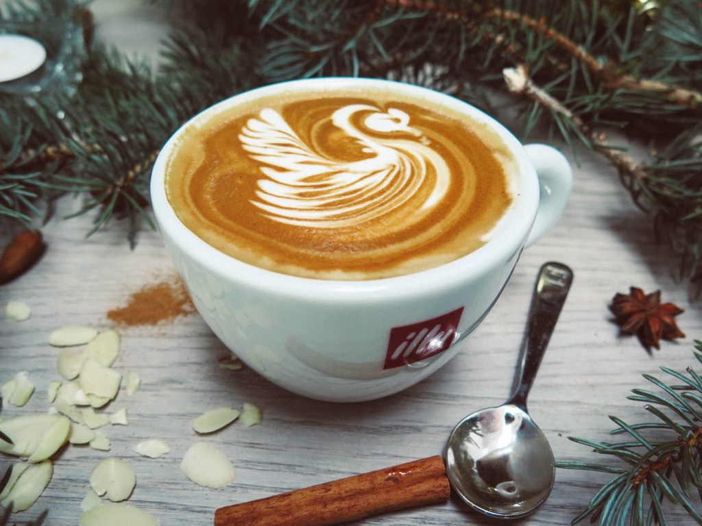
This swan is a combination of the pouring method and using the tool. After the leaf is poured, the art is then enhanced using the tool. Sometimes, we directly use the tool to paint with cream. They also add food colour to make colourful artworks.
Swan – Latte Art (Photo Courtesy – WordPress Photo Library)
The most complex of these I feel, is the 3D Latte Art. Here, they create 3D structures on the coffee surface with cream and coffee concentrate or chocolate sauce. 3D Latte Art is very Popular in Japan. It was started by a Japanese Artist. Cute things are always liked in Japan. Sharing a few pictures from the internet below. Do browse and look up for more. I don’t hold any rights in them, it is just to show the readers what I am talking about.
3D Latte Art (Photo Courtesy Dreamstime Images)
Did you know, we get printing machines that print designs on coffee? A cream gun that makes the white cream for art. There is a lot to explore if you are a coffee lover, isn’t it. Although the cream flattens as time passes, I am sure you will agree that these creations make the coffee more alluring and tempting. They are very fascinating to watch as well as try.
The main ingredient is the cream. Creating that at home is difficult. I have tried it with the beater at home but it doesn’t give the same effect. We need the coffee machine or it’s tools. Best to let the Barista pour it for us and then try the designs along with them. That way they prepare the base for us, making it easy.
After that admire your creation, click as many pictures and then drink the coffee. As simple as that! It is a fun and relaxing activity to do on a weekend. Try it for your next date at a coffee shop, if you want to make it more interesting or if you are dating an artist. Hehe.. of course, you can try it otherwise too!
Isn’t it amazing how we can use something so regular from our daily kitchen to make such beautiful artworks. Have an Arty week!
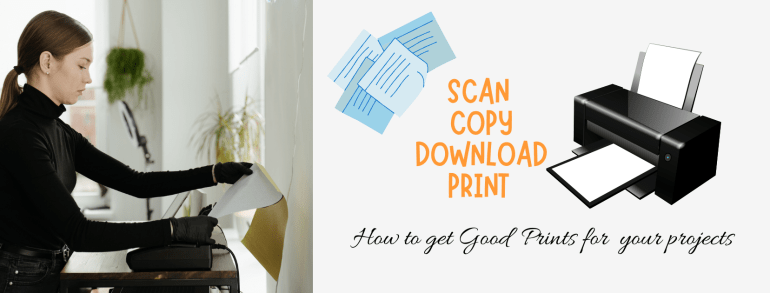
Did a hand drawn artwork and now want to make copies OR drew it digitally and now want to print it? Photographs, Graphics, Vector Art, Backgrounds, Designs, Drawings and Paintings – All of us might have tried to print these at some point of time or another. It could be for a School Project, a University Submission or a Personal Art Craft Project or for Commercial use.
I see many people struggle to get good prints of their work. What went wrong? They don’t know. I often get to hear “I gave the print command and the printing device printed it.” “I took it to a professional printer and he said the art work is not done correctly. The printing service owner said the device (printer) has done it correctly.”
It’s our loss as the money is wasted and we are not happy with the output. Today’s post is about ‘Getting a good print out’. I am going try and translate the language of a printer. In other words explain it in simple terms that everyone can understand.
Here’s my hand drawn ink art and the scanned print both next to each other
Initially I sold ‘Digital Downloads’ at my Etsy Shop. It was one of my best selling products. One can ‘buy >> download >> print >> use.’ I also included a file with printing instructions and ideas for assistance. So the buyer can confidently print the art work they bought at home on a home printer or with a professional printing service of their choice.
Yes! Now a days most of the projects are only online submission and we don’t print files. I am aware of that. However there are times we want them printed. For example – A photo book or a journal or diary. A card for celebration or the final university project.
There are some basic terms one must know to be able to give the device the right commands for printing. After all it is a computer, it will do as commanded. Here’s a list of jargons we come across for this task. These are not definitions but rather explanations in a simplified form. The regular definitions are already up there on the internet.
Pixel – Think of a paper made up of small particles – numerous dots. This is a Pixel. It is square in shape. A computer screen is made up of numerous pixels. Just as we measure paper in a unit such as cms or inches, we measure a computer screen in pixels. Right click , go to ‘properties’ of the computer file to know the measurements of the image. It will be shown as length x breadth.
Some common standard monitor screen sizes
1366 x 768 pixels High Definition (HD)
1600 x 900 pixels High Definition Plus (HD+)
1920 x 1080 pixels Full High Definition (FHD)
3840 x 2160 pixels 4K or Ultra High Definition (UHD)
Image Size – The length and breath of the image, just like the length and breadth of the canvas or paper. For ease we can convert this from pixels to cms and vice versa with help of converters online. Helps know the best size it will print in. The size an art work is created in is always the maximum size it will print best.
An example of the image size shown in properties
Pixelate – Fine dots give a good image. The size of the pixel is called the pixel size. When we drag the file way larger than the size it was created in, each pixel size also gets amplified and we can see the distinct square blocks making up the image. The image is said to be pixelated. Always print the file only to a maximum of the size that it was created in, so that it doesn’t pixelate.
DPI – This is the resolution of the image. Consider the detailing done while copying or scanning the file. A higher resolution means more detailing and a larger file size. This value must be set while scanning the image or art work. Anything below 150dpi is blurred while above 300dpi may be excess. Images at 300dpi print well. It is a standard. For images that are used online on websites or blogs we generally keep the resolution as 150-200dpi. DPI stands for dots per inch.
File Size – Consider this as the weight of the package. The transport service in this case is electronic but allows a limited weight only. The weight is measured in kb, Mb, Gb (Kilo bytes, Mega bytes, Giga bytes). This information can be checked in the properties tab when we right click on the file. Higher the resolution, higher the file size. Means the package weight is high. A large size file takes longer to upload. We can lower the size of a file by compressing it. However it also compromises on the quality.
Compressing a file – Making the file size smaller. This could be by reducing the image size in terms of the length width as well as the file size in terms of the bytes. In some portals or software’s it can be a hidden command. In many email services, forms collecting data and social media platforms a default setting is made. The computer is asked to compresses the file to upload/ download faster. If we want to send across a high resolution file, we must make sure we turn off this setting and manually set it.
These are technical words that are used to describe or check if the file is suitable for printing. One important point we need to understand is that there will always be a minor difference in the colour on the screen and in print. I have explained ‘why’ this happens in my post about the Colour Wheel. For those of you who missed it – It happens because of the difference in the colours of light and the colours of pigment. A computer screen uses RGB (Red Green Blue) format while the Printing devices are based on the CMYK format (Cyan Magenta Yellow Black).
As professionals, designers must order prints with the exact colour shade and can specify the number assigned to the colour or shade. There is a standardised numbering system followed world over. This way the printer just cannot go wrong. It prints the exact colour selected.
Now there are some basic printer settings which all printers have. A Printer (device) comes with a set of default settings but we can always modify them if desired. Let’s understand these.
Black and White Print Setting
Colour Printed Images – Photographs with White Border (Margin)
Black and White – It will print only the extreme colours Black or White. No shades of grey. This setting is used to print all text files to save the toner and ink.
Grayscale – The page will be printed in shades of black and white. The shades in between will be printed as tones of grey. Even a coloured image can be printed as black and white or grayscale. The output will differ.
Colour – This is the setting we want to select for printing colourful images. A thing to note here is that a scanning device also has the same settings. We need to make sure we scan it and print it with the same settings for the desired output.
Borderless Printing is now possible on some printers
Print Margins – The white borders on the printed page are margins. We can change these when we give the print command. The image size and page size will not be exactly same, even if theoretically they are the same size. It means that the page and image edges will not coincide or overlap. An Image printed will always be smaller than the actual page.
This is a technical aspect of all printers. It differs with technology and brands. We do get borderless printers to print high quality photos and large format pictures. For home printers, at least even if we keep the margins to zero, it has a ‘gutter’ which will always be there.
Fit to Page – Small and Large Image Sizes
Fit to page – This is a simple beginners setting. If the image is bigger then use the ‘fit to page’ setting to get the image to limit to the size of the page. For example the artwork is 12 inches by 18 inches which is bigger and we want to do a test print at home and the printer at home prints only A4 size, which is smaller than the art work. We can use the ‘fit to page’ setting and comfortably print it in A4. If this setting is not used the printer will use multiple pages to print the same image. It tries to print the artwork at the exact size it was created plus the white print margins. Leads to a lot of wastage in paper.
In another case, if the image is small and we use the ‘fit to page’ setting the image will be dragged to make it as large as the page. It will get pixelated.
Further we also need to ensure the aspect ratio is locked. Meaning when we change the size of the image, if the computer is decreasing the length by one inch it decreases the width also in the same proportion instead of keeping it constant. Otherwise it will change one of them and the image will not print correctly. This is the reason the white border is broad on one side and very thin on the other.
Of course we can cut and remove the white borders, join these sheets and all. However it is best to avoid such wastage by making sure the commands are in line with the output we want. Here is a simple chart explaining standard Paper Sizes used by all printing devices. They are denoted as ‘letter’ or ‘A3’ or ‘A5’. We select these from a drop down menu. The computer will edit the other settings to match it once we select from the drop down menu. The image is by Vector Stock and only for reference.
Paper Size in mm – Standard Chart only for reference
Let’s do a quick recap of the points to remember:-
1) Draw your artwork in the same size as the one you want to print. A larger art can be comfortably printed in a smaller size but not the other way around. If you are downloading and printing then check this info.
2) Scan it at 300dpi OR set the resolution of the computer drawing file at 300dpi. We can reduce this if we want to use the file only in the digital format. A printer will require it at 300dpi only. Changing this at a later stage spoils the file. It is to be done from the beginning itself.
3) Specify the colour or black and white print settings. A colour image can be printed in black white or grayscale also if that is the command selected.
4) Read the Printer Paper Sizes Chart and keep it handy. This enables us to know exactly the size we require the work in.
Last but not the least. Do this with the art that you create or art that you bought. Art work downloaded from the internet may be subjected to Copyrights. Printing or making copies of certain art work is considered illegal or a violation of the law. I did do a post on Copyrights earlier. Do take a look if it interests you. Making copies of things like currency or coloured copies of government papers is strictly illegal. Please do not engage in any such practices.
Use this information to make prints for your artwork, download files that are permitted for personal use or artwork that is officially yours and you have the rights in it. I hope this information was helpful. Now we can confidently get good prints at home as well as at professional printing services. Have an Arty Weekend!
Photo Credits : The WordPress Photo library for all the photos except one from vector stock and the other one that is mine.
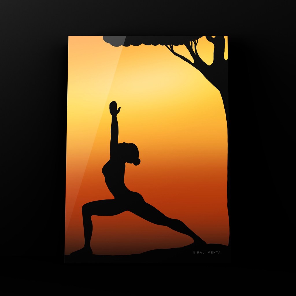
How to say that? It is ‘Silu -et’. That’s right! I am not talking about a soft fabric but a technique of painting. Silhouette is also a popular method in photography. It is an object or profile in dark black against a very bright source of light, usually the Sun.
To understand it better, do a small experiment. Take a camera and try clicking pictures of any object with the Sun at Sunrise and Sunset. The object will always come dark. On the other hand if you click in the other direction where the Sun illuminates the object, we get a crisp clear photo with details of the object. That is why they say don’t click against the Sun. Unless of course you want the special effect.
A example of how the photo will be – Image from WordPress Photo Library
The reason is the immense brightness creating a contrast with the object. Thus the object appears completely black or dark with only an outline or profile. A distinct shape of the object will be seen. This is called a Silhouette. Sunrise and Sunset are the perfect backgrounds.
It is a very simple method for painting and can be done by just anyone. No need to know anything about painting. One can paint with any medium of paint. In digital it is super quick to draw one. We can even paint it using markers. Relief techniques as well.
The Knight – I painted it digitally to explain Silhouette
It is 3 simple easy steps 1) Decide the placing of the objects 2) Paint the background in colours of yellow and orange 3) Draw the object and colour it in black – as simple as that. One thing to note is the position of the Sun. White followed by lemon yellow followed by orange to red, brown and black. This is the colour blending of the Golden Sky.
Yoga Pose – Another one that I painted digitally
Drawing the object directly seems difficult? Let’s make it even easier. Download a ‘Silhouette’ of the object, print it and cut it. Place it on your drawing and mark the outline. Now paint it black. We can use a stencil also. For a first timer it is ok to use assistance. Once we understand how to paint it we will be able to do it without any assistance.
It is like the learning side wheels in a bicycle. We can let them off once we learn to ride. It helps overcome the stigma ‘I can’t paint’. A beautiful blend of colours with a distinct object highlighted. The colour on the outside and the object in single solid colour – Silhouette. The internet has ample images for inspiration. Choose something you like.
Some classic examples from the WordPress Photo Library
I paint them digitally because it is super quick. Beach scenes or by the sea shore are best drawn using this method. One of my favourites to paint would be the Knight holding the flag and the other is a famous scene from the movie ‘The Lion King’ where Mufasa roars from the top of the cliff. A woman standing at the cliff point with open arms and breeze blowing through her hair is another one I like to paint.
Painting Silhouettes is easy and hence can also be very easily replicated and copied. Hence, I don’t sell them at my shops. Decided to do a post on them for learning and understanding. One can always paint them for their learning without any worries OR If photography is your area of interest, try clicking some pictures.
The title says it all ; this is a all you want to know kind of post and it is all about ‘The Washi Tape’. Ok! What is so special about it? Fine! It is just another tape, so use it as one. True! I think it is a door to creativity. Especially for storytellers who cannot draw well but have so much to say and share.
What is Washi Tape?
The name literally translates to Japanese Paper Tape. In India we have been using paper tapes for painting jobs. It is usually to protect an edge from unwanted paint. It is often referred to as masking tape. However Washi Tape is way better in terms of quality. It was originally used for Arts and Crafts. I think it is a must have for everyone, for students and professionals both alike. If your children are in school and have to do a lot of projects or journals, you will definitely agree. I just love them.
Photo Courtesy- Downloaded from Unsplash – Photo by Sticker Mule
What is so special about it?
The paper is different. It is strong and stiff like a tape but light and semi transparent like paper. Layering is possible. Next, the glue is very good to stick it smoothly on a surface. At the same when we remove it, it will not leave any stickies or damage the surface. Comes off very easily. The glue can be easily cleaned with soap and water, if any. Last but not the least we get them in a HUGE, yes HUGE variety of colours, sizes and designs. We can cut and use them as stickers too!
This is a portion of my collection – An idea on how to use it
Where will I get them? What is the price point?
It is a Japanese Tape so obviously it is available at stores that sell art craft materials and stationery from Japan. I bought mine during my visit to Japan. I have original Japanese Washi Tapes from The Japanese Paper Museum. In India, we now get them online as well as at all Art and Craft stores. We do get products that may not be the original one from Japan but are referred to as Washi Tape only because they are decorative tapes made from paper or titled so for search engines.
Washi Tapes are available in different sizes (broad) and usually bought in combos. Depending on themes, designs, colour matching and so on. It all depends on how you wish to use them. The prices are also offered like wise. The more you buy, the higher discount. For example INR. 30/- for one or 6 for INR.120/- It is an example, actual price may vary but is approximately in the same range.
How to use them?
As a regular tape in your diary to stick or attach something
As a decorative tape for borders, arts crafts, projects. journals, diary, your writing book, greeting cards, memory journals and more.
As a protective edging tape while painting surfaces. We tape the surface we don’t want the colour on. So when we remove the tape the extra colour or resin is removed and that surface is clean.
To create effects in some abstract geometric art
Labelling products
Marking a straight line while painting or drawing
Colour CombinationLabellingprotecting edgesGlitter onesJournalingPhoto Courtesy – Downloaded from Un splash and Word Press Library only for idea purposes – Rights with respective owners
Special Tip – A new Tape may have strong glue that may erode the paper surface a teeny bit. To avoid that simply paste the tape on the paper and lift immediately once or twice. Then stick it. Now when we remove it, the paper will not erode.
A photo to explain the special tip
Paper Tape can be used on any surface for edging or protecting the edge or surface. I used it to protect my coasters while coating resin. It works well with liquid paints as well as spray paints. It is an essential for re- furnishing and re- painting jobs. The plain colours are cheaper than the fancy ones.
Yes! I think they are totally worth the investment. There are ample ideas on creatively using them shared on Social Media. Take a look to get started. I have covered all the important information for a crafter or artist in short. If you wish to know more, you can always search online. Do check my Pinterest Board – Washi Tape Ideas to get started. I have pinned 50 different projects or ways one can use Washi Tape.
Valentines Day tomorrow! You can buy Washi Tapes and make your last minute preparations like a pro. Have an Arty Week!
On my way home, I stopped to grab a coffee at my regular coffee joint when I peaked at the new poster coming up on the notice board. It was a poster of an Art Exhibition coming up at the display gallery on the first floor. The exhibition was by a five-year-old artist.
Wow! At that age, I didn’t even know how to spell art or write anything. A little girl, just five having an entire gallery display, a solo artist. Did I wonder how? What? Why? When? Who? My mind began to run at the fastest speed that I had known.
Modern Art, Abstract Art and Contemporary Art these terms are used together or in place of the other many times. This little artist was into Contemporary Art. Her guardians were organising her show. She was trying for the world records as the youngest artist to have a solo art show.
I don’t know if she made it but it got me my topic for this post. Yes! We will be discussing Modern Art, Contemporary Art and Abstract Art in this post. Are these the same? Not really. Honestly very few people understand these or know. It is more about visual appeal. If they like to look at it, they buy it. Simple!
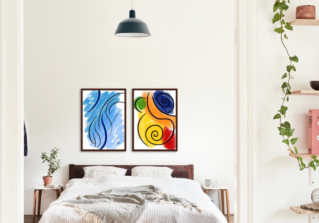
A square tile of my Abstract Art
Modern Art is a term used for the thought process. The artist is painting something that is not restricted by the traditional boundaries of the past. Abstract Art means it doesn’t resemble anything in form as such. Contemporary means more of the style of today. As art styles evolved every landmark change coined a new term. More like the terms are used for the art style in a particular era.
Modern Art is better defined in terms of shapes and textures. It looks more like patterns and designs. Contemporary Art on the other hand is more abstract than modern Art. Modern Art is a style popular in 1860s to 1970s. Contemporary Art is more as today’s Art style.
The key point in selection is the colour scheme. This art goes well with today’s modern contemporary interiors. It doesn’t represent or mean anything. Just adds a look and feel to the whole place. Many people like to purchase Art that doesn’t have an exact defined meaning.
Highlight a Wall with Abstract Art
This Art looks better on a nice big canvas. Reprints are easy. Selections are quick and simple – most of the times people just go with what their interior designer suggested. And the prices are affordable. Art galleries also like to stock more of these because it is a fast-running product for them.
One of my artworks shown in an actual space – Living Room
Jokingly I am sure at least one person looking at it will be like “Hey! I can paint that!” Haha! True and False both. True because people think it is easy I can dip a brush in colour and run it on the canvas and call it Art. False because you can’t recreate the same thing. Your Art will always be different. Interesting! Isn’t it!
Abstract Art is all about shapes, textures and colours. It completely depends on the artist’s aesthetic sense. The Art can be geometric or random. The artist paints a mood, an emotion or a feeling using colours and creating textures with brushes, hands or tools. Big bold strokes and striking colours are my style.
Two of my artworks shown in a commercial space – Work Desk
There is no good or bad here. One either likes it or doesn’t like it. No two ways about it. One cannot say if this was like this maybe it will be better. Here it is an artist’s call when to say complete. It must be visually appealing. This Art gains meaning when it is installed in a space. It is more like it completes the space and gives the look to a place. What one feels is too much may be perfect for another. Always to your taste!
One of my artworks – square prints – Bathroom
‘Dream of your Art and Paint your dream.’ All in all paint whatever comes to your mind with complete confidence. To get that beautiful artwork preferably paint on a canvas in acrylic colours. This gives a lot of options in creating different textures. You may want to read my previous post on painting with acrylic colours to know why it is a preferred medium to paint. View Post on Acrylic Colours.
Two of my artworks – Bedroom
No one can teach anything here, we paint what comes to us naturally. We can browse the internet and look at paintings by famous artists for inspiration. The technique is we paint directly with colour. No erasing, going back and forth or smoothening or anything. And paint in layers. One colour over another is completely ok. No need to blend.
I have made abstract modern art designs for my products at my Society shop and Redbubble shop NMARTWORKS. Here I am sharing some printable posters with my Art which would make suitable Wall Art pieces for residential as well as commercial spaces. These are more on the lines of contemporary art. These artworks have been created digitally for prints in different sizes but exactly on the lines of how we would paint them offline.
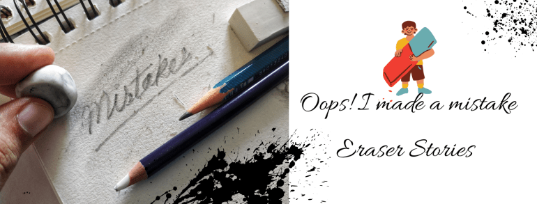
‘Life is the Art of Drawing without an Eraser’ I am sure you have heard this one before. But the truth is most of us cannot draw that well. We all make mistakes at some point in time. Nobody is born knowing it all. What we do after that .. how we correct it .. what we learn from it .. is important. Think! What is it that we could do differently so that the mistake is not repeated? We learn by asking questions and making mistakes. We grow as we learn. It is a part of the process.
People can be a bit too hard on themselves. They discard things with the slightest flaw or even a single mistake. In Art, we can either incorporate the mistake into the design or erase it. Then it is about how big or small the mistake is. My Art teacher always said, “It is ok to make a mistake. What you should also know is how to correct it. You cannot keep throwing away everything or stop painting altogether because of them.”
Reflecting, I realised I had made mistakes on my art journey as well. Sharing them with you could help you avoid them, rectify them or at least feel that you are not the only one. Here’s a list of the ones I could recollect.
If one uses a very sharp pencil or a hard graphite pencil on paper, it creates a dent. The pencil graphite can be erased but the dent or mark will stay.
Excessive erasing can peel off the paper. Hence it is important to select a good eraser as per our use.
Erasing when the paper is slightly wet will erode the paper. Literally!! There will be a hole. This happens if we use pencils along with watercolours. It is best not to draw with a pencil before using watercolours. If at all we do use them, make sure it is very light and will get covered in paint. We won’t have a problem if we use gouache colours because they are thick and opaque.
Drawing with a pencil on a canvas and erasing it is a big no-no. The graphite will mix with the paint and the colour will change to dull and dark. It is a good idea to draw with a paintbrush on a canvas. We can use a very light shade (almost white but visible to the naked eye) for drawing or making the markings. This will get covered up when we paint on it thereafter.
We do get ink erasers. Pencil erasers can be used for colour pencils too. I tried erasing a little pencil mark when the paper was almost dry but not completely dry and the paper peeled. This was because of the moisture in the marker. The idea is that once we paint or colour on the paper, the pencil mark goes under it. Hence it cannot be erased even after drying. Whether we use pencils, markers or paints it is best to erase all the extra markings before painting. We can always keep the outlines that will get covered with thicker outlines or enhanced after painting.
This is one of my favourites – Give a light wash in the background and then detail and then more detail. Same way in pencil shading. Do the light tone, then darker and then darker as and where necessary. Work on the whole piece simultaneously, so that the colours of the artwork mix and match well. Also, there is a complete flow in the picture. By any chance, if we make any mistake or want to make changes after doing the other portion we will be able to correct it. Once the dark or final touch is done, it becomes a lot more difficult to correct it. That is why it is always better to work in layers.
Spilled a colour and ruined the spot? Lighten the colour by removing the pigment by lightly dabbing on that portion. Let it dry completely and then paint over it. That is what I meant by it can be easily corrected in the beginning. That is why nobody paints one part of the art to the finish while the other part doesn’t even have a base wash. That’s 99% a digital edit.
Want to remove dried paint? Acetone works well to remove Acrylic paint on surfaces like glass or plastic. I have used it on canvas too. The cotton in the canvas will have to be treated with gesso once again before painting.
The paint water glass tipped and dripped water onto the paper. This happens a lot when we work in small spaces or a hurry. Especially during art exams. For many of us, it can even be a horrifying experience. Don’t worry this can also be corrected. Take a dry cloth and lightly dab on the paper to soak up the excess water. Some paint will come onto this cloth. It will be back to the light wash stage. Let it dry and repaint only that portion.
Last and very important – In the process of correcting the mistake, don’t try too hard. Sometimes people focus so much on the mistake that it ends up becoming the highlight instead of blending or fading away in the picture.
One thing I clearly understood is most of the times we are the only ones to know what the mistake is and where. The onlooker doesn’t know it unless we specifically point it out or highlight it or in any way make it very obvious. If we manage to blend it and make it flow along with the rest of the painting it can add to the beauty. Yes! Some mistakes can be beautiful. A little here or there adds to the beauty of handmade. It makes it different and unique. It makes it special.
What if none of these methods works and we have to do a re-do? Then think of what Thomas Edison said ‘I haven’t failed, I just found 10,000 ways that won’t work.’ We are all human. To err is human. I like to wear my bruises as my badges of honour. So if at all we make a mistake, there is nothing to worry about. It is ok to make mistakes.
Fortunately, we have erasers for art. And there are different types of erasers too. Hehe.. Yes! There are different types of erasers. And no please don’t call it rubber. It is called an eraser. We all have this one vinyl eraser or a regular soft eraser (with a brush to clean the dust) for regular use. This can be used for Art as well. A pencil eraser for erasing precise lines (this is an eraser pencil, see the picture) and a kneaded eraser (magic eraser as I call it) that absorbs graphite and charcoal is something every artist should include in their toolbox.
Different types of erasers that I use for my Art Projects
Having a good eraser and more so the right ones can be very helpful in drawing and painting. I don’t use erasers that are hard on the surface such as the sand eraser and the pink eraser. An eraser mounted on the pencil is a big no for me. It is not for drawing or sketching. One can use it for regular writing work. We also get changeable erasers and electric erasers in the market. These erasers are more pricey and better suited for specialists or professionals.
Do you also have eraser stories? Feel free to share them. We could all learn from them. Have an Arty Weekend!
Hey! Look! I managed Pencil Shading. I am confident that I can handle it well. May I try Charcoal now? Hehe…If that is your question “Sure! Why not!”. Charcoal sketching is very similar to pencil shading but in ways, it is also different. We use charcoal pencils or charcoal powder instead of graphite. In pictures, graphite looks a little greyish while charcoal gives a distinct black colour.
Would you like to join me down memory lane? In this post I am sharing my artworks I did years ago. Some while learning at the class and some afterwards. Soft Pastels (chalk) is also a similar medium. It has colours and is easier to handle. I couldn’t take formal training for Soft Pastels but I can decently manage with it. In fact, I really loved the medium once I started working with it. One can do much with it. Paintings with Pastels are quick and can look very realistic.
I started with FlowersThen tried AnimalsThese are done with Stumps and Charcoal PowderSketching Human Faces – BasicMore detailed Sketches – Portraits
Those are charcoal sticks in the picture above. They very are useful for filling darker tones in large spaces. All the pictures here above are of my artworks that I learnt and did in the class. Charcoal Sketching wasn’t exactly my strength but I enjoyed it and I think I did pretty well. Finding a good teacher is a blessing. So many can draw and paint but not all of them can teach.
Many people think pencil shading or charcoal sketching means making something exactly like that in a photograph. Please understand we are not competing against computers. Earlier when we did not have cameras people liked to have portraits and landscapes for memory. That is why artists tried to paint those pictures. That is replaced with photography. The cameras we now use are so amazing with details and precision that we need not paint the same.
I think this one turned out really well
Some people edit photos and add effects to make them look like sketches or paintings. For me, if the computer can do it better, I feel it is better to let them do it. Personally, I like sketches that have a hand-drawn touch or twist to them. For my exams at the classes, we had to draw a sketch of a student sitting around: first in a pencil and then a charcoal sketch. That was my attempt at ‘live study’. I was happy I cleared the exam with pretty a good score.
Storing Charcoal Artworks can be a little tricky. The powder continues to dust off. It can spoil the other artworks stored with it. Store it in a cello envelope or sleeve. Once it is final, spray it with a fixative to fix the powder. Not only will the Artwork stay well, it won’t dust off and spoil the other papers it is kept with.
In the making with Charcoal PencilsOne of my more recent works
Soft Pastels are more like chalk. They work very well for shading large surfaces. We can use the broader side as well as the pointed side. We also get Pastel Pencils for more precise finishing. More the shades in the colour box, the better for shading. Blending done with the finger works best.
Pastels on PaperThis is a mix of Pastels and Charcoal Powder
Nostalgia! I am all ready to paint with charcoals and pastels all over again. I would like to make a new artwork and see how it turns out. Would you like to give Charcoal Sketching and Soft Pastels a try? Have an Arty Weekend!
Pencil shading is creating artworks using pencil strokes. I did my first artwork in pencil shading during my school days, probably in the 5th or 6th grade while preparing for my art exams. Later, after the 10th grade I took up a course in Charcoal Sketching. It was a vacation batch and as a preliminary step to Charcoal Painting my teacher took a few classes in Pencil Shading first. I learnt a lot both about Pencils and Charcoals in that class.
A pencil is the most easily available drawing tool. Learning pencil shading can teach a lot about shade and light in a drawing. Pencil Shading as a subject will be a part of every curriculum – at every Art School or University or College or a Masters level study. Traditionally ‘live study’ meaning the subject to be drawn or sketched is actually in front of you and you have to draw it was the way to sketching in Art.
It would be a good idea to invest and buy a few books on Pencil Shading and Sketching. It will be helpful to observe works by different artists and study their styles. We can practice and draw from the drawings in books. One can draw from photographs or online drawings at a later stage. Beginning from a book or with a tutor guides us stepwise and covers all the subtopics. Artists who wish to take up Pencils as their main medium of Art require training of an advanced level.
Begin with simple ‘Landscapes’ to more complex ones, followed by ‘Object Drawing’ and ‘Nature Drawing’ and finally to ‘Human sketches’ and ‘Portraits’. That is how I did them. Drawing and sketching always helps and is important even if you take up any other medium. I really think everyone can draw and everyone’s drawing will look different.
Here’s how I learnt it or what I learnt about Pencil Shading:-
To start with, select a simple single subject like a flower or leaf or a pot or a pan. (Picture 5)
For the first one, try to shade using only the 2B pencil. Observe the strokes, texture and blending (Pictures 1 and 2)
Add darker tones with 4B and 6B pencils (Picture 3)
Can blend using the finger, stumps or cotton buds (Picture 4)
Use a kneaded eraser. It helps erase a clean line when pointed and used. If you just tap it on the shaded area it will absorb the graphite like a magnet making the shaded area lighter but keeping the strokes. That is why I call it a magic eraser. (See pictures 6 to 8)
Pencil Shading Explained
A beginner can start by looking at artworks and reference images in drawing books. I wouldn’t advise looking at images on the Internet because sometimes they are a bit too much for a novice. One can barely differentiate between a hand-drawn and digital artwork. Some of these are genuinely handmade artworks by professional artists, while some are computer edits. Don’t be disheartened looking at them or set the benchmark too high. That is why I suggest books or taking up formal training.
The strokes will improve with time. See bottom images and top images.
Pencil shading is the foundation to a lot of methods in drawing and painting. Once this is aced, the other methods become easier to learn. With time and practice the shading will improve. Like in this picture the leaves in the bottom images are my previous works and then with time it improved as the top two images. All the four are from my early days of learning pencil shading. Then as we feel more confident, we can take up advance levels.
I felt sharing my experience might help beginners taking up Pencil Shading. One can use Coloured Pencils for colouring as well. I have seen artists doing realistic colouring using coloured pencils. One small but important point that I would like to make here is ; with the advent of such amazing digital tools for drawing, even the best artists can get fooled as to whether the art is hand-drawn painted or digital. So please be honest with yourself and learn it without using the digital tools.
Trees done in Pencil Shading
There are some additional things one needs to know about Pencil Shading. Knowing these can sort out some problems that may pop up while learning :-
1) Create strokes or lines to shade in the direction of the object surface. Rounded for the pot. The direction shows the rounded ness of the object. (Picture 9 and10) Some people create bold strokes in pencil shading like this but they should be in the flowing direction of the object. That is how they show movement also.
2) The Paper matters. The thickness, grains and texture of the paper influences the finish. I suggest Cartridge Paper of 160-200GSM if you don’t know which one to go with. After a few trials, you will surely be able to select the paper that works best for your style. (Picture 10)
3) The graphite powder can stick to the hand ruining your work. Keep a plain paper under your hand while shading to avoid this. (Picture 11)
4) All artworks in Black and White look best with contrast. There must be a distinctly dark tone, mid-tone and a light tone in the artwork. The whole artwork could be done using only one pencil. However, there should be areas you can distinctly call dark, mid and light.
The light, mid and dark tones must be clear.
5) For a white, we either erase a portion or leave it as it is. Shade the area around that with a mid or dark tone to give a contrast. (Picture 12 and 13) The white looks whiter when there is a dark colour around.
Some additional points to note
So let us start! Make smaller objects first and then an entire picture. Think of Pencil Shading as learning the ABC to Art. We don’t need to be professionals at it but we definitely need to know it – Pencil Shading. Have an Arty Weekend!
Related Posts you may also want to take a look at :-
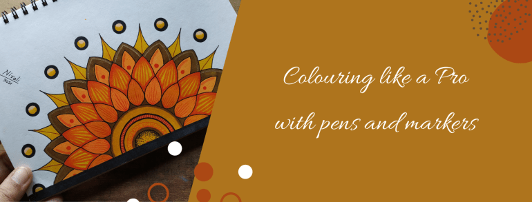
Two Artworks with the same sketch can look different only because of the colours, isn’t it? I have known people who cannot draw or paint that well but can colour amazingly well. In fact, their colouring is so good that they can turn it into a profession. Then how come nobody teaches us how to colour or why don’t we give much importance to it? “What is there to learn in that?” they say. I would say colouring is also an Art.
Everything from selecting the colours to the finished look has little things to understand. Once we know these, anyone can colour like a pro! Nowadays colouring is a popular hobby among both children and adults likewise. Art material brands offer free colouring pages. We can also download colouring apps or we can buy colouring pages online.
The drawing in colouring books have larger blocks to colour for younger kids and then as we progress to higher age groups, they have more intricate designs with small blocks to colour. Printed colouring books for children and adults are available at all book shops. It is a great activity for creative minds to do while waiting or travelling.
I have already done an elaborate post on selecting pens and markers before. In this post, I will share tips and tricks on colouring with them. Even today I try and learn new ways or designs to make my work better and faster.
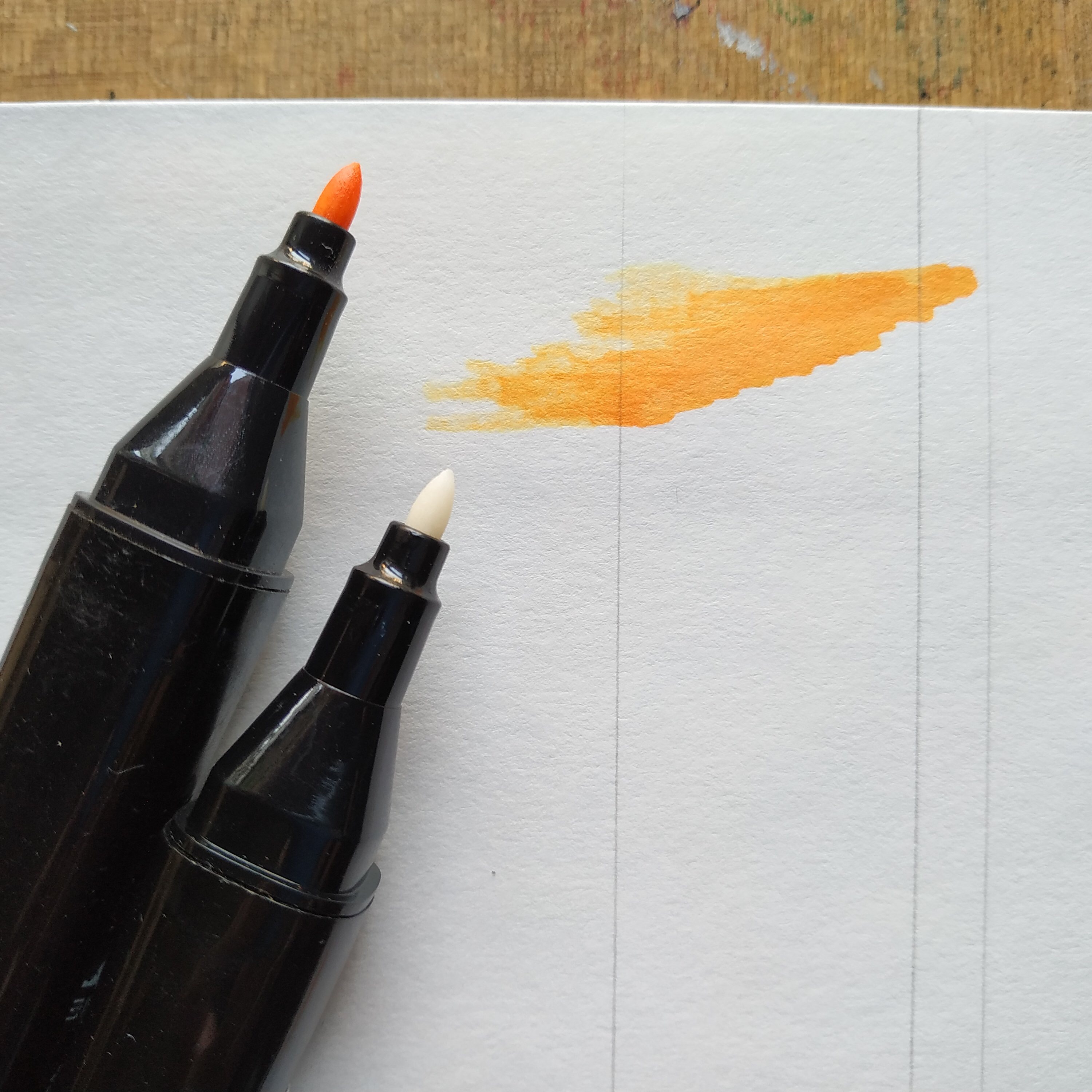
I have worked with pens and markers by almost all popular brands. Professionals prefer using alcohol-based markers for their art and illustrations because of the finish. This includes 1) artists making greeting cards and stamping 2) illustrators making fashion illustrations 3) architects and interior designers making drawings 4) cartoonists, caricature artists, character designers and manga artists.
Watercolour artists use watercolour pens and markers for creating those effects in colouring. I like using oil-based markers for metallic colours. I also use permanent waterproof ink or archival ink pens for outlining, drawing patterns and for all my ink illustrations.
Beginners could buy a set of watercolour markers and waterproof ink pens to begin with. Then as the interest develops, it is a good idea to invest in alcohol-based markers and metallic markers. We also get acrylic markers or paint markers to draw on objects.
Explaining how to hold different Markers and Pens
It is always a good idea to test the markers before buying. See the finish after drying and check if they come on to the other side of the page. If they do then we need to use a different paper for it. I have faced this problem with colouring books that don’t use good quality thick paper. Markers work differently on papers of different textures and thickness.
Look the alcohol marker ink came onto the other side.
Whenever we use alcohol-based markers we need to place a paper or protector below our paper to avoid colouring unwanted things. I mean the drawing board or the table or surface. Watercolour markers can be washed off from surfaces but not the others. Hence washable markers are best for kids.
Here are some methods or techniques for colouring. You could have a different style as long as it suits the kind of finish you wish to achieve.
Outline in permanent ink
Colour in the direction of object
Starting to colour
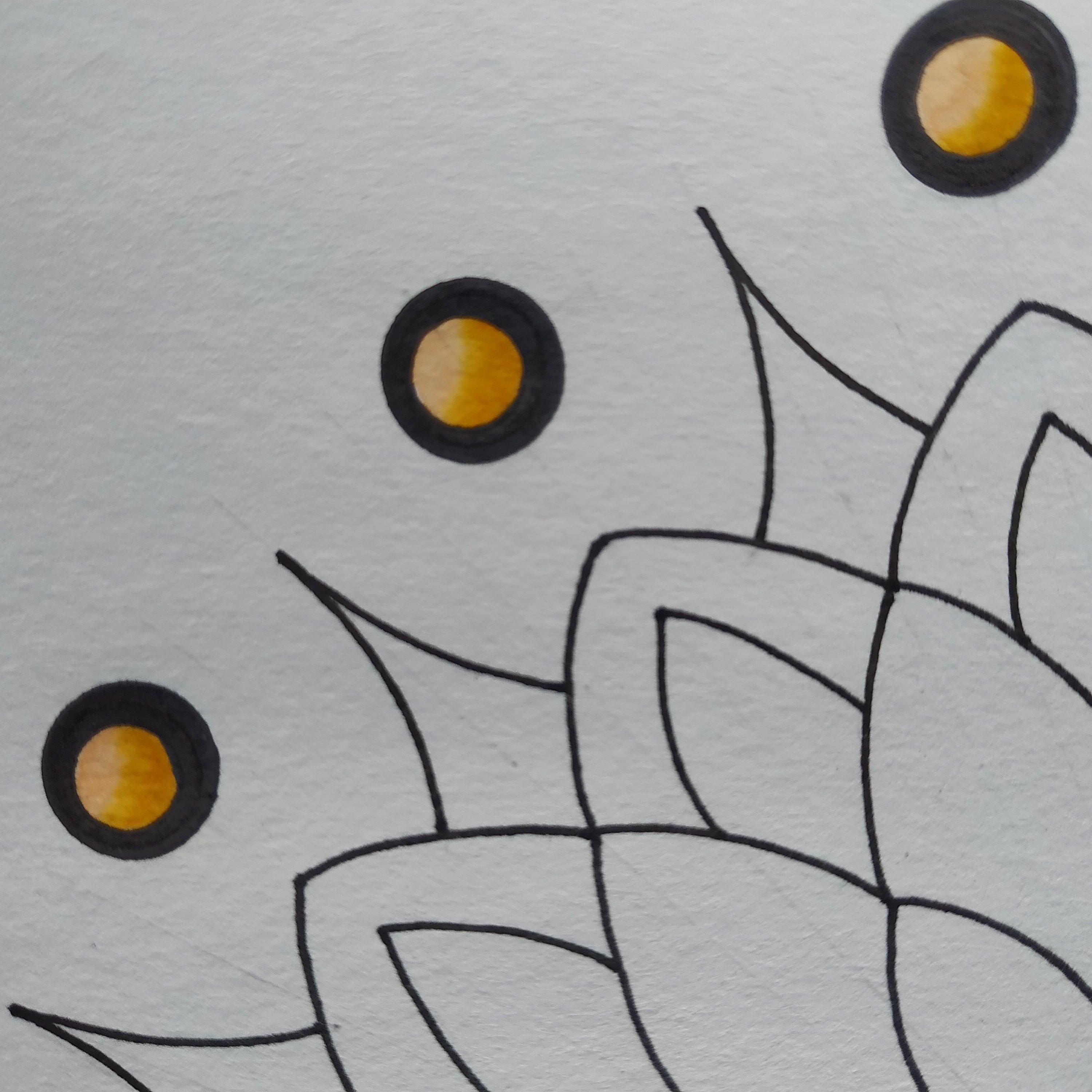
Solid Colour – Colour in a single direction and use the pointed tip to fill the corners that may have been left out. Do not keep colouring the same place over and over. There will be colour blocking when the ink is wet. However once it dries, the colour automatically evens out in the case of most markers. When colouring larger blocks use the accented tip or the brush tip. If we use the round tip it will create a self texture in the fill; meaning we won’t get an even colour in the fill. Once again please note the direction is important or colour in tiny circles.
Highlights – Leave out the portion of the highlights. Do not colour it. The part where the light falls maximum is called highlight. It is a good idea to leave out a larger portion if you are not sure. The area can be coloured later. The white ink doesn’t work well to give highlights because the colour somehow shows through it. It isn’t even.
Blending Two Colours – Can we do shading with markers? Yes of course. Doesn’t matter which marker it is, watercolour and alcohol-based markers both can be used for shading. I recommend applying the light colour first and then the dark colour, so that just in case some of the colour comes on to the tip of the marker then a light colour marker may get spoilt. Many artists colour dark to light also but that is mostly with alcohol-based markers.
Single Colour Shading – The pressure applied is important here. We get colourless blenders for blending the colour. It is also a marker but the ink is colourless. Apply pressure and then lift the pen to create strokes for shading in single colour.
Darkening a Colour – If you apply another coat of the colour when the colour is wet, it will blend. So to create a dark line or make the same shade darker apply another coat after a few minutes. It will blend with the previous colour but will be darker. This works only for alcohol-based markers. For watercolour markers once dry the colour doesn’t blend. The green dot above has the dark colour done like that.
Creating Textures and Patterns – When we apply a stroke of two different colours next to each other, they blend. We can use these alternately and create fill textures. When we want the lines to stand out or want to create patterns without the colour blending. We can use a permanent ink marker before or after using the watercolour or alcohol-based marker. I use permanent ink pens for outlines during finish as well as my base sketch.
Colour Palettes – It is always better to think about the colour combinations beforehand. We get a lot of shades in the markers. Colour mixing isn’t possible. The paper can tear with excessive scribbling. This art has the yellow, orange, brown colour combination. Buying large boxes of markers is expensive, especially the professional or artist pens.
Selecting the right colour combination can make a huge difference to your artwork. If possible do a little research on the most popular colour palettes or international colour palettes frequently used before buying the markers. I recently bought a box of markers with the basic colours and then bought individual pens for the extra shades that I needed. It worked out to be cheaper than buying the larger box with colour shades that I didn’t need or wouldn’t use.
The colour combination in the artwork by artists of a particular region is influenced by the colours of their local surroundings. Further every colour conveys a meaning and emotion. For example, the colour red is considered auspicious in some cultures and it conveys love or anger as an emotion. I have done a post on understanding colours before this. You may want to take a look at it.
A close up of the artwork I recently did with watercolour brush pens
I normally draw my own sketches but you could print the colouring pages at home or with a printing service. Most of the large stores have a printing service. Do share your colouring experience with us. Have an Arty Week!
“My son draws well. Look! At five he can draw so well. I couldn’t even draw a circle at his age. Do you think I should encourage him to take up Drawing? Enrolling in classes isn’t happening any time soon. But I don’t want him to waste this time either. What should I do?”
This is a common query I received, more so in the last year. There is a possibility that the parent was not all that good at Art but the child is blessed and talented in Art. With home schooling ‘Art or Drawing’ as a subject is often neglected. The concentration is more on the other book and score subjects. But if your child is good at Art, how can you help him sharpen his skills? Even if you are not very good at it yourself!
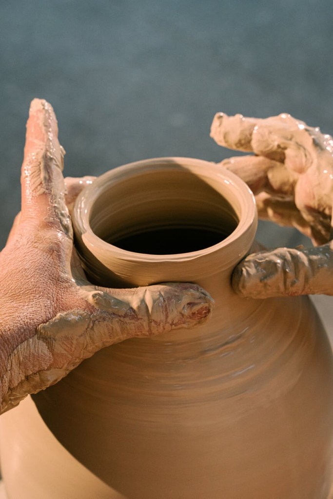
Shaping the earthen Pot
Have you seen a potter make his earthen pots? He shapes them, bakes them and once it’s dry : the shape is fixed, it’s strong and sturdy. It is the same with any sort of training. Same with Art too! We have to ‘train the hand.’ A child’s hand at Art is exactly like that soft mud of the earthen pots that can be shaped. It then becomes important to shape it correctly. Otherwise the pot might not turn out they way you wanted it to, even if the mud was suitable and perfect for making pots. I hope you get the point. Once we learn to draw using instruments we cannot unlearn and draw without them. Most Art schools do not allow the use of scale or rulers or any instruments for that matter.
The most easy access these days is video tutorials on Art. I like them, some of them are really good. My only issue is the foundation. Online tutorials are good for additional inputs or bettering something you already know. On the other hand if you were to learn something you don’t know anything about, I’m afraid the online videos would mean learning in a haphazard manner. Skipping steps and jumping because this system of learning is about convenience and many times they don’t show all the steps.
Besides when we do something by ourselves : we do more of the stuff we like over and over again while we leave out the parts we find difficult. No! Please don’t mistake that as practice. Practice is doing anything we are learning again and again to be better at it.
If you have a good foundation and learn the basics, then learning from anywhere including video tutorials will be very quick and easy. For my calligraphy class we practiced lines and curves for a month, till I got them right. My teacher taught me how to hold the pencil while drawing by actually clasping my fingers and making me do those lines again and again for months until I could draw them fluently.
That comes naturally to me now, like it’s a part of my movement. Just like the hardened earthen pot. My hand has taken shape. No doubt it takes time and practice. And every teacher has a different method of teaching. In this post I am trying to tell you what these foundation materials are. So when your child learns to draw you can make sure they begin from step 1 and build a strong foundation. These things can be taught only in person, so it puts the onus on the parent.
It may be boring but when a drawing teacher makes the child draw lines and shapes for the first few classes, don’t be in a hurry for them to begin drawing actual meaningful stuff. It’s like running even before your learn to walk. First learn to stand, then walk and then run. In the same way draw lines, curves, shapes neatly in clear strokes. In future for anything we draw we first draw rough lines and curves and then the final shape.
Pro Tip here: Use a 2B pencil slightly blunt to draw. Use a regular pencil and not the pen-pencil or changing points fancy pencil as your first drawing pencil. Even if you use them select a 2B lead. HB lead is for writing dark and legible- not for drawing. Strokes drawn with a 2B pencil are light and can be erased easily.
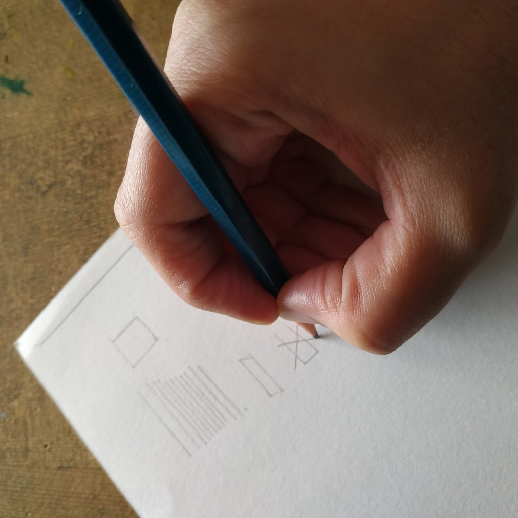
Pic 1 : Holding the Pencil and Drawing linesPic 2: This is to write. Wrong way to hold for Drawing
Consciously make a note and see how you hold the pencil when you draw. Holding it like shown in the second picture will give hard dark lines that are difficult to erase and restrict movement for large strokes. Try it! While in the first one you will be able to move the pencil freely, drawing long lines in a single stroke without lifting the pencil. We can also see what we are drawing. Can draw by lightly touching the paper and strokes can be erased without leaving any marks.
Pic 3: Drawing different Shapes
Practice drawing different shapes. Here in one of the pictures I have drawn the axis and then the circle showing a glimpse of how we use reference lines for drawing. Next to that is circles directly drawn. The axis have to be straight because the rest of the drawing depends on it. Further most drawings are combinations of basic shapes. Practising these ensures training the hand for free movements to draw.
Pic 4 : Drawing a straight line with help of edge
I am holding the pencil differently to draw this border without the use of a scale. It measures to about half inch border on all sides. I take the help of my drawing board or book edge to lock my fingers and steadily draw a line parallel to it. Warning!! Please be careful the edge of a new paper is sharp enough to cut your hand. Try this only under supervision of an expert.
This is about drawing lines without using a ruler or a scale. Below I am showing ‘How to measure and draw symmetrical drawings without using a ruler or scale’ or any other measuring instrument.
Pic 5 : Drawing Symmetrical Objects
I am using the drawing pencil to measure and make markings to draw a symmetrical object. Here one half side is drawn and I have to match the other side to complete the object. Following the steps :-
Half side is drawn and I have made axis at major turning points.
Measuring the distance of the intersection point on drawn side with the pencil.
Making the same intersection markings on the other side.
See all the marked points. Can make points for the length and width as required.
Join all the points to match the drawn half.
Erase or add markings and corrections till they look visually same.
This method of measuring is also used while drawing live in person. That is when the subject you are drawing is in front on you. When we draw from a picture we make a similar grid and then match points to draw alike. They say the measuring tools are in the eyes of the artist. However not everyone is so good at it and so these other methods can be helpful.
Drawing this vase also demonstrates how we use lines and curves while drawing. These are basics and the foundation to drawing. Once you learn to draw like this, I am sure you will be able to draw most of the things. Have an Arty Weekend!
Looking for some Art to up the aesthetic appeal of your space? You did a search and found something that you just couldn’t take your eyes off. “It is so me! I think it will look fantastic on that wall in our room. Just what we needed!” Ta-da! Bought!
Now comes the difficult part – selecting a Frame that goes with it. The task isn’t as difficult as it seems but many people find it stressful to make up their minds while selecting a Frame. A lot of questions and confusion. Have I made the right choice? What if I had selected another Frame? Matt or not? Vintage or Classic? Metal or Wood? After all, the Frame can make such a big difference to the final look.
Shipping Framed Art can be difficult which is why most Artists sell their Art unframed. I am an Artist and I also sell most of my Art unframed. I do upload Framing ideas on my social media accounts regularly so as to assist potential buyers. Framing is an additional service that I provide to close friends & family as well as local buyers upon request. At online shops, my Artwork is shown with and without Frames so the onlooker can imagine how it would look once it is framed. I usually show Frames that are common and easily available or standard market Frames.
With the advent of 3D and AR (Artificial Reality) a cool new feature will soon be available – We can scan our wall or space using the camera in our phone and the software will project and show us how the Art will look framed on our wall, like on that wall in your house, like what if you bought it and put it there how would it look? All this in real-time before buying. Although it seemed unbelievable at first, this feature is currently in the beta testing phase and very much implementable.
Art is to everyone’s taste and choice. It isn’t a one shoe fits all formula. Some may like a minimal wall with just one big Art while others may want many Frames filling up the whole wall end to end. I totally agree ‘Beauty lies in the eyes of the beholder’. I am not an expert at Framing but I can definitely share whatever I have known or learnt so far about ‘Making an Art Wall and Framing your Art’.
These are basically ideas and suggestions that would help anyone make a simple ‘you cannot go wrong with this’ kind of choice. It works best for people who wish to decorate their spaces with Art but on a budget. Yup! Definitely recommend expert help from a professional if it suits you. Even then this information will help. When the Frame maker asks you questions to understand your requirements, you would know what exactly is he talking about. So here’s answering some of the questions I usually come across about selecting Frames and putting up Art on the wall.
1. Edges of the Art – A minimum of half inches on all the sides gets enveloped into the frame. Even in a plain classic thin black or white frame without matting the edges get hidden into the portion of the frame. An artist paints these edges knowing well that it will get covered up or may leave a white border edge for it.
Two Artworks – One painted to the end and other with white border left out. Thick white panel is the Matt Board.
If the Art doesn’t have a blank border and you don’t want to cover up the edges then select a Floating Frame or a Sandwich Glass Frame. In a floating frame the Art is put above the matt making it look like it is floating, while in a double wall glass frame the Art is sandwiched between two glass panels. Only the glass touches the frame and the Art looks floating. See the picture below.
A double wall glass frame giving a floating effect.
2. What is Matt – A Matt or a Mat or a Mount is an additional border around the Art cut from a sheet of paper or board. Although it has a decorative purpose, it is more to preserve the Art by avoiding direct contact between the Art and the edges of the frame and glass. They recommend using an acid free material for it. A window for the Art is cut out. We can have any colour mat. Black, white and off – white are standard colours.
Frames that are available at shops include a mat or we can make one from paper sheets available in the market too. A mat is preferred for photos, prints and Art on paper that is otherwise small. The matt makes the frame look bigger while keeping the focus on the Art. Art Galleries and Museums have Artwork with matts.
There are double matt frames too. It means the Art encased in the first matt and then another matt and finally the frame. Looks like multiple frames inside each other. Ready Frames in the market will have only a single matt option.
Half inch Black Frame with One inch Matt on all sides
3. Size of the Art – How big is the wall? What is the size of the Art? Take a scale (ruler) and approximately measure the size of the Art that you will be putting up. How much space you want to cover or leave out? In case you are going to put up multiple Frames then space them out well. How many of them are landscapes and how many portraits? Visualise!
Placing a paper of the same size as the Art on the wall to visualise the Framed Art can help map the space for a beginner. Any Frame adds to the size of the Art and if you get a frame done with matting, it adds even more. The chances of a miscalculation in the size can be reduced if we understand this.
Explaining it with the help of an example : Let’s take an art on paper that has a finished size : 8 inches width and 10 inches height. We find a Frame of 11 x 14 inches. So for the 3 inches in width and 4 inches in height we can add a matt OR we add 3 inches equally and get a custom Frame of size 11 x 13 inches.
All the frames have same size plain black simple classic Frame. No Matt.
Even without the matt, it would be about 8.5 x 11 inches. The Frame moulding would add about an inch or more depending on its design, bevel and thickness. Always check the finished size written in the info when buying a standard market Frame. As for custom framing, you can control this better. This applies for all paintings on canvas or on paper, photos and prints that you can Frame.
It makes complete sense in buying the Art first and then selecting a suitable Frame. Also always calculate an approximate finished size on the wall before clicking the purchase button. We may not be able to make an exact calculation but the nearest can be rounded off to the next number on the higher side to avoid any bloopers.
4. Matching the Canvas with Frames – A board canvas needs to have a frame. With glass or without is ok, but a moulding around defines the Art. Paintings with acrylic paint can be used as wall mounting Frames. In this case the wooden frame in the stretched canvas is itself the final frame and it can be hanged on the wall directly. In case you wish to frame such a canvas you would need a Box Frame because this canvas is 1 or 1.5 inches thick like a box. For a canvas we have to consider the thickness also. The glass must not touch the canvas. A regular Frame wouldn’t fit so we would have to opt for custom framing. That is why wall mounting canvas frames are popular.
Ready standard size Frames work best for prints, art and photos on paper. They have a chart with common sizes for photos and A4 or maximum A3 size. Frames for Art larger than that may be difficult to source. The cost of framing an oil painting is the highest. It is high maintenance and must be done by a professional so that it is airtight and avoids contact with the glass. Even if it is custom framed, it needs a very experienced Frame maker or the Art can get spoilt.
5. Glass or Acrylic – Here they don’t mean the Acrylic paint. They are asking if we want the transparent panel in the frame that is made of glass or acrylic material. Acrylic is lighter in weight. It is cheaper too. A glass Frame will always cost more. The advantage with glass is that it doesn’t develop scratches. Acrylic does not break or chip off easily. Most over the counter Frames that are available for prices as low as a few dollars have acrylic panels.
Art Wall : All of them have a Matt and different Frames.
6. Material and Type of the frame – It can be metal, wood or plastic? Vintage or Classic? Thin or thick? This selection is based more on the look and the cost. Only thing to remember is that the Frame shouldn’t be more than the Art itself. We want to Frame the Art to preserve it longer and be able to hang it on the wall. Other than that the Frame should add to the decorative factor of the Art and not the other way around. A simple suggestion would be to consider the other factors of the space. Some frames may look too heavy or cheap and not in sync with the other things around. A simple elegant black or white Frame with or without a matt or a nice wooden Frame in dark or light brown polish that matches the rest of the room works very well.
7. Changeable – Frames where we can remove and change the inserted Art by opening them are changeable frames. If you don’t want to go through the hassle of getting a Frame and putting a nail each time, this is also a good option. Also when you want the same Frame for all the Art on that wall, one would opt for a changeable Frame. In future when you buy new Art you can use the same Frame and all of them match each other. This is because if we buy Frames over a period of time then there are chances that all will not be the same. Besides it is a one time investment. In this case the frames should be more sturdy and of good quality to last for years.
Changeable Glass Frame made of Plastic.
8. Hooks to hang the frame – Don’t miss this out when selecting your frame. Some Frames have movable hooks, some have a single hook, some double and the distance between these hooks matter. The hook may be small or fitted to the same level as the frame or could be coming out a level higher. These things we can’t determine while looking at the Frame in pictures. Only when we actually go to put the Frame up on the wall we realise that the Frame doesn’t sit well in place and it is because of the hook.
That was the hook on the Frame and now to put it up on the wall, we have to put a suitable nail. Now a days we get adhesive hooks that stick to the wall. No need to put nails that damage the wall. Works best if you don’t want to put a nail in the wall but select these as per the weight of the Frame. The options are vacuum hooks, velcro hooks and hooks with tape or adhesive. They will not damage the wall and no need to drill either. They are called ‘no nail or no damage hooks’.
Photo Wall with different sized Frames on a printed Wallpaper background
9. Selecting the Wall – What I have learnt is that the Wall stands out when it’s made into an Art Wall. Basically when you want to highlight a particular wall or want a wall to grab attention in a room, it is the wall to select and make an Art Wall. Single large Framed Artworks on a single colour painted wall work best for abstract or modern Art. These look beautiful on wall mounted canvas without any frame or glass.
A small cluster of about two or three same sized Frames on a wall gives a classy contemporary look. The only big no-no here is having Frames on all the walls in a single room. That makes it look like a library or a museum or an Art gallery. The walls of staircases and passages are good for memory walls or photo walls. A little light that illuminates the Art is better than a dark space. Then again it is more to your taste.
10. Wallpaper and Decals : Often used for a photo wall. For a nursery or a commercial space it would be a good idea to have Framed prints or posters and decals around. Decals are vinyl stickers that we can stick on the wall. They are available in many designs. Having a nice background with a printed wall paper and Art frames on it also look good for some Art. Mixing these along with Art give a very different new look. It isn’t the traditional style and may not appeal to some.
I hope this clears most of the doubts on Framing and creating an Art Wall. If you have time, please visit my Pinterest account. I have an album for ideas on creating an Art Wall. Have an Arty Weekend!
Photo Credits: Pictures that I have clicked have my name and the others are from the WordPress Library.
Most of the people I know buy brushes that are labelled as watercolour brushes and art paper that is mentioned as suitable for watercolour at the store and they are sorted. “Look! the company says I can use them for watercolour painting, so I bought them.”
They bought it either because someone told them, they saw someone using it or the brand company had written so on the product. Very few people bother to find out the product details and know if it is the right product for their use. Many a times we don’t want to stock different materials for different Art and so we use the same brush or paper for all. The selecting pattern is same for them and so I grouped canvas and paper with paintbrushes.
For beginners it really won’t matter; however artists and professionals will be equally choosy or selective about these materials. It makes a difference in their work and once we are used to a particular one, we only use that. Most artists start off with the trial and error method and once they like a particular brand or product, they stick to it.
Different kinds of brushes, what they are called and their suggested uses are printed on packs. As always a lot of information is available on the Internet. So I will not get into repeating that printed knowledge.
We have discussed ‘Selecting Art Materials’ in our previous posts. On the same lines I will share about selecting paintbrushes, art paper and canvas in this post. I do not endorse any brand and this is not an advertising or promoting post. I share about my understanding of these materials so that it helps others make an informed purchase decision.
Selecting a Canvas
Canvas
Any surface we paint on is called the canvas. So if we are painting on fabric or wood or paper, all of them are actually our canvas. However when we go to an Art store and ask for a Canvas we usually get this fabric like drape wrapped on a board called BOARD Canvas, a stretched drape pinned to a wooden panel frame called STRETCHED Canvas and a ROLLED Canvas which is a roll of the drape. All three have the same material, only the mounting is different. Once the painting is complete we have to get it framed before hanging the painting on the wall.
The board canvas is a hard and flat painting surface, the stretched canvas is mounted on a frame and has a slightly bouncy feel while the roll canvas more floppy like a loose fabric. A stretched canvas can be directly hanged on the wall using the existing wooden frame. Hence it is also called wall mounting canvas. A canvas sheet that is cut from the roll will have to be stretched or mounted before painting.
Canvas was traditionally used more for oil painting. Earlier when I learnt mural painting we would have to apply oil and colour to prime the canvas. Now a days canvases are already coated and primed. Cotton is the main fibre of a canvas. Did you know? We also get paper sheets made from cotton linen pulp which are used as canvas for oil painting and acrylic painting. They are like a sheet cut from roll canvas: have the same texture and feel but are relatively sturdy and stiff like paper.
All of them will be acid free and primed and have some treatment or coating for protection against pests. It really won’t matter which one you buy, almost similar. Only the tension of your canvas will differ. That would be the basis of your selection. If you are using them for acrylic painting a canvas primed with gesso works well. You can use others too. If you are into oil painting you may be more selective while choosing the canvas.
Not all art supply stores stock all sizes of canvas. It is a good idea to buy the quantity together if your project uses multiple canvases. In case the size you need is not market ready, you can buy the roll canvas and get it custom made or mounted to your required size. Canvas is also used for Art prints. Digital prints of artwork is quite common. Flex banners are also a type of canvas.
Selecting Art Paper
Art Paper
We get sheets of art paper in bundles as well as bound in books. Books have perforated sheets which can be pulled out. Smaller sizes such as A4 and A5 sketchbooks are very popular and will be easily available everywhere. Art Paper is used for all mediums including pen drawing, pencil shading, acrylic painting, pastels painting, charcoal sketches, watercolour painting and oil painting.
In the info section they print the size in inches and cm. They print the thickness in ‘GSM’ or lbs. GSM stands for grams per square metre that is the weight of the paper or pulp for every square meter. It is how the thickness is measured. How does that make a difference? The thickness of the paper is an important attribute because for watercolour painting we need thicker sheets like 250-300GSM that will absorb water but will not tear while for ink art we can work with 120-180GSM.
Next we look for textured or plain. The grains on the surface. Depends on the artwork one is working on, whether they want a textured feel (a rough surface) or a plain background. For pastels and charcoals a little grain or texture is required. It helps hold the powder while for ink and watercolour art a smooth or plain surface can be selected. This gives a plain edge or a straight neat line finish while painting.
Artists usually use ‘acid free’ meaning paper that has been neutralised. In simple words if the paper is acid free it will not turn yellow with pitting and can be preserved longer. Paper made from cotton will have more absorbency for water based painting. It can be 100% cotton or mixed with other natural fibres like cellulose. I select the ones with 20-30% cotton for my artworks.
Selecting Paint Brushes
Paintbrushes
Selecting paintbrushes is very simple. Each of them are built as such for a purpose or for a particular style of painting. It may sound weird but some artists manage to get fine lines with a thick brush of size 8 and a thick like with a brush of size 4. With years of practice we don’t change brushes for each size. So buying them in odd numbers like 0,2,6,8,10 is enough. For finer lines and intricate work I use finer brushes of size 0, double zero 00 and triple zero 000. These are smaller or finer than zero size brushes.
For painting on a canvas on the easel we require long handle brushes. Regular size handles are good when we are working on paper. Further we would need a mix of round and flat brushes in our art tool box. Flat brushes are used to paint backgrounds, round brushes for fills and riggers for fine lines. Filbert brushes are useful for one stroke painting or creating visible strokes and design. I even use the back of the brush handles as round stumps for dot painting.
Brushes can be made from natural animal hair or synthetic fibres. Use brushes with soft thin bristles when you want the colour to be applied evenly. It gives a smooth neat finish. Thick bristles cause an uneven finish with lumps of colour which can be left as it is or smoothened by using a roll over it. Bristles of brushes made from natural hair expand when soaked. They are best suited for oil painting. For painting using acrylic and watercolour paints we can use brushes made with natural or synthetic bristles. Watercolour and Acrylic, both being water based paints we can use a common set of brushes. No need to keep another set.
One special kind of brush is the water tank brush. This brush has a plastic body with a water tank attached to it and bristles of the brush are synthetic fibres. When we press the tank, the water drips to the brush tip and soaks the bristles. It works very well for quick sketches and on the go painting using watercolour cakes.
Just bought new Paint Brushes
I was surfing the Internet the other day when I came across a video titled ‘How it’s made – Paint Brushes?’ ‘How it’s made’ is a very popular show and I like watching it. They show how various products of our daily items are made. Helps us understand about the products, their usability and the thought process of the maker in creating it.
I understood which problem faced by artists are they trying to solve by offering a particular type of brush or why it is made the way it is. Every product is manufactured keeping in mind a certain use. Similarly they also have videos on ‘How it’s made’ for canvas, paper and many more products. If possible do take out some time and see them.
Selecting Art Materials
Links to posts related to this topic are listed below. Click on the title to open the post in a new tab. Have an Arty Weekend!
If there was something like a ‘People’s Choice Award’ or an Award for the ‘Most Popular Paint’, I am sure it would go to Acrylic Paints. While the others are more natural dyes and colours, Acrylic Paint is synthetic and man made. It is easily available at stores selling Art Supplies as well as all Paint and Stationery Shops.
Poppy Flowers – An Acrylic Painting that I have done
Acrylic Paints vs. Oil Paints
Oil Paints take 7-10 days to dry completely. It is this quality of oil paint that helps in mixing colours and blending them. Any artist who has worked with oil paints will agree, it is this property that really helps in making those realistic paintings.
Oil paints have one major drawback ; by any chance if any little traces of water get trapped between the colours because of humidity then the painting develops moss. Refurbishing, Repairing or Repainting- nothing works.
Indian Mural Style Oil Painting. The ornaments are modelled from clay
When beginning a new oil painting, the canvas needs to be seasoned (sizing) to absorb oil. The more oil it absorbs the better finish. Whereas for Acrylic Paints we only need to use ‘Gesso’ to prime the base. Gesso is like a paint which when applied to any kind of surface prepares it for the paint to be applied. Last but not the least having a glass frame and making the frame airtight ensures that the Oil Painting stays well for longer. Acrylic does not have any such requirement.
Brushes and Palettes can be cleaned with water. If we get some paint on our hands or any surface while painting, it can be easily cleaned with water or removed with acetone. It usually petals off like a plastic coating. We all know that is not the case with oil paints. We need to keep a separate set of brushes for Oil Painting which cannot be used for anything else. On the other hand it is possible to have a common set of brushes for Watercolour and Acrylic Painting since both are water based paints.
Acrylic Paints vs. Watercolour Paints
It is possible to achieve a Watercolour like finish using Acrylic paints. We can mix the colour with different mediums such as Gel, Gloss, Matt, Pearl and so on to get different effects. We can create textures and even achieve the level transparency we want in the colours of the painting with Acrylic Paints.
This image is created from stock photos for explanation
Watercolour is basically for Painting on paper. Even after a painted layer dries, water can be used to mix or blend both colours. Water can be applied on the paper and then colour drops can be added, giving this grains effect. This painting method is suitable to Watercolours. So most artists specialising in Watercolour Painting will not want to use Acrylic Paints. Watercolours are also easy to work with, portable and can be carried along. The cake form is very compact and portable. Mixing of colours to get your shade is easily workable.
I use a mix of Watercolour and Acrylic Paints for my paintings listed on the shop for sale. You may visit my Etsy Shop or Social Media pages to see those.
Here are some of the reasons I think this Acrylic Paint is preferred equally for both Arts and Crafts :-
1) It has a unique property. It is soluble in water and hence diluted with water to paint. However once the paint dries the polymers bond to give a water-resistant painted surface.
2) Acrylic Paints can be used to paint on multiple surfaces including Canvas, Paper, Wood, Glass, Walls, Ceramic and Fabric. I have personally tried them on all of these. We need to seal the completed work with varnish and we are good to go.
Recycled this old plastic container by repainting with Acrylic Paints
3) We can select the consistency of the paint. The Acrylic Paints that are available in Tubes have a slightly thicker consistency as compared to those available in bottles. The ones in the bottles are liquid like pouring consistency. Both are Acrylic Paints and can be used together on all the projects. The pouring consistency colours work well for projects like Dot Painting and Fluid Art.
Roll up brush case I made from my old jeans. Dot painting with Acrylic Paints
4) These paints are available in smaller tubes of size 9ml to larger tubes with 40ml to 120ml. Also available in bottles and larger cans. We even get Acrylic Sprays. Art and Craft Schools and Studios can stock large containers while people who do one off projects can buy the smaller ones. Further if we run out on a particular shade, we can buy just that single shade too!
I use Artist quality Acrylic Paints by the brand ‘Camel’ or ‘Camlin’ because of its easy availability and reasonable pricing locally.
5) Water Resistant surface makes it easy to combine it with other art materials such as permanent markers or watercolours. Acrylic colours can be used on watercolour painted surface but not the other way around because for watercolours to work, the paper needs to absorb the water. Acrylic paints make the paper impermeable. Acrylic paints can be used alongside or as highlight on watercolour painted surfaces.
6) Acrylic Paints are preferred for creating textures. An artist can achieve the effect he wants with the colours – solid thick, translucent or transparent finish, all by mixing different quantities of mediums and/or water. It is like painting in layers. The bottom layer dries completely and then we paint the next layer. We can even paint a white on a black without the previous layer smudging at all.
A closer look and method for Knife Painting with Acrylic Paints
The fast drying property and thick paint consistency make it suitable for Impasto or Knife Painting. By using these methods of painting artists can create a good variety of textures. We can use ‘retarders’ to slow the drying process and increase the working time for blending.
7) Almost anything can be painted with Acrylic Paints. These paints can be used for Painting on pots, Painting Clay, Canvas Painting, Painting on Paper, Painting on T-Shirts and Tote Bags, Pebble Art, Wall Murals, Painting on Glass and Mirrors, Painting on Tiles, Mixed Media and a lot more variety of Art and Craft Projects.
Mixed Media Acrylic Painting. Flowers are modelled from clay
8) These colours remain unaffected by humidity or extreme cold or heat conditions.
9) Framing is optional. Hence we have wall mounting canvases. To clean it simply take a dry brush and lightly dust of the dirt that may have settled on it and it will be clean.
Wall Mounted Canvas – Knife Painting using Acrylic Paints
10) Variety of Colours and Shades. Mixing colours might not be a good idea because it dries very fast. So buy them in the colours or shades needed. There will usually be a whole shelf dedicated to it. Any colour that we need can be bought anytime. We get neon shades and glow in the dark paints too!
The only drawback with Acrylic paint is that the colours will dry out if the water from the colour evaporates or if the bottle is left idle, so cap them well. Remove the colours in disposable containers in the required quantities instead of painting directly from bottles and leaving large containers without the lid for long hours of painting.
Acrylics are easy to work with. Rectifying a mistake is also easier when using Acrylics, so it works well for beginners as well as professionals. I really don’t know what more can they offer to make these paints better. Definitely worth buying a box and trying out some Art projects. I have shared some of the recent Projects that I have worked on using Acrylic Paints. All these are still with me and not for Sale. The paintings for sale on the shops are different. These are all from my personal collection.
Ever looked at your finished Art and thought something is missing. Somehow I am not completely happy with it. There could be something to improve but I just don’t know what? Further sometimes we don’t even know where to look, which part of it needs to be fine tuned. If we work on one portion, something else looks out of place. I know this feeling, it happens.
So do you know how to get it right? That is the question I am going to try and answer in this post. In this article when I say Artwork: it means Drawing, Painting and Sketching. And when I say object- it refers to whatever we are drawing, painting or sketching. I don’t have a checklist of any kind but I can definitely tell you the five ways to fine tune your Artwork in order to improve and make it better based on my learnings and experience.
These are also the observations we need to make when doing Art. If you observe these and are able to check them right, not only would you be good at Art but also find it easy to understand and learn different Art styles. This is more or less an exhaustive list. It does have sub topics or points. In a way it is also 5 mistakes to avoid while making Art.
It is like a grade meter, how much fine tuning is required for each of the parameters will have to be determined by you. That is because it is to your taste. Over a period of time with observation and experience you will be able to decide your own parameters for each of these. Perfection isn’t when all of it is present, it is when all of it is in the right quantities. So let’s begin listing them.
1. Shapes and Patterns
Everything has a main outer shape and maybe more smaller shapes. It is important to observe this. First we draw this main shape and then do the details. Consider it as rough work to your final answer. This also helps decide the placement for various objects in the Picture. You can also take them as a marking of the space each object can take on the canvas. It is important to place things evenly or rather correctly space them out on the canvas. Most people make the mistake of skipping this step and begin to draw directly.
Let’s consider drawing something like ‘My House’. If you are drawing this landscape, make the large main shapes of the tree, the fence, the house, the sun or sky, the human with his pet, the ground and so on. Then add the details. Erase the rough work. It is the correct method to draw.
Some videos on the Internet will show super awesome Artists who complete one particular corner of the art with full finished details while the rest of the canvas is blank. Wow! They are super humans but we are normal humans and this is how we draw. It is mostly a digitally edited video, very rarely can anyone draw like that. They need to get into the book of records for such exemplary skill if they really can. For the rest of the normal people this is the first step for drawing anything.
Everything in nature has a pattern. So for example when you draw a flower. Look for this main shape of a circle or an ellipse. See the pattern of the petals are they – above or below, in odd numbers or even. See the shape of the petals – pointed or round, long or circular. Further see the centre of the flower and look for a shape there. The pollens will have a pattern – are all of them in the same direction, how many turn right or left. These things we need to observe and then when we draw, we match it with our reference.
2. Proportions and Scale
Many people confuse these terms. So in another words it is the size and ratio of the objects drawn. So in your landscape a bird cannot look bigger than the tree, that is scale. Now how much space of the tree is the branches and how much the leaves – that is proportion. That is what we need to observe. How the object looks in context with the other objects in the picture and what are the proportions of its own parts. When drawing a human face you would note the proportion of the eyes to the eyebrows, the nose and lips. The scale would be the size of the actual face. They are connected and not used in isolation.
3. Perspectives and Backgrounds
Which angle or point are you looking at it from? Top or bottom, right or extreme right. The distance- up close or far away. The objects which are closer are detailed, while the objects farther away at a distance in the background may not have all the details. If you draw details of all the objects in a picture, it is like keeping everyone in the front row. It will look like everyone is shouting for attention. The focus is always on some objects in the front and less on those in the background. Artworks with backgrounds look complete.
Perspective adds depth. The third dimension or 3D. This makes the object look natural as against flat image. 3D means 3 axis – X axis, Y axis and Z axis. Length, width and depth or thickness. The most common example is if you draw a rectangle. Now try imagining this as a box, as that of the wall of a house or this wall Humpty is sitting on.
Your position while looking at the object determines how it is visible to you. For example four different people looking at a car from four different spots – the top, from the right, the left and the bottom will all draw it differently based on what they see. Correct? What your view is, is your perspective. This brings about a balance in the picture.
4. Light, Shadows and Highlights
In one picture there can be one source or two sources of light. Two when there is one natural source like the Sun and two when there is a light fitted or the created source. The light coming from any point does not fall equally on all the objects. The rays fall in a straight line and not in curves. So the whole picture has be in sync with it. The Shadow of an object is determined by the direction of the light and also falls straight. Depending on the position, the size of the shadow will change. There could be a situation where the shadow of one object also falls on another.
There is something called highlight – when a significant portion of the light falls at a spot and it almost looks white. We colour or shade from light to dark or dark to light and then add the shadows and highlights. This adds depth to the painting. Also observe how an object reflects the light. The texture and surface of the object determines that.
It really looks funny when all objects have different sources of light and random shadows. There has to be a flow in the picture.
5. Colours, Shades and Tones
Tones is Dark, medium and light. This is determined by the source of light in your picture. When you do an artwork in black and white it will still have these. The gradient is smooth and blending it is important. Where we want to show it as blocks, we make sure the edges are crisp. When we colour the objects, we can try as much as possible to match the exact colour to the real object. Mixing of colours to make various tints, tones and shades can be understood with the help of the colour wheel.
There should be a contrast between the dark, medium and light tones otherwise the image will look flat. Meaning how dark the colour looks against the medium tone colour. Whether the difference is significant or very little. Sometimes all you need to do is make the dark shade a bit darker. A pro tip here is not all colours can be made lighter by adding white or darker by adding black. When you observe an object see the dark colour, does it have traces of other shades. For example the dark colour could be brown with little of green and not always necessarily black.
These topics need to be studied in detail. The only way to understand these is to observe and try it out practically. Now that you have basic information about these, the next time you are drawing, sketching or painting look and observe these things in your Artwork. Whatever you are drawing – be it a portrait, a landscape, an object, nature or design. Check for these and mark the difference with your Art as against your reference. Your artwork will show significant improvements.
If possible, take an object like a flower or a vase or a pen or a bottle or a landscape picture, keep in it front of you and then read this article once again while observing these and mentally making a marking of each. Then begin to draw. It isn’t a one time exercise, you keep going back and forth. I am sure you will be pleased with the outcome. There is a possibility that after years of practice some artists can do a mental calculation of these. After all Art is about being able to imagine that object on your canvas, so that you can draw and paint it.
2021 is here! Wishing everyone a very Happy New Year! The celebrations have been simple and joyous. It was about spending time with family at home for most of us. All of us have been thrilled to bring in the new year filled with hope for a better tomorrow. New Year resolutions are not my thing. 2020 has been a difficult year but that doesn’t stop me from dreaming. They say if you want a different outcome then do something different today.
So how about this? Let’s make an Origami model of your dream, of what you see yourself as, of something you want! That model on your desk will keep telling you, you can do it! It will tell you to keep your focus. If it’s something you want to get rid of, make them and throw them away, let them fly away or vanish into mid air. This activity helps you get rid of the negative emotions and works on building the positive ones.
I want to be free like a bird in 2021. Somewhere our freedom has been curtailed because of the pandemic. Free to fly, free to meet people, free to eat wherever you want, free to roam about, free to breathe. These are some of my wishes. So I am going to make birds – ‘As free as a Bird’.
But why Origami? I could do this with anything else? True! Origami because all you need is a sheet of paper. It shows that something so common and simple can turn into just about anything you want – as long as you are really willing to! This exercise also helps generate new ideas for creativity and innovations. Just in case you haven’t heard of it yet, I’m talking about ORIGAMI – The Art Of Paper Folding.
Origami – Animals and Birds
We can create a model or a sculpture by folding a sheet of paper. Origami is a Japanese Art. Usually a traditional Art from Japan will have a given set of rules or instructions to be followed. Traditional Origami does not permit the use of glue or making any kind of cuts in the paper. Hence modified versions have also been adapted and are quiet popular. The methods and techniques of Origami have seen applications not only in the field of Arts and Crafts but also in other fields such as Medicine and Engineering.
Origami is for all. One can learn it at any age. Some popular Types of Origami include 1) Modular Origami or Unit Origami 2) Kirigami 3) Action Origami 4) Wet – Folding Origami
Japan is earthquake prone. Hence the materials used in their houses are light weight. We can notice a significant use of paper in their houses. Another observation I have made is about miniatures in Japan. Being a densely populated country, land is very expensive. This makes them use their space optimally as a resource. Japan always amazes me. Creating things, making the best of what we have and making a come back when you are knocked out – Japan aces it! I see it’s reflections in Origami too.
I wanted to convey that Origami isn’t just about building tiny or toy models. It is real and much more than that. I learnt traditional Origami when I was in the 7th Grade in School. I had books on Origami – a set of five volumes. I remember at one point of time I had made all of them. Folding Paper neat and precise, visualising something in a sheet of paper – builds concentration and imagination. And of course that feeling of ‘I made it’. One of the most fascinating things I have seen made with Origami is ‘Jewellery’.
Materials required are as simple as square sheets of Paper. Ready packets are available in the market at all stores that keep stationery. Books to guide you and inspire you are also easily available. So even if your country has some lockdown restrictions, this is one activity you can easily do at home. Not to mention all the other added benefits it would have such as make you smile and stress- free.
Souvenirs from the Paper Museum in Japan
The most popular design is ‘The Crane’. From animals to objects – there are so many things one can make. Did you know? Now there are apps that can show you some folds. There are websites that show you the popular designs for free. You must definitely try out a few!
This zeal for Origami attracted me to ‘Napkin Folding’. I think Napkin Folding is very similar to Origami. Only here we use a Napkin – a well starched cloth to fold. I was reverse engineering this design at a restaurant when the person in – charge of setting up the table noticed me. He said “would you like to learn that?” Surprised! I immediately said “Sure, why not!” He was kind enough to show me three four different folds. The rest I learnt from books.
So what are you waiting for? Let’s get started! Share the Origami models you make or about your experience creating them. Have an Arty Week!
In the Holiday mood, I am also going to take a break next week. Most people have already signed off till New Years. As a shop owners, we are busy making products, posting on social media, settling accounts, packing, shipping and making new and the cycle continues year round. That makes us use our phones for long hours at work. A little digital detox to spend time with yourself, family and nature can rejuvenate us.
My Desk! It’s Christmas 🎄
And we can come back in the New Year refreshed and charged up for another year ahead. Many people also use this time to upgrade their skills, read up on books they always wanted to. I started my Blog this year in September 2020. I have 17 Posts by now. The response to the Blog has been overwhelming. It’s been a good journey with your love, support and encouragement.
So I thought I would do this year in a review post. Helps me connect with the new followers too! Here is a list of the posts I have done on Arts and Crafts so far. You may click on the title to go to the post. All these are listed on my Blog page – ‘The Art Life’
How to select Art Material for Charcoal and Pastels Painting? Explaining the technical names along with their similarities and differences with other Pencils used in Art.
Dr. Wilona Annunciation, a practising Psychiatrist is our Guest Blogger this week. She shares her experience and thoughts on Mental Health and healing with Art – Art Therapy.
Sharing what I learnt when I studied the Copyright Law in simple language for everyone to understand. Tried to keep it to our daily language of conversation while introducing the main topics to read up on.
Learning this beautiful unique visual art related to writing. Answering your questions on Calligraphy- What is it? Where to start? What materials to buy? And more
Four Books I can recommend for Arts and Crafts Lovers. You may want to buy these and learn a new skill – Sewing, Candle Making, Gift Wrapping and Napkin Folding.
Learn about the Art of Paper Quilling and it’s world of infinite possibilities. A Step-by-Step tutorial to making two basic types of beads with explanations to the other varieties. We make a Christmas Tree Ornament using the crafting methods we learn.
My Story and experience with the Japanese Art of Paper Folding – Origami
So just in case you missed out on reading any of them, you still can. Please note the Blog page shows only the last 10posts and so to see the previous ones you may use the links above or scroll to previous posts.
If you like reading my posts and wish to continue our association, you may click follow or subscribe to the Blog. This will make the posts come to your Email Inbox and you may read them at your convenience.
Wishing everyone a Merry Christmas and a Happy New Year!
December Calendar with a Christmas Wreath that I created Digitally
This is an Instant Digital Download (JPEG) File that can be purchased at my Etsy Shop NMARTWORKS Picture Format opens with any Photo Editing Software. Once you pay, you can instantly download and use.
It’s an Art, a Visual Art but it looks like handwriting – Calligraphy. In simple words humans made markings with available tools as symbols. Later as characters and scripts developed they began to write using tools available to them. As our writing tools developed, the tools for Calligraphy also changed. Calligraphy is practiced in many countries. The tools they use, the writing styles and scripts differ. I find this art quite fascinating. This one is all about practice, practice and more practice.
I learnt the European Gothic Style of Calligraphy during my school days. Did it help me in any way? My handwriting was decently good and legible. My teacher insisted I use Ink Pens till 5th Grade, after which I was permitted to use ball point pens for writing my notes. I also used Ink Pens for Calligraphy. So it seemed like more fancy writing, just additional handwriting practice in the beginning. I could use it for my school projects. My mom insisted I use my fancy writing skills on Greeting Cards, Gift Tags and Envelopes exchanged on occasions. Gained some love and appreciation there!
Different Styles, Different Nib Sizes
Today, I don’t remember writing an entire page by hand in a long time. Fonts – Typography, Logos and Signatures – Lettering and Graphic Designing. Learning Calligraphy helped me here! I agree, we now use digital tools for these but the basic knowledge remains the same. It gave me finesse in holding the pen, the brush and now the digital pencil. The digital sensors correct the breaks in the strokes and make it look flawless. Even I prefer using the digital tools. I don’t think it is easy to compete against a computer opponent in this case. The computer would win! It has made Typography and Graphics much much simpler and faster. This makes a handmade version – handwritten Calligraphy by a Calligraphy Artist a rare find – unique and beautiful; just watching a Calligraphy Artist paint can be a visual treat by itself.
Now even schools are online, we don’t even use the pen for signatures. We are almost forgetting what it is like to hold a pen. Calligraphy is now mostly used to write names on wedding cards. Even for those we now use digital fonts and print them. So why should I learn it? If that is your argument, then I have to say “Learning this Art has helped me improve my creativity and artistic skills. I don’t think I could have done it any other way. I’m glad I learnt it.”
Brush Pens – Ruffed Brush Tip
Brush Calligraphy is quite popular. Brush Calligraphy and Modern Calligraphy are different. Calligraphy is mostly referred to when using a Pen to write, while you use the brush or brush tip pens to write in Brush Calligraphy. I don’t want to get into the terms and definitions but say that learning one will be different from learning the other. So try your hand at Traditional and Modern Calligraphy as well as Brush Calligraphy. You could be better at one than the other.
Where to start and how to learn this? What material would I require? Is it very expensive to pursue this Art? Do you teach? Wait! Wait! I shall try and answer all these questions. They say ‘Teaching is the best way to learn’. That is why I taught some of my close friends whatever I knew about Calligraphy. It was my first ever experience in teaching. It is always better if you can find someone to teach you this Art but if you cannot then the next best thing is to buy a Book. This Art is all about practising. A teacher would also need just one or two sessions – to show you how to hold the pen, how to make the strokes, show you one or two writing styles. The rest depends on your interest and practice. A book will do that and may be show you more writing styles to practice.
Calligraphy Art – My Desk
A Calligraphy Set would have one Ink Pen, changeable Nibs of different sizes and Ink Tubes. This is the smallest set. Larger sets with additional tools are also available. A ready set is most likely to include a book with at least one writing style. This will be a very basic one. Then you can download practice sheets available online. We used regular Ink Pens. We bought Calligraphy (4-6 different size) Nibs. See the loose nibs in the picture, I still have them. The Ink was permanent Blue or Black Ink (regular Ink Pot). We even got nib cutters to cut the nib. Unfortunately loose or only Calligraphy Nibs are not available anymore. So you could buy the most basic Calligraphy Set and a good book with different writing styles and practice sheets.
Wow! Why are these Ink Pens expensive? The nib of a Calligraphy Pen is accented. It gives a thin upstroke and a thick downstroke. For larger font size one needs a broader or larger nib size. To begin with nib sizes 1& 2 are good to write in regular handwriting books. The red blue ruled books we use when we learn handwriting are perfect to learn Calligraphy too. Then of course you would just need a single line ruled book or no lines as you progress. This part is similar to our handwriting practice books.
Calligraphy with Markers
We get sketch pens or markers with accented tips too. These are used for Calligraphy. The difference is the tip is much softer and so the pressure to be applied is different. The pressure applied to write with a writing instrument that has a metal tip, wooden tip or fibre tip will always be different. Similarly brushes are used for Brush Calligraphy. We get Brush tip markers too. It is cheaper to get markers and we can always use them for other Arts and Crafts. One of the reasons Brush Calligraphy is popular. If Calligraphy really interests you and you wish to take it to another level, you may want to invest in a Traditional Calligraphy Pen and perhaps get trained with a professional Calligraphy Artist.
One special tip here : All these pens will be labelled as Calligraphy Pens on their pack at the Art Store. So the onus is on us to select what we are looking for. We definitely don’t need all of them. Best to buy a book and then the Pens if that makes more sense. Choose the writing instrument you are most comfortable using.
The Ink, the Paper, the Writing Instrument and most importantly your Style of Writing. All of this matters in Calligraphy. Even if I write the same thing, with the same pen on a different paper or with different ink or by applying different pressure, the result will be different each time. Hence only with practice and experience an Artist will be able to create those amazing works.
All said and done. This amazing Art seems to be dying out and getting replaced with digital forms. It may be difficult to find a tutor but don’t give up. In the end it will all be worth it – an enriched learning experience. Have an Arty Weekend!
In early times, people did Art to decorate their homes and objects of everyday living. It could be an individual or a group of people collectively working on something. It was mainly Designs and Patterns that could be done by more and more people. Then we came to know of better ways and did more realistic Paintings that conveyed stories. Sculpting, Photography and now Digital Art ; there is always something new and trending. Art is a way of expression. People express their feelings and experiences. Arts and Culture influence each other to a great extent. It is like they are interwoven. Internet and Globalisation made it a boundary less world. This opened up infinite opportunities in Art as well. For a creative person it is like a vast ocean. There is always so much too learn and do. I like to read up, see, learn and better my skills everyday. We are truly blessed to be able to have easy access to so many resources now.
“To practice any art, no matter how well or badly is a way to make your soul grow. So do it” – Kurt Vonnegut
Art is my passion, it’s Life. Your reason could be different : a stress buster, a hobby, a way to be social, helping your child with art at school, being a professional artist or having a part time or full time career. However if you are serious about Art, it is always better to take up formalised training. You have the talent, that’s super. Now all you need is the wisdom. I see many people write ‘Self Taught’ in their bio. It’s great! But just imagine! if you are so good when you learnt only by looking, how awesome will you be if you have a mentor, a guide or a teacher formally teach you!
I would say it is like a Tree. I was born with a liking, aesthetic sense, creativity and a good hand for Art – that would be the seed. I have to water it everyday – that would be practice. I have to add manure, fertilisers or food – that is knowledge. What I gain from this journey or growth over the years is wisdom. That makes me a full grown Tree. Don’t be in a hurry to monetise your work. Learn whatever you can, try your hand at different Art Styles. My friend told me ‘My daughter is really good at doing a flower, she keeps doing it.’ I think that’s absolutely ok but at least try the other things. How do you know if this is your best work or if you can do better unless you try?
By all means make as many mistakes as you can in the learning phase. You know what they say right ‘I didn’t make a mistake, I learnt a 100ways it could go wrong.’ It is True. Besides, being an Artist is also about letting go of the fear of being wrong. For an Artist, what makes him or her different from another Artist is himself. It is difficult to separate an Artist from his work. I could put it as ‘that one special move that you are so good at, makes your work different from the others’. That is why I feel if you are serious about Art, you would invest in yourself.
My artworks during school days
Most Art Schools and Universities have a system of grading and examinations. The format is similar for most Art Institutes. Knowing this early on can help prepare for the way ahead. Broadly these are five subjects. We can’t be selective and be very good at just one of them. Need to be relatively good at all of them. The subjects are:-
1) Nature Drawing – Drawing and Painting Flowers or Nature. They give flowers in the exams because they have to give something easily available, as there to so many students. It is about actually seeing these flowers in real and painting them. Use Watercolour. The more realistic it is with shadows and highlights, the more points you can score.
Preparing for the Art Exams
2) Object Drawing – Painting daily life Objects. Each material has a texture. Example the skin of an orange vs that of a coconut. Note and observe these details to make it look more realistic. Another way to score better is getting the right perspective. Were you looking at the objects from the front, right side, left side or extreme corner – your artwork should reflect that.
Memory Drawing – Fishermen
3) Memory Drawing – Drawing People and Places. It is called memory drawing because we are expected to draw what we saw by recollecting the memory. Select a topic which is something you have experienced or seen in real life. Obviously it becomes easier to draw that rather than something you just saw someone else draw. It will make your work more real and different. Creatively highlight your strengths by drawing what you draw best. Complete the background. A complete picture always makes a better impression.
4) Design – The combinations and possibilities in Patterns and Designs are endless. Showing usability of a design or object you are designing scores a brownie point. Commercialisation and mass production of a Design is something most people look out for. For ‘Freehand Drawing’ you are given a design and asked to recreate it. Matching the colours, lines and curves becomes important. Basically the examiner wants to know how well you can replicate the design given to you.
Designs and Lettering
5) Geometry and Lettering – Geometry is about precise measurements. How well can you convey the meaning of the word, keeping it easy to read while having a unique font style? Lettering and Good Type done by hand requires a lot of handwriting practice. Commercialised version we all know as ‘Logos’. This is different from Calligraphy.
Designs and Lettering now most often are done digitally in the Industry for precision. However they will teach you to do these by hand first. It is always better to learn both methods – doing it by hand and digital.
Information is readily available on these subjects. So I thought I would share some additional tips which can help you score a few brownie points in these subjects. Use Gouache Colours for a nice neat look. Make sure you can complete your artwork in the given duration. Last but not the least practice. Try to do better than yourself each time. Taking up work that challenges you makes the learning interesting.
One request, please don’t use help from the digital tools – they will only get you followers on social media, nothing else. During my school days we were not allowed to use any measuring tools like ruler or compass except for Geometry and Lettering. We learnt how to draw without using these. There are methods how artists keep a scale with their eyes, which your teacher should be able to teach you.
I cleared my Intermediate Grade Exams in Art scoring a ‘Grade A’ and merit rank. Intermediate Grade Exams are senior level Art Exams conducted by the Maharashtra State Board and lakhs of students appear for it every year. You may or may not appear for the same exams but training in all these subjects surely helps. I scored ‘Grade B’ in the Elementary Exams (Junior). Then I had my teacher train me. The results you can see.
I also feel this system of training is holistic which creates a good base for taking up any specialisations in Visual Arts and Allied Arts. Once we know these, it becomes easier to pick up any new trends in Art. Further even to get into a good Art Institute we have to submit an Art portfolio on these lines or appear for entrance exams on these lines. So if you are serious about your Art, this is the way ahead! Have an Arty Weekend!
Please Note: All the artwork shared is my actual artwork I had done during my school days when I took these exams. Our references were books and previous years question papers.
‘For it is in giving, that we receive’ – St.Francis of Assisi
The Festive Season is coming soon. I love to select Gifts, wrap them up with fancy wrapping, add a small hand written note; thus making it special. Everyone likes to feel loved. Sometimes a thoughtful gesture and a little extra touch can bring so much joy. Today I’m sharing a very easy method to craft simple ‘Paper Flowers’. These flowers look pretty on Greeting Cards, Gift Tags or as Fancy Gift Wraps. Alternatively I have even used these to decorate Paper Bags, Pen Stands and even my School Projects. It takes just about 10mins to make these and the material required is usually available at home or can be easily purchased. You may creatively use materials from whatever is available to you, no need to buy anything.
Materials for Paper Flowers
Materials Required:
1) Sheets of Coloured Paper – Ready Packs of Coloured Paper for Crafting OR Printed Paper from discarded magazines OR Used Wrapping Paper ; As long as the Paper is foldable. Laminated thick sheets won’t work. Ready Packets are available as A4 or Square Paper Sheets in various colours.
2) Glue, Scissors and a Pencil
Optional Decorations
3) Paper Strips ( from a shredding machine) or Ready Paper Quilling Strips [Optional]
4) Embellishments [Optional]
5) Markers and Colours for any additional creativity [Optional]
Making the Paper Flowers – Part 1
Making the Flowers :-
Take a square sheet of Paper. Fold at mid length along the dotted lines as shown in the picture. Once again fold along the dotted line to get a folded square. Next fold matching opposite corners to get a triangle. Last fold, fold the triangle into half at the dotted line as shown. Draw and mark the shape of the Petal and cut along the blue dotted line.
How to fold the Paper
Please note the centre of the paper being folded becomes the pivot and centre of the flower. So all folds are made accordingly. Look at the reference picture below for help. It is shown as a green dot reference. Open up the Flower once it is cut. Make more flowers smaller and smaller each time. Layer them by placing one inside another.
Apply glue as a dot only at the centre to stick the flowers. Add a paper dot in the centre of the flower using a quilled circle or a punch hole from paper or an embellishment. Cut Leaves. I have shown two-three different leaves. Choose the ones you feel are easy. Arrange all this with optional decorations on your base Paper.
Making Paper Flowers – Part 2
Special Tip: It is always a good idea to make a bunch of flowers and leaves in odd numbers. Example 3 Flowers -5 leaves. It looks more natural.
Making it colourful and neat is more important. One does not require too much precision in this. Someone without much practice will also be able to make a flower as pretty as another. Anything natural is not perfectly in a line. The beauty lies in the imperfections. Creatively I used the extra crumbs from discarded cutouts of this paper as confetti in the background. It looks better when the background is complete. Go ahead try these and let me know if you enjoyed. Have a Crafty Weekend!
A friend jokingly said “That is why I shop online, the Art Store displays are too tempting to resist.” I smiled and replied “Then do you end up buying all the recommended best sellers” Both of us burst out laughing. At the end of this friendly discussion we agreed that knowing your Art Material can definitely help save up some money.
In my previous post, I shared about Graphite and Coloured Pencils. Do refer to that to associate a connection with this post. In this post I will share about Charcoal Pencils, Pastel Pencils and Woodless Pencils. Woodless Pencils are Graphite Pencils without a casing. They are covered in a coat of lacquer. They are helpful in shading large areas. It is a helpful tool that you would want to add to your Art Kit, once you are confident in Pencil Shading. Similar to them are ‘Sticks’.
‘Sticks’ are like a thick block of pigment. They just have a sheet of paper wrapped around it or sometimes none. When we say ‘Pastels’ we normally refer to the stick form. If you want it in the pencil form, you need to ask for ‘Pastel Pencils’. Similar to Coloured Pencils even Pastels are pigment combined using a binder such as; wax, oil, gum, clay or water soluble.
Pastels are of two types 1) Hard Pastels 2) Soft Pastels.
Pastels
A special tip here – if you ask for crayons, you will get Wax based Pastels. Oil Pastels are also referred to as Hard Pastels in some countries. Many people call Oil Pastels as Crayons which may cause undue confusion. Pastels made using Clay as a binder are commonly called ‘Chalk’. Pastels made using Gum as a binder are referred to as Soft Pastels. Water Soluble Crayons are similar to Watercolour Pencils but are used mostly by children. Pastels are also available in the form of compressed powder palettes called Pan Pastels.
Both Charcoals and Pastels are available as Pencils, Sticks and in Powder form. Charcoals and Pastels are preferred by many Artists for sketching Portraits and Landscapes. The investment is relatively less than what an artist would have to make for doing other kinds of Paintings.
Charcoal is a form of graphite or carbon. In simple words it is ‘Soot’ or a burnt material. The lead tip of a Charcoal Pencil is made up of compressed Charcoal Powder. Charcoals made without using any binders are best preferred. This means it is a nice dark lovely black pigment. Charcoal Pencils are available as Soft-Medium-Hard. Each of these leads will create a different texture when rubbed against the paper. The smoothness of the paper also affects this texture. Just like Graphite Pencils even Charcoal Pencils will have grades like 2B-4B-6B ; higher the number, darker the pencil.
We get combo packs consisting of 2-3 different Graphite Pencils, 2-3 different Charcoal Pencils, a Sharpener, 2-3 different size Stumps, 1-2 Charcoal Sticks and a Kneaded Eraser. ‘Stumps’ are tightly wound paper sticks used as a blending tool. If you are a beginner and don’t know much about the material, you may want to go for a combo pack like this. It is enough to begin learning Charcoal Painting.
Charcoal Painting
Charcoal is mostly black as associated with coal. Can we say Charcoals are black, while Pastels are colour? No, because we get coloured Charcoal Powder as well. Just as explained in the previous post both these are available in two variants 1) Artist Quality 2) Student Quality
I thought I would first share what is available in the market and explain a few jargons and then share about selecting from these. Making a choice should now be easy!
‘Pastels Painting’ mostly refers to Soft Pastels. One box of as many shades as you like from a good brand is enough. Yes! Like Crayons, Oil Pastels and Coloured Pencils ‘more the colours, more the fun’. Hard Pastels don’t need blending while you can use your fingers to blend Soft Pastels. You can use Charcoal Pencils or Pastel Pencils for finer details because the sticks are too thick to draw a fine line. Pastel Pencils are Soft Pastels in Pencil form.
Charcoal Pencil, Sticks or Powder entirely depends on the Artist whichever form of Charcoal they are comfortable using. Some Artists avoid powders while some use only powders. For a beginner a ready small pack with three black pencils, one white pencil, sharpener and eraser is good to go. Sometimes I use black and brown Pastels instead of Charcoal Sticks. Yes! We can mix the two in the same Artwork. They work well.
If it’s only Charcoals you wish to work with, your selection will be something like this:
Charcoal Pencils, Powder, Sticks, Sumps and Kneaded Eraser
1) Three Charcoal Pencils – 2B, 4B, 6B in Black
2) A White Charcoal Pencil
3) 2-3 Stumps (a ready pack of standard sizes) or you may use cotton buds or your own fingers to blend if you are comfortable. Any brand will do.
4) A Kneaded Eraser – I call it a magic eraser. It is specially for this purpose. It is often included in combo packs or can buy it individually.
5) Charcoal Sticks – This is usually a ready pack of only sticks.
6) Sharpener for your Pencils
7) Charcoal Powder – You would need stumps to apply this. Colours like blacks and browns are most commonly used. Other colours are available but it’s up to you.
If you already have Graphite Pencils it would be better to buy only the smallest combo pack of charcoal pencils and try it out first. Even if you make the other purchases later it will be less costlier than a otherwise all included big combo. So now you know all about your Pencils. Looking forward to doing some Art next. Have an Arty Weekend!
Ever gone to an Art store and wondered ‘To buy or not to buy’ that is the question! And if you go with your kids, they will want to buy everything they can see on that shelf. Hehe..it happens with all of us. However it is not practical to stock so much. Also, it may end up being a waste of money or material. We all want to buy tons of Art Supplies especially when the display is so attractive. So then how to keep both your art appetite and your pocket happy at the same time? Knowing your Art Materials might help make an informed decision and select a product suitable for you.
This time I’m doing an article on the different Pencils you can use for your Art. I will cover all the type of Pencils available in the market and their use. I do not endorse any brand and hence will not mention any names, just how to make your selection based on your understanding of the product. This is not a product review but a know your Art Materials post. Based on my experience of using these, I will share a few special tips too!
Graphite Pencils: Graphite or Lead encased in a cover of plastic, paper or wood. The lead is used for drawing or writing. We all know that right! These are available in different grades depending on the hardness or softness of the lead. Here in India, we use an HB pencil most often for writing. The Pencils I use for drawing and shading or sketching are 2B, 4B and 6B. ‘B’ stands for blackness while ‘H’ stands for hardness. The pencil grades meter will show this. Higher the number, darker the pencil finish, softer the lead better for shading and smudging. You could go for the ready set or buy only selected ones as per your requirement. I prefer buying single pieces because I don’t use the other grades, so for me it is a waste to buy the entire set. Further if I use up a lead faster than the other, I keep more of those. I buy more of 2B pencils and maybe just one 6B pencil. You could do the math and in all probability it will even turn out more economical also. Just these three pencils is enough at the beginners level and even on a professional level. Once you take up pencil shading commercially or professionally you may want to invest in a complete set of any good brand suitable to your use.
Coloured Pencils: Coloured Pencils are made of a Pigment (colour) and a binding agent that binds this coloured powder. There are three types of coloured pencils based on the material they are made up of – wax based, oil-based and water-soluble. A pencil that has vibrant colour, a soft but strong lead that presses the colour well on to the paper but does not break easily while making bold strokes is considered as good quality coloured pencil. These are generally bought in a set. More the number of shades, more fun for an artist to colour the picture. 24 or 48 colours is considered a large variety but you even get up to 150 shades in a box for professionals. It is a one time investment because one box can last you for years unless you misplace a few shades. Rarely can one run out of a shade because they used it all up.
Waxed based coloured pencils have a soft lead and are slightly difficult to blend as compared to the others. I prefer oil-based coloured pencils – the lead is soft but sturdy, remains sharp, doesn’t dry out fast, pigments are nice, layering and blending can be done easily. Actually even for crayons I prefer Oil Pastels. So actually it is like the same family and works well if you use different mediums in the same Artwork. Wax based coloured pencils are less expensive than the others.
Water Soluble or Watercolour Pencils or Aquarelle Pencils : As the name suggests are water based. They can be used dry or wet. The dry version gives a lighter colour but once you use water over it, it gives an almost watercolour like finish. Once you paint something, you use a plain water brush over it and blend the strokes. Washable with water or removable, you can use these to shade or highlight in your watercolour paintings. We even get water soluble ink pens or watercolour brush pens. This combination works for those who do watercolour paintings.
We cannot use a water based colour on an oil based colour or a wax based colour. However we can use a wax based or oil based colour on a water based colour. Many people use wax based and oil based interchangeably. An important point to note here is that all three types are not manufactured by all brands. This is their point of differentiation. It means a difference in price, quality and finish. Reading up a little about the brand and which type of pencils they offer will surely help in making your selection.
Further like all Art materials even Coloured Pencils are available in two categories :-
1) Artist Quality 2) Student Quality
Most brands offer both. An Artist Quality will have better colour quality meaning more pigment less binder and will be more expensive than the student quality. So check the label and buy as per your usage. I generally prefer buying Artist Quality even if it lesser number of shades. For a school going child you may want to buy Student quality just in case the child misplaces or breaks them. The price difference can be substantial at times.
Many people feel coloured pencils are for children. That isn’t true. Adult Colouring is trending. It is a stress buster and many Adults are taking to colouring these days. Adult colouring means the colouring pages will have pictures with details or smaller colouring blocks as compared to colouring books for children which have pictures with a larger colouring blocks. There are ample colouring pages and books available in the market. Sometimes they are free. It is a good way to pass time while travelling too!
I will share about other Art Pencils – Charcoal, Pastels, Woodless Pencils in my next post. Have an Arty Weekend!