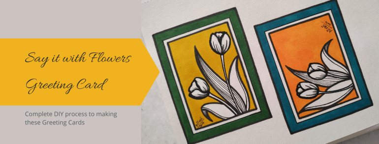
If there is something you want to say, say it! And as they say, say it with Flowers. A floral design card works for so many expressions. Please! Sorry! Thank You! and More! In this post, I am sharing an easy to do design you can try at home.
This simple, elegant and classy design will suit any occasion. We can make a gift tag, a greeting card, a postcard or have it as a letterhead on the letter to your pen pal.
You require some colours, pens, paper, basic drawing skills and your enthusiasm for making a handmade card. The same design can be made for a horizontal (landscape orientation) card as well as a vertical (portrait orientation) card.
Step-by-Step process to making this Floral Design Card
Step 1
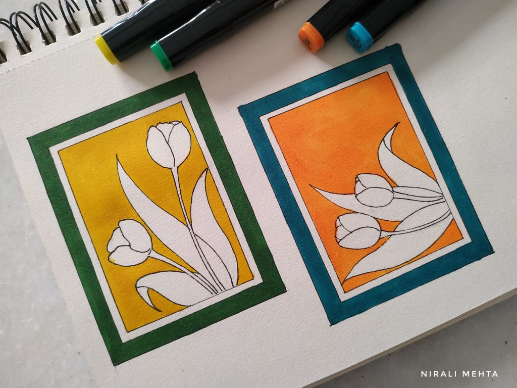
Step 1 – DRAW : Draw double borders to the page as shown above. We want one thick outer border and a thin inner border.
Step 2A
Step 2 – DRAW and OUTLINE : Draw the flowers and leaves. Tulips are the easiest to draw. They have long leaves and very few petals. A floral bunch looks better when it totals to an odd number. I have drawn two flowers and three leaves. We need not fill the entire space. Cover the area enough so that it looks well spaced out. Outline the final drawing with a waterproof black pen. If you don’t have a waterproof pen. You need not outline it at this stage.
Step 2B
Step 3 – COLOUR FILL : Fill the background with colours. Select any two colours – one for the thick border and one for background. Leave the flowers and thin border in natural white of the paper. For this card I have used markers. Even paint will look good.
Step 3
Step 4 – FINAL OUTLINES : Outline the flowers, leaves and borders with a thick marker. Leave the thin border. Add little lines or fill patterns to the flowers and leaves in black. Give the thin border a thin outline. This thick and thin outlines makes it look better.
Landscape or Horizontal Orientation Portrait or Vertical Orientation
Colour combinations like Pink – Blue, Yellow – Blue, Red – Green also look good. Bright colours or Pastel shades both look great. A design like this is a ‘you possibly cannot go wrong kind of a design’. Here are both cards together :-
Tulip Design Greeting Cards
That was easy right? So try it out yourself and let me know if you have any questions. Have an Arty Weekend!
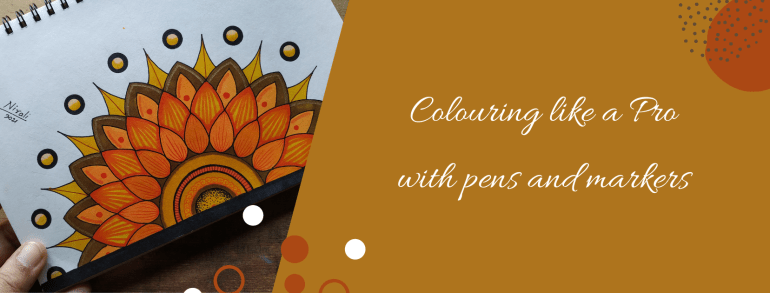
Two Artworks with the same sketch can look different only because of the colours, isn’t it? I have known people who cannot draw or paint that well but can colour amazingly well. In fact, their colouring is so good that they can turn it into a profession. Then how come nobody teaches us how to colour or why don’t we give much importance to it? “What is there to learn in that?” they say. I would say colouring is also an Art.
Everything from selecting the colours to the finished look has little things to understand. Once we know these, anyone can colour like a pro! Nowadays colouring is a popular hobby among both children and adults likewise. Art material brands offer free colouring pages. We can also download colouring apps or we can buy colouring pages online.
The drawing in colouring books have larger blocks to colour for younger kids and then as we progress to higher age groups, they have more intricate designs with small blocks to colour. Printed colouring books for children and adults are available at all book shops. It is a great activity for creative minds to do while waiting or travelling.
I have already done an elaborate post on selecting pens and markers before. In this post, I will share tips and tricks on colouring with them. Even today I try and learn new ways or designs to make my work better and faster.
I have worked with pens and markers by almost all popular brands. Professionals prefer using alcohol-based markers for their art and illustrations because of the finish. This includes 1) artists making greeting cards and stamping 2) illustrators making fashion illustrations 3) architects and interior designers making drawings 4) cartoonists, caricature artists, character designers and manga artists.
Watercolour artists use watercolour pens and markers for creating those effects in colouring. I like using oil-based markers for metallic colours. I also use permanent waterproof ink or archival ink pens for outlining, drawing patterns and for all my ink illustrations.
Beginners could buy a set of watercolour markers and waterproof ink pens to begin with. Then as the interest develops, it is a good idea to invest in alcohol-based markers and metallic markers. We also get acrylic markers or paint markers to draw on objects.
Explaining how to hold different Markers and Pens
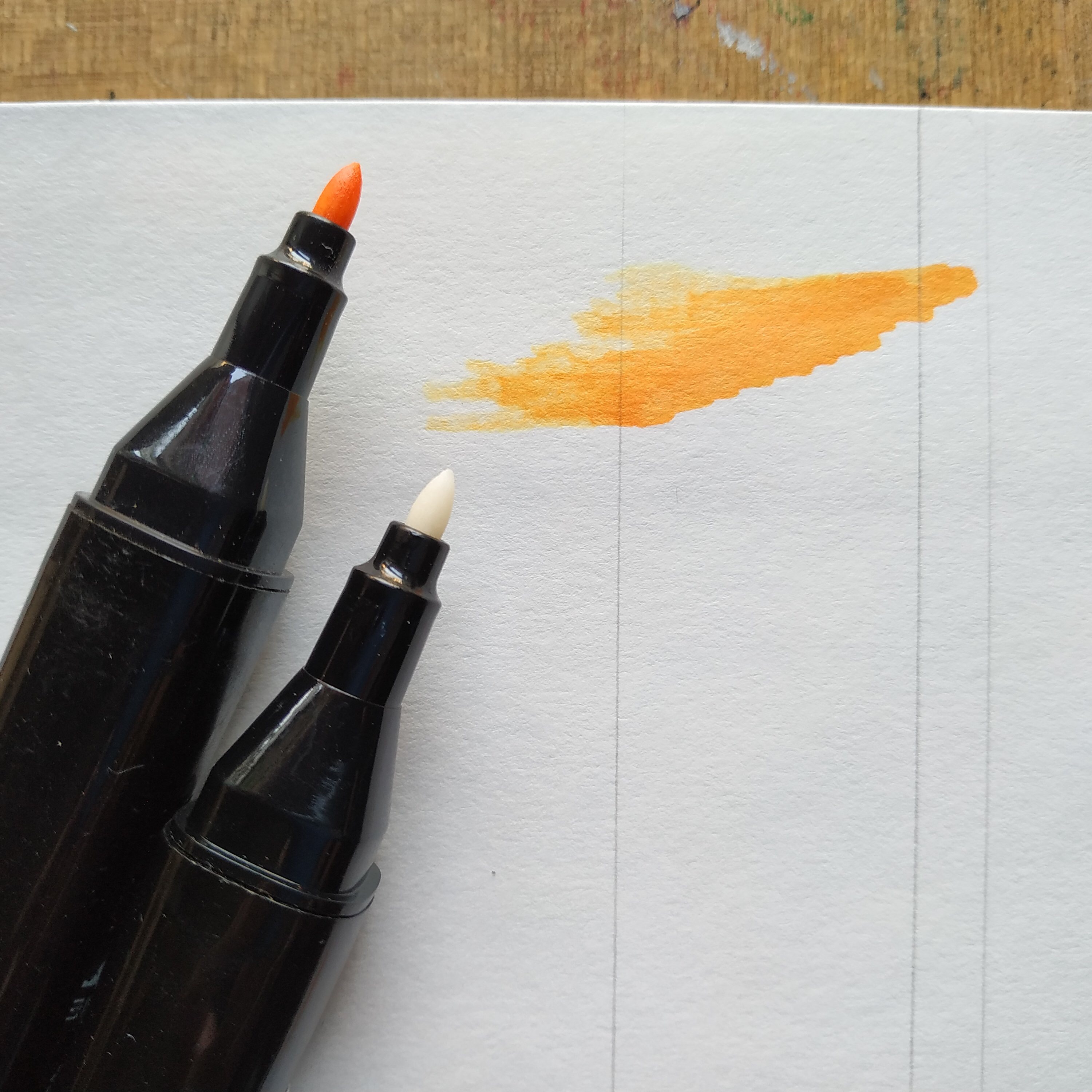
It is always a good idea to test the markers before buying. See the finish after drying and check if they come on to the other side of the page. If they do then we need to use a different paper for it. I have faced this problem with colouring books that don’t use good quality thick paper. Markers work differently on papers of different textures and thickness.
Look the alcohol marker ink came onto the other side.
Whenever we use alcohol-based markers we need to place a paper or protector below our paper to avoid colouring unwanted things. I mean the drawing board or the table or surface. Watercolour markers can be washed off from surfaces but not the others. Hence washable markers are best for kids.
Here are some methods or techniques for colouring. You could have a different style as long as it suits the kind of finish you wish to achieve.
Outline in permanent ink
Colour in the direction of object
Starting to colour
Solid Colour – Colour in a single direction and use the pointed tip to fill the corners that may have been left out. Do not keep colouring the same place over and over. There will be colour blocking when the ink is wet. However once it dries, the colour automatically evens out in the case of most markers. When colouring larger blocks use the accented tip or the brush tip. If we use the round tip it will create a self texture in the fill; meaning we won’t get an even colour in the fill. Once again please note the direction is important or colour in tiny circles.
Highlights – Leave out the portion of the highlights. Do not colour it. The part where the light falls maximum is called highlight. It is a good idea to leave out a larger portion if you are not sure. The area can be coloured later. The white ink doesn’t work well to give highlights because the colour somehow shows through it. It isn’t even.
Blending Two Colours – Can we do shading with markers? Yes of course. Doesn’t matter which marker it is, watercolour and alcohol-based markers both can be used for shading. I recommend applying the light colour first and then the dark colour, so that just in case some of the colour comes on to the tip of the marker then a light colour marker may get spoilt. Many artists colour dark to light also but that is mostly with alcohol-based markers.
Single Colour Shading – The pressure applied is important here. We get colourless blenders for blending the colour. It is also a marker but the ink is colourless. Apply pressure and then lift the pen to create strokes for shading in single colour.
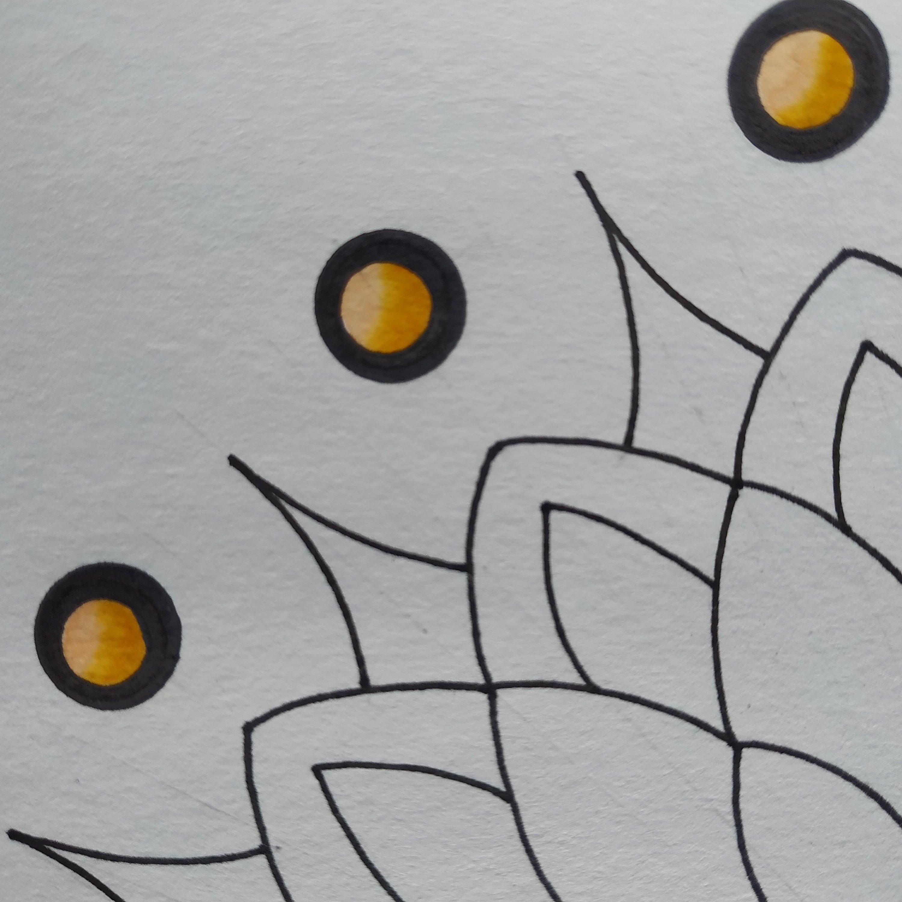
Darkening a Colour – If you apply another coat of the colour when the colour is wet, it will blend. So to create a dark line or make the same shade darker apply another coat after a few minutes. It will blend with the previous colour but will be darker. This works only for alcohol-based markers. For watercolour markers once dry the colour doesn’t blend. The green dot above has the dark colour done like that.
Creating Textures and Patterns – When we apply a stroke of two different colours next to each other, they blend. We can use these alternately and create fill textures. When we want the lines to stand out or want to create patterns without the colour blending. We can use a permanent ink marker before or after using the watercolour or alcohol-based marker. I use permanent ink pens for outlines during finish as well as my base sketch.
Colour Palettes – It is always better to think about the colour combinations beforehand. We get a lot of shades in the markers. Colour mixing isn’t possible. The paper can tear with excessive scribbling. This art has the yellow, orange, brown colour combination. Buying large boxes of markers is expensive, especially the professional or artist pens.
Selecting the right colour combination can make a huge difference to your artwork. If possible do a little research on the most popular colour palettes or international colour palettes frequently used before buying the markers. I recently bought a box of markers with the basic colours and then bought individual pens for the extra shades that I needed. It worked out to be cheaper than buying the larger box with colour shades that I didn’t need or wouldn’t use.
The colour combination in the artwork by artists of a particular region is influenced by the colours of their local surroundings. Further every colour conveys a meaning and emotion. For example, the colour red is considered auspicious in some cultures and it conveys love or anger as an emotion. I have done a post on understanding colours before this. You may want to take a look at it.
A close up of the artwork I recently did with watercolour brush pens
I normally draw my own sketches but you could print the colouring pages at home or with a printing service. Most of the large stores have a printing service. Do share your colouring experience with us. Have an Arty Week!
Looking for some Art to up the aesthetic appeal of your space? You did a search and found something that you just couldn’t take your eyes off. “It is so me! I think it will look fantastic on that wall in our room. Just what we needed!” Ta-da! Bought!
Now comes the difficult part – selecting a Frame that goes with it. The task isn’t as difficult as it seems but many people find it stressful to make up their minds while selecting a Frame. A lot of questions and confusion. Have I made the right choice? What if I had selected another Frame? Matt or not? Vintage or Classic? Metal or Wood? After all, the Frame can make such a big difference to the final look.
Shipping Framed Art can be difficult which is why most Artists sell their Art unframed. I am an Artist and I also sell most of my Art unframed. I do upload Framing ideas on my social media accounts regularly so as to assist potential buyers. Framing is an additional service that I provide to close friends & family as well as local buyers upon request. At online shops, my Artwork is shown with and without Frames so the onlooker can imagine how it would look once it is framed. I usually show Frames that are common and easily available or standard market Frames.
With the advent of 3D and AR (Artificial Reality) a cool new feature will soon be available – We can scan our wall or space using the camera in our phone and the software will project and show us how the Art will look framed on our wall, like on that wall in your house, like what if you bought it and put it there how would it look? All this in real-time before buying. Although it seemed unbelievable at first, this feature is currently in the beta testing phase and very much implementable.
Art is to everyone’s taste and choice. It isn’t a one shoe fits all formula. Some may like a minimal wall with just one big Art while others may want many Frames filling up the whole wall end to end. I totally agree ‘Beauty lies in the eyes of the beholder’. I am not an expert at Framing but I can definitely share whatever I have known or learnt so far about ‘Making an Art Wall and Framing your Art’.
These are basically ideas and suggestions that would help anyone make a simple ‘you cannot go wrong with this’ kind of choice. It works best for people who wish to decorate their spaces with Art but on a budget. Yup! Definitely recommend expert help from a professional if it suits you. Even then this information will help. When the Frame maker asks you questions to understand your requirements, you would know what exactly is he talking about. So here’s answering some of the questions I usually come across about selecting Frames and putting up Art on the wall.
1. Edges of the Art – A minimum of half inches on all the sides gets enveloped into the frame. Even in a plain classic thin black or white frame without matting the edges get hidden into the portion of the frame. An artist paints these edges knowing well that it will get covered up or may leave a white border edge for it.
Two Artworks – One painted to the end and other with white border left out. Thick white panel is the Matt Board.
If the Art doesn’t have a blank border and you don’t want to cover up the edges then select a Floating Frame or a Sandwich Glass Frame. In a floating frame the Art is put above the matt making it look like it is floating, while in a double wall glass frame the Art is sandwiched between two glass panels. Only the glass touches the frame and the Art looks floating. See the picture below.
A double wall glass frame giving a floating effect.
2. What is Matt – A Matt or a Mat or a Mount is an additional border around the Art cut from a sheet of paper or board. Although it has a decorative purpose, it is more to preserve the Art by avoiding direct contact between the Art and the edges of the frame and glass. They recommend using an acid free material for it. A window for the Art is cut out. We can have any colour mat. Black, white and off – white are standard colours.
Frames that are available at shops include a mat or we can make one from paper sheets available in the market too. A mat is preferred for photos, prints and Art on paper that is otherwise small. The matt makes the frame look bigger while keeping the focus on the Art. Art Galleries and Museums have Artwork with matts.
There are double matt frames too. It means the Art encased in the first matt and then another matt and finally the frame. Looks like multiple frames inside each other. Ready Frames in the market will have only a single matt option.
Half inch Black Frame with One inch Matt on all sides
3. Size of the Art – How big is the wall? What is the size of the Art? Take a scale (ruler) and approximately measure the size of the Art that you will be putting up. How much space you want to cover or leave out? In case you are going to put up multiple Frames then space them out well. How many of them are landscapes and how many portraits? Visualise!
Placing a paper of the same size as the Art on the wall to visualise the Framed Art can help map the space for a beginner. Any Frame adds to the size of the Art and if you get a frame done with matting, it adds even more. The chances of a miscalculation in the size can be reduced if we understand this.
Explaining it with the help of an example : Let’s take an art on paper that has a finished size : 8 inches width and 10 inches height. We find a Frame of 11 x 14 inches. So for the 3 inches in width and 4 inches in height we can add a matt OR we add 3 inches equally and get a custom Frame of size 11 x 13 inches.
All the frames have same size plain black simple classic Frame. No Matt.
Even without the matt, it would be about 8.5 x 11 inches. The Frame moulding would add about an inch or more depending on its design, bevel and thickness. Always check the finished size written in the info when buying a standard market Frame. As for custom framing, you can control this better. This applies for all paintings on canvas or on paper, photos and prints that you can Frame.
It makes complete sense in buying the Art first and then selecting a suitable Frame. Also always calculate an approximate finished size on the wall before clicking the purchase button. We may not be able to make an exact calculation but the nearest can be rounded off to the next number on the higher side to avoid any bloopers.
4. Matching the Canvas with Frames – A board canvas needs to have a frame. With glass or without is ok, but a moulding around defines the Art. Paintings with acrylic paint can be used as wall mounting Frames. In this case the wooden frame in the stretched canvas is itself the final frame and it can be hanged on the wall directly. In case you wish to frame such a canvas you would need a Box Frame because this canvas is 1 or 1.5 inches thick like a box. For a canvas we have to consider the thickness also. The glass must not touch the canvas. A regular Frame wouldn’t fit so we would have to opt for custom framing. That is why wall mounting canvas frames are popular.
Ready standard size Frames work best for prints, art and photos on paper. They have a chart with common sizes for photos and A4 or maximum A3 size. Frames for Art larger than that may be difficult to source. The cost of framing an oil painting is the highest. It is high maintenance and must be done by a professional so that it is airtight and avoids contact with the glass. Even if it is custom framed, it needs a very experienced Frame maker or the Art can get spoilt.
5. Glass or Acrylic – Here they don’t mean the Acrylic paint. They are asking if we want the transparent panel in the frame that is made of glass or acrylic material. Acrylic is lighter in weight. It is cheaper too. A glass Frame will always cost more. The advantage with glass is that it doesn’t develop scratches. Acrylic does not break or chip off easily. Most over the counter Frames that are available for prices as low as a few dollars have acrylic panels.
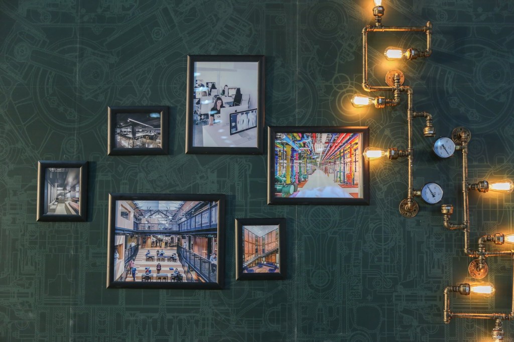
Art Wall : All of them have a Matt and different Frames.
6. Material and Type of the frame – It can be metal, wood or plastic? Vintage or Classic? Thin or thick? This selection is based more on the look and the cost. Only thing to remember is that the Frame shouldn’t be more than the Art itself. We want to Frame the Art to preserve it longer and be able to hang it on the wall. Other than that the Frame should add to the decorative factor of the Art and not the other way around. A simple suggestion would be to consider the other factors of the space. Some frames may look too heavy or cheap and not in sync with the other things around. A simple elegant black or white Frame with or without a matt or a nice wooden Frame in dark or light brown polish that matches the rest of the room works very well.
7. Changeable – Frames where we can remove and change the inserted Art by opening them are changeable frames. If you don’t want to go through the hassle of getting a Frame and putting a nail each time, this is also a good option. Also when you want the same Frame for all the Art on that wall, one would opt for a changeable Frame. In future when you buy new Art you can use the same Frame and all of them match each other. This is because if we buy Frames over a period of time then there are chances that all will not be the same. Besides it is a one time investment. In this case the frames should be more sturdy and of good quality to last for years.
Changeable Glass Frame made of Plastic.
8. Hooks to hang the frame – Don’t miss this out when selecting your frame. Some Frames have movable hooks, some have a single hook, some double and the distance between these hooks matter. The hook may be small or fitted to the same level as the frame or could be coming out a level higher. These things we can’t determine while looking at the Frame in pictures. Only when we actually go to put the Frame up on the wall we realise that the Frame doesn’t sit well in place and it is because of the hook.
That was the hook on the Frame and now to put it up on the wall, we have to put a suitable nail. Now a days we get adhesive hooks that stick to the wall. No need to put nails that damage the wall. Works best if you don’t want to put a nail in the wall but select these as per the weight of the Frame. The options are vacuum hooks, velcro hooks and hooks with tape or adhesive. They will not damage the wall and no need to drill either. They are called ‘no nail or no damage hooks’.
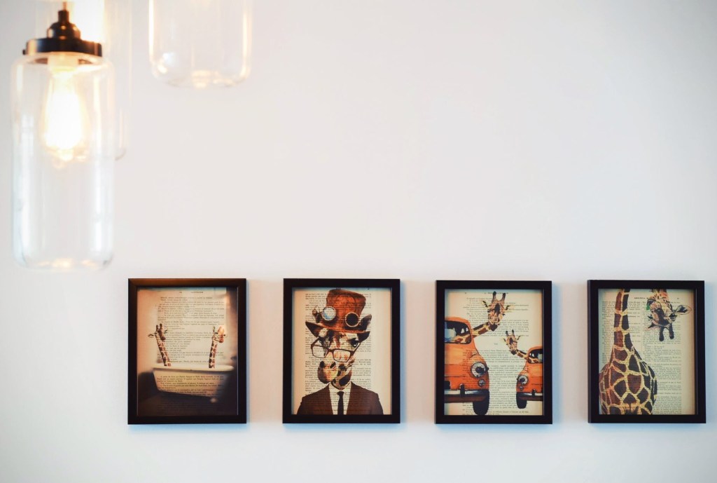
Photo Wall with different sized Frames on a printed Wallpaper background
9. Selecting the Wall – What I have learnt is that the Wall stands out when it’s made into an Art Wall. Basically when you want to highlight a particular wall or want a wall to grab attention in a room, it is the wall to select and make an Art Wall. Single large Framed Artworks on a single colour painted wall work best for abstract or modern Art. These look beautiful on wall mounted canvas without any frame or glass.
A small cluster of about two or three same sized Frames on a wall gives a classy contemporary look. The only big no-no here is having Frames on all the walls in a single room. That makes it look like a library or a museum or an Art gallery. The walls of staircases and passages are good for memory walls or photo walls. A little light that illuminates the Art is better than a dark space. Then again it is more to your taste.
10. Wallpaper and Decals : Often used for a photo wall. For a nursery or a commercial space it would be a good idea to have Framed prints or posters and decals around. Decals are vinyl stickers that we can stick on the wall. They are available in many designs. Having a nice background with a printed wall paper and Art frames on it also look good for some Art. Mixing these along with Art give a very different new look. It isn’t the traditional style and may not appeal to some.
I hope this clears most of the doubts on Framing and creating an Art Wall. If you have time, please visit my Pinterest account. I have an album for ideas on creating an Art Wall. Have an Arty Weekend!
Photo Credits: Pictures that I have clicked have my name and the others are from the WordPress Library.
Most of the people I know buy brushes that are labelled as watercolour brushes and art paper that is mentioned as suitable for watercolour at the store and they are sorted. “Look! the company says I can use them for watercolour painting, so I bought them.”
They bought it either because someone told them, they saw someone using it or the brand company had written so on the product. Very few people bother to find out the product details and know if it is the right product for their use. Many a times we don’t want to stock different materials for different Art and so we use the same brush or paper for all. The selecting pattern is same for them and so I grouped canvas and paper with paintbrushes.
For beginners it really won’t matter; however artists and professionals will be equally choosy or selective about these materials. It makes a difference in their work and once we are used to a particular one, we only use that. Most artists start off with the trial and error method and once they like a particular brand or product, they stick to it.
Different kinds of brushes, what they are called and their suggested uses are printed on packs. As always a lot of information is available on the Internet. So I will not get into repeating that printed knowledge.
We have discussed ‘Selecting Art Materials’ in our previous posts. On the same lines I will share about selecting paintbrushes, art paper and canvas in this post. I do not endorse any brand and this is not an advertising or promoting post. I share about my understanding of these materials so that it helps others make an informed purchase decision.
Selecting a Canvas
Canvas
Any surface we paint on is called the canvas. So if we are painting on fabric or wood or paper, all of them are actually our canvas. However when we go to an Art store and ask for a Canvas we usually get this fabric like drape wrapped on a board called BOARD Canvas, a stretched drape pinned to a wooden panel frame called STRETCHED Canvas and a ROLLED Canvas which is a roll of the drape. All three have the same material, only the mounting is different. Once the painting is complete we have to get it framed before hanging the painting on the wall.
The board canvas is a hard and flat painting surface, the stretched canvas is mounted on a frame and has a slightly bouncy feel while the roll canvas more floppy like a loose fabric. A stretched canvas can be directly hanged on the wall using the existing wooden frame. Hence it is also called wall mounting canvas. A canvas sheet that is cut from the roll will have to be stretched or mounted before painting.
Canvas was traditionally used more for oil painting. Earlier when I learnt mural painting we would have to apply oil and colour to prime the canvas. Now a days canvases are already coated and primed. Cotton is the main fibre of a canvas. Did you know? We also get paper sheets made from cotton linen pulp which are used as canvas for oil painting and acrylic painting. They are like a sheet cut from roll canvas: have the same texture and feel but are relatively sturdy and stiff like paper.
All of them will be acid free and primed and have some treatment or coating for protection against pests. It really won’t matter which one you buy, almost similar. Only the tension of your canvas will differ. That would be the basis of your selection. If you are using them for acrylic painting a canvas primed with gesso works well. You can use others too. If you are into oil painting you may be more selective while choosing the canvas.
Not all art supply stores stock all sizes of canvas. It is a good idea to buy the quantity together if your project uses multiple canvases. In case the size you need is not market ready, you can buy the roll canvas and get it custom made or mounted to your required size. Canvas is also used for Art prints. Digital prints of artwork is quite common. Flex banners are also a type of canvas.
Selecting Art Paper
Art Paper
We get sheets of art paper in bundles as well as bound in books. Books have perforated sheets which can be pulled out. Smaller sizes such as A4 and A5 sketchbooks are very popular and will be easily available everywhere. Art Paper is used for all mediums including pen drawing, pencil shading, acrylic painting, pastels painting, charcoal sketches, watercolour painting and oil painting.
In the info section they print the size in inches and cm. They print the thickness in ‘GSM’ or lbs. GSM stands for grams per square metre that is the weight of the paper or pulp for every square meter. It is how the thickness is measured. How does that make a difference? The thickness of the paper is an important attribute because for watercolour painting we need thicker sheets like 250-300GSM that will absorb water but will not tear while for ink art we can work with 120-180GSM.
Next we look for textured or plain. The grains on the surface. Depends on the artwork one is working on, whether they want a textured feel (a rough surface) or a plain background. For pastels and charcoals a little grain or texture is required. It helps hold the powder while for ink and watercolour art a smooth or plain surface can be selected. This gives a plain edge or a straight neat line finish while painting.
Artists usually use ‘acid free’ meaning paper that has been neutralised. In simple words if the paper is acid free it will not turn yellow with pitting and can be preserved longer. Paper made from cotton will have more absorbency for water based painting. It can be 100% cotton or mixed with other natural fibres like cellulose. I select the ones with 20-30% cotton for my artworks.
Selecting Paint Brushes
Paintbrushes
Selecting paintbrushes is very simple. Each of them are built as such for a purpose or for a particular style of painting. It may sound weird but some artists manage to get fine lines with a thick brush of size 8 and a thick like with a brush of size 4. With years of practice we don’t change brushes for each size. So buying them in odd numbers like 0,2,6,8,10 is enough. For finer lines and intricate work I use finer brushes of size 0, double zero 00 and triple zero 000. These are smaller or finer than zero size brushes.
For painting on a canvas on the easel we require long handle brushes. Regular size handles are good when we are working on paper. Further we would need a mix of round and flat brushes in our art tool box. Flat brushes are used to paint backgrounds, round brushes for fills and riggers for fine lines. Filbert brushes are useful for one stroke painting or creating visible strokes and design. I even use the back of the brush handles as round stumps for dot painting.
Brushes can be made from natural animal hair or synthetic fibres. Use brushes with soft thin bristles when you want the colour to be applied evenly. It gives a smooth neat finish. Thick bristles cause an uneven finish with lumps of colour which can be left as it is or smoothened by using a roll over it. Bristles of brushes made from natural hair expand when soaked. They are best suited for oil painting. For painting using acrylic and watercolour paints we can use brushes made with natural or synthetic bristles. Watercolour and Acrylic, both being water based paints we can use a common set of brushes. No need to keep another set.
One special kind of brush is the water tank brush. This brush has a plastic body with a water tank attached to it and bristles of the brush are synthetic fibres. When we press the tank, the water drips to the brush tip and soaks the bristles. It works very well for quick sketches and on the go painting using watercolour cakes.
Just bought new Paint Brushes
I was surfing the Internet the other day when I came across a video titled ‘How it’s made – Paint Brushes?’ ‘How it’s made’ is a very popular show and I like watching it. They show how various products of our daily items are made. Helps us understand about the products, their usability and the thought process of the maker in creating it.
I understood which problem faced by artists are they trying to solve by offering a particular type of brush or why it is made the way it is. Every product is manufactured keeping in mind a certain use. Similarly they also have videos on ‘How it’s made’ for canvas, paper and many more products. If possible do take out some time and see them.
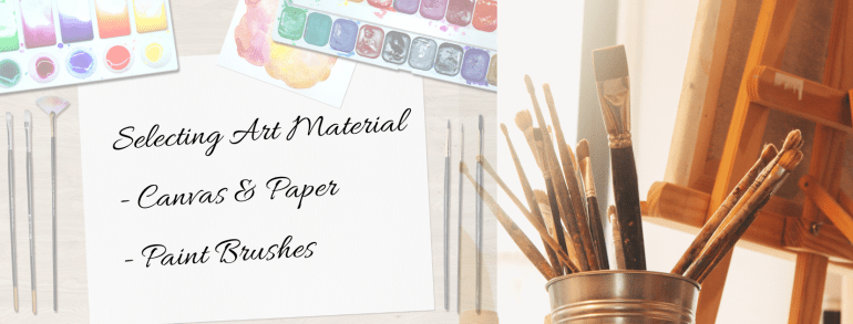
Selecting Art Materials
Links to posts related to this topic are listed below. Click on the title to open the post in a new tab. Have an Arty Weekend!
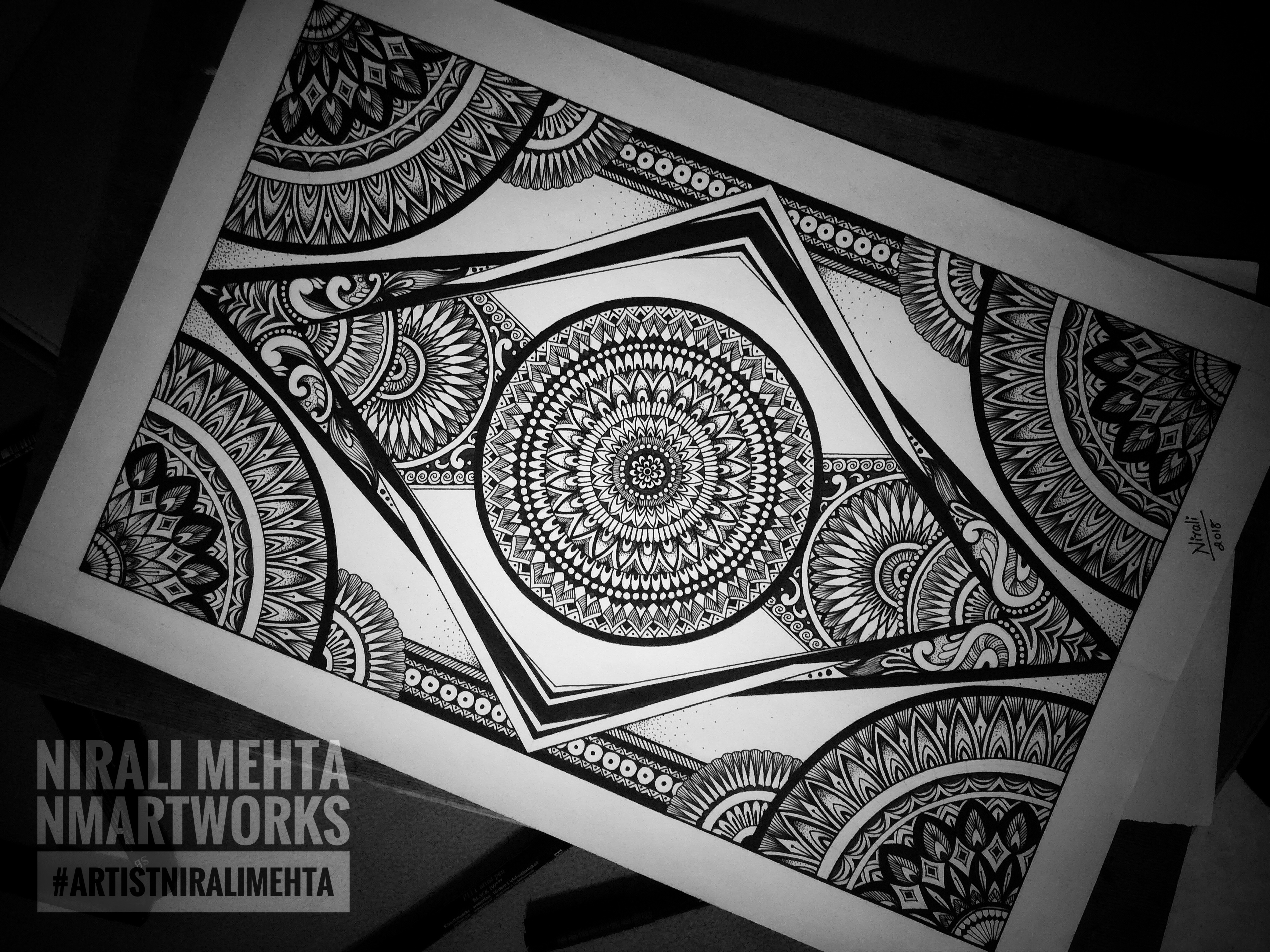
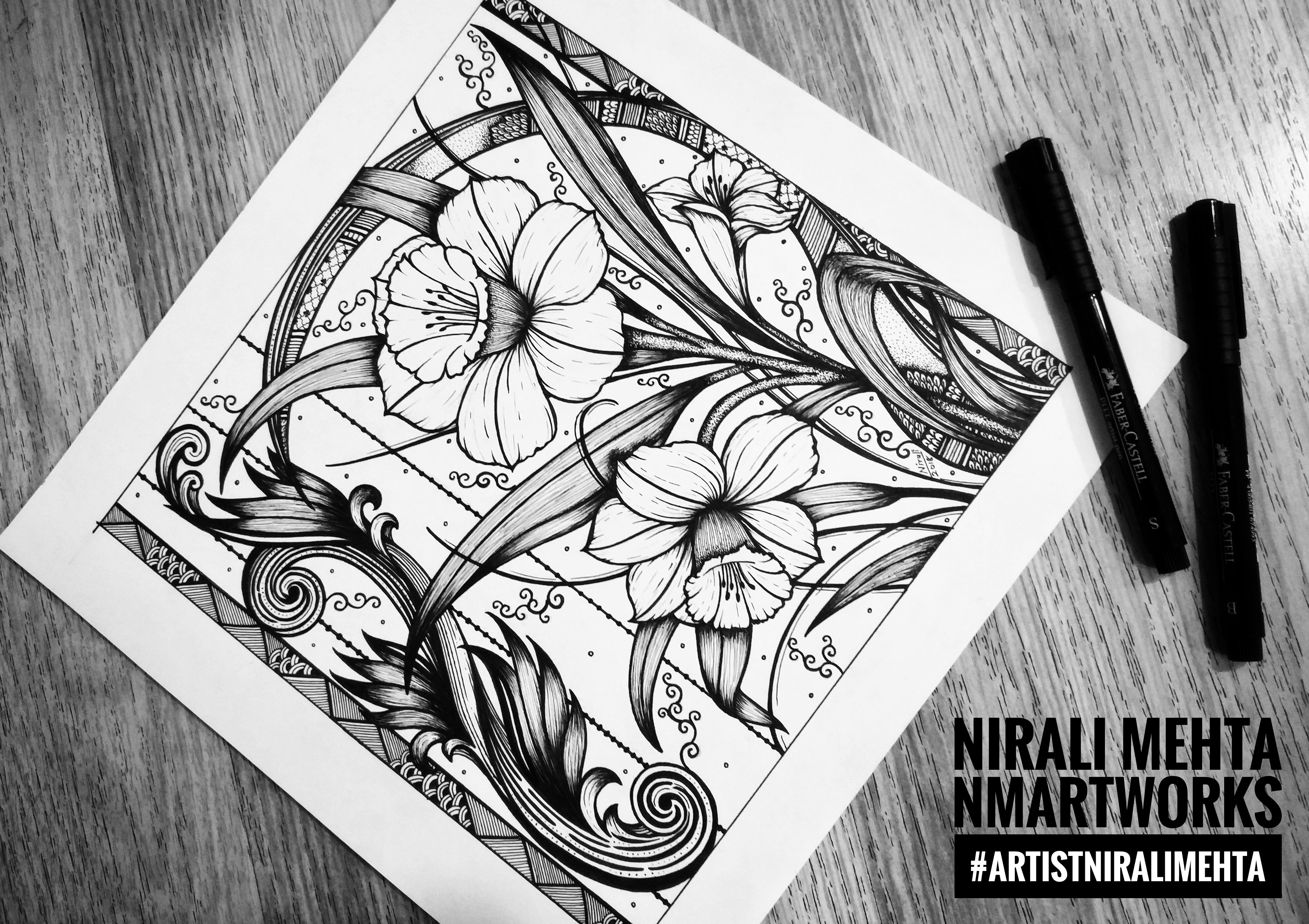
Clear lines, strokes and dots of Black Ink that make beautiful works of Art – Ink Work or Pen and Ink Drawings have been my forte. Original hand drawn Ink Art and Illustrations as well as Art Prints of my Pen and Ink Drawings are available at my Shops. I like to draw and paint Birds and Flowers the most. Sometimes I use Ink Pens along with Watercolour and Gouache colours for my Artworks. In this post I am going to share all about my favourite medium – Ink. Because it is Black Ink on White Paper usually, the Art works are also called Black and White Illustrations.
We have explored Zentangle Art, Doodle Art and Mandala Art in my previous posts. These Arts are mostly done in Ink. I have also shared about selecting Pens and Markers for your Art in another post. It is the main material for Ink Art. Ink and Paper are the only two materials required for Ink Art. For some techniques we may draw the initial sketch in pencil. Please refer to these posts for detailed information on these topics. It would be additional helpful information on Pen and Ink Drawings.
This time let’s take it a level higher. Explaining in simple words we can say – creating Drawings, Illustrations and Sketches using Ink Pens and/or Ink with bamboo sticks or brushes is called Pen and Ink Drawings. Very good quality Ink Pens with a variety of nibs are easily available. We don’t have to use brushes or Inks from bottles anymore. This has led to a lot of people taking up many of these Art styles.
Tattoo Designs, Ink Illustrations, Stippling Art, Mandala Art, Doodle Art and Zentangle Art are all very popular on Social Media. We have many artists sharing these works made with Ink. Botanical Illustrations in Ink are loved by many.
Mandala Art
Floral Ink Illustration
Zentangle & Doodle Art
Stippling & Doodle Art
Mandala & Stippling Art
Floral Ink Drawing
Hand Drawn Ink Art by #artistniralimehta
Click here to view my virtual Art Gallery and see more of my Artworks. You may also visit my shops (links on the homepage) to buy my Art. My works of Art would make suitable Wall Art for contemporary spaces both Residential and Commercial.
Artist Pens have Inks that are fade-proof, water-proof and permanent and are available in all major colours. ‘Archival Inks’ as they are referred to are also fade-proof, water-proof and permanent Inks.
Earlier Ink artworks would be made using brushes or bamboo sticks dipped in Inks, just like Calligraphy. If it interests you, do read my earlier post on the Art of Calligraphy. Painting with those would have surely been more difficult. Pens that are available now make it much much easier to draw and paint. These Pens have become so much a part of our Artworks that we use them even for something like just giving an outline or darkening a pattern.
These Pens are available in a set as well as loose Pens. The ink, nibs and grip of Pens of all brands have a minor difference. I have used pens by almost all the major brands and have liked all of them. I use Micron Pens (Archival Inks) most often. I also use Pitt Artist Pens by Faber Castell for brush nibs and accented tips.
My other favourites would include Uni Pens and Winsor Newton Markers for a more Watercolour like finish. These are more like Artist choice Pens. It would be absolutely ok for students to do the same kind of Artwork with the other Pens or Markers that they regularly use. No problem at all. Permanent Ink is also available in bottles. We can still use the traditional method of writing or painting using Ink from bottles with brushes or bamboo sticks.
The Paper you select must be thick to absorb the Ink. Handmade Paper gives the authentic olden days look. If the Paper is thin the Ink bleeds or may move on the back side of the Paper too! The Pens should move smoothly and give a good finish to your bold and confident strokes.
A closer look at the making of one of my Ink Illustrations
Black and White does not mean just a dark black tone. It is important to shade and show dark light areas even in Ink drawings. For this we can use any one of the following techniques or we can create one of our own. The shading adds depth and makes it look 3D and more realistic. Sometimes people use a black colour pencil and shade the colour, it is an easier way out though. Like me you can also do a combination of two or more of these Ink Art techniques if you want. Here are some of the techniques :-
Ink Art Techniques
I am completely in awe of the Japanese Art of Ink Wash Painting. Also known as ‘Sumi-e’ Painting. It is typically monochrome, meaning it uses shades of black on handmade white paper. I was told that the Ink and brush and/or bamboo sticks used for this Painting are same as those that were used for the Art of Calligraphy in China in earlier days. ‘Ink Wash Painting’ as they called it is said to have began during the Tang Dynasty in China.
It was introduced to Japan by the Zen Buddhist Monks. Sumi-e Artists paint Nature, People and Places. Their brushes are special and different from regular brushes and it is all about these clear black strokes. I have been wanting to learn this Art since a long time. Let’s hope I get a chance soon, may be sometime in the future!
If you have any questions on how to use this medium, feel free to ask them in the comments below. Have an Arty Week!