The Perfect Blend – Exams & Coffee

What is Coffee got to do with Art? 😀 My young followers have exams coming up at schools, colleges and universities. Coffee will be their best friend keeping them up studying late nights. Just like a good coffee is all about the blend. Art is also all about blending and having the right combinations. All set? Prepared?

A coffee cup with my design available at my shops – NMartworks

I will do posts on ‘Latte Art’ and ‘Coffee Painting’ later after exams. This post is to wish them ‘All the Best’. No last minute advice or instructions before the exams. Just go out there and do your best. A sweet follower wrote to me saying she has her art exams coming up and my posts were helpful in preparing for them.

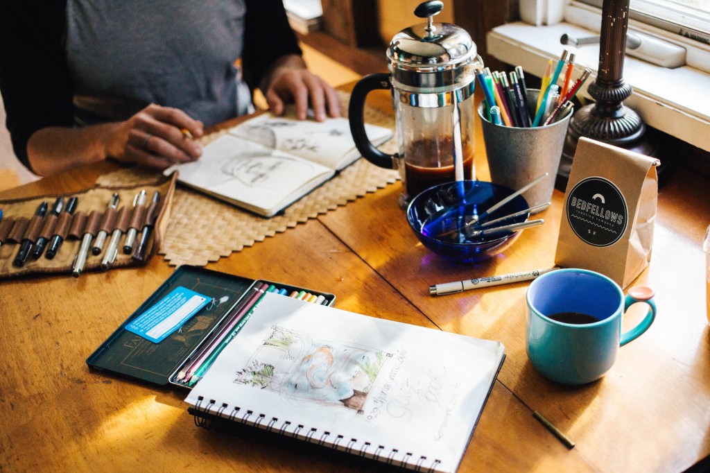
artist at coffee table
An artist sketching at a coffee table – Image from Unsplash

I am so glad the posts were helpful. I am sharing links to some of them once again as they have been pushed off the main blog page due to the space limitations. The posts might be of interest to the new readers or followers who just joined and missed the previous posts. I will put a search the website option once I do a few more posts.

Wishing everyone all the best with my coffee theme cards

I made them using Coffee theme stamps, Black Ink archival ink stamp pad, Watercolour Markers and Brush Calligraphy Pens. Here’s a very extra special tip that one must always remember :- You can paint with Coffee but you can’t drink Paint Water. Hehe..Just to lighten the mood. Have an Arty Weekend!

Selecting colours in Art for their meaning

Learning to paint, this little child asked me “Ma’am why can’t I paint a green or pink sky? Yellow water or black rose? Isn’t art about the freedom to paint?” I was startled for a moment but then I tried to look at it from his eyes. Yes! The artist is free to paint whatever he wants and as he wants. Then why wasn’t I ready to accept his imagination? Did I consider it as a violation of the norms? Why does the sky have to be blue and the trees green? Has this thought crossed your mind too?

Art is about the freedom to express. We all draw and paint to express our thoughts. Worldwide, we associate colours with certain emotions. That is why when an artist paints a red rose it invokes a different reaction and when he paints a black rose it invokes a different one. Why? Because every colour has a meaning. Some meanings are accepted in general on a broader level by most people while some meanings are deeper or secondary and have more local communal interpretations.

For example, red as a colour of love is generally accepted by all. On the other hand red is also the colour of anger. Further, red as an auspicious colour is accepted only by certain communities. So you see one colour can have many meanings. How is this meaning derived? It is mainly because of our associations through our thought process. Colours which we see around in our environment and surroundings are colours we associate better with. Colours as symbols to indicate messages or mark goods in trade have been used since time immemorial.

In India, we have the white desert better known as the Rann of Kutch. Art that is traditional to this location is on a white background, just like the white desert. The locals have colourful dresses to be seen easily. They also have mirrors to reflect the sunlight. They like to use bright colours in their homes and clothing. The colour pigments are made locally by the artisans from materials in their environment. Over the years they begin to associate feelings of happiness and cheer with these bright colours like red, green and yellow. This story holds true in some way or another for art around the world.

A good piece of art is one that conveys the message well. All artworks require a good choice of colours. However, artworks like designs, patterns, abstract art and modern art tend to have a higher dependence on the colours used. Hence before choosing colours for the artwork it is always better to know about colours and their meanings. If you want to appeal to a certain audience, it is always a good idea to know their interpretation of colours.

The study of colours is a vast subject and many people have built careers on it. In this post, we will limit it to the use of selecting colours for drawing and painting – mainly to express ourselves well through our art. Almost all colours will have some meanings and emotions considered as positive and some meanings and emotions considered as negative. Depending on the emotion one wishes to invoke as an artist, one can decide the colours. Then of course there are the light and dark shades – tints, tones and shades for all colours.

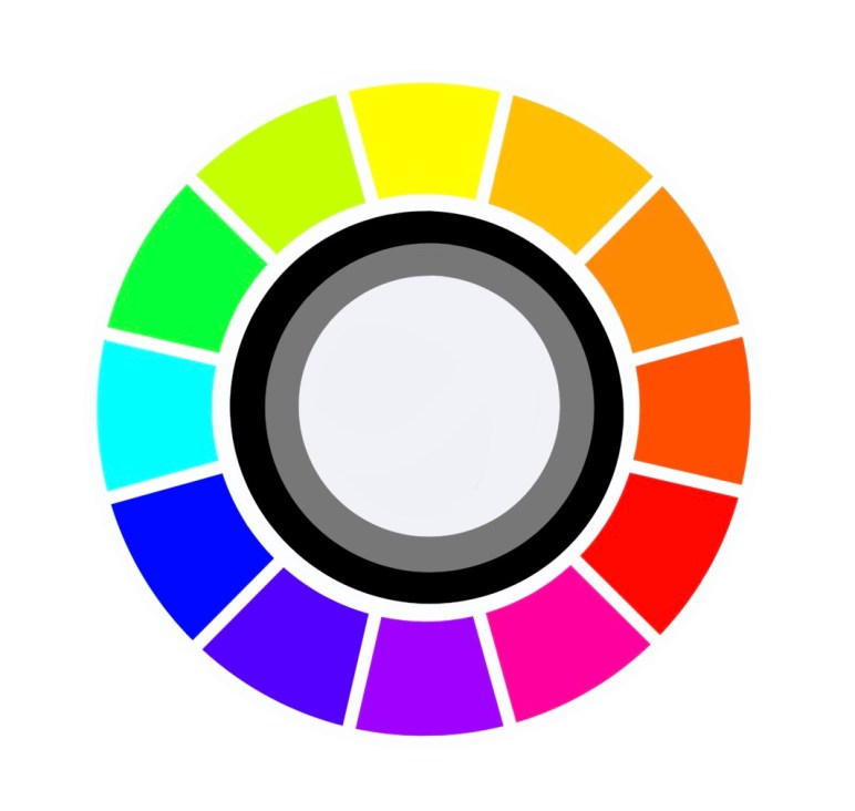
There are colours clubbed as warm colours – these invoke a feeling of warmth. Shades on the colour wheel from yellow to red are warm colours. Colours that invoke a cool refreshing feeling in us are termed cool colours. These are the other portion of the colour wheel. What is this colour wheel you are talking about? I have shared it in one of my previous posts. You may want to read up a bit on it as well. It is called ‘Understanding Colours’.

Let’s discuss some colours and the emotions they invoke :

Purity, Innocence, Clean, Fresh, Simple, Good, Complete, New Beginnings.

On the negative side it is symbolic for blank, empty, cold, death or mourning. Secondary meanings include peace, calm and hope. Spiritual meanings like enlightenment or illumination, renunciation or disinterest.

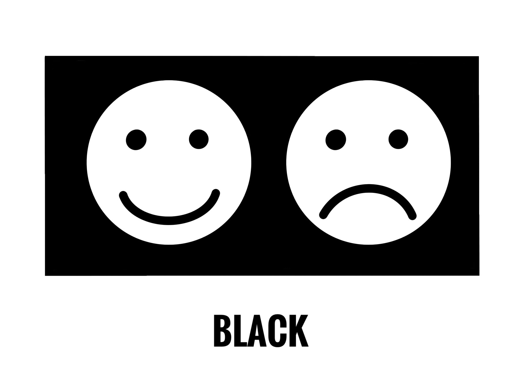
Power, Authority, Strength, Seriousness. Business or Law – Black and White.

On the negative side it is symbolic for dark emotions or opposite of white, sadness, mystery, night, evil, despair. Secondary meanings of sophistication, elegance and formal dressing. It is also the colour of death and mourning in some cultures.

Love, Passion, Fertility, Sexuality, Confidence, Health, Prosperity, Action, Energy.

On the negative side red being the colour of blood it is symbolic for anger, fire, danger, hurt, violence, warfare. Secondary meanings as an auspicious colour in some cultures.

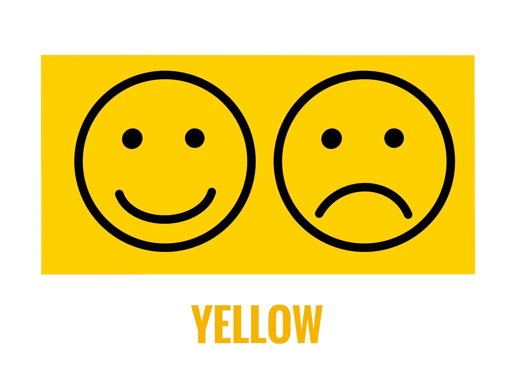
Happiness, Warmth, Sunshine, Brightness, Creativity, Hope, Positivity, Friendship, Knowledge, Laughter, Enthusiasm, Joy.

On the negative side it stands for cowardice, deceit, caution, sickness, illness, Secondary meanings in religious texts or associated with the Sun or god. Yellow is also for Gold.

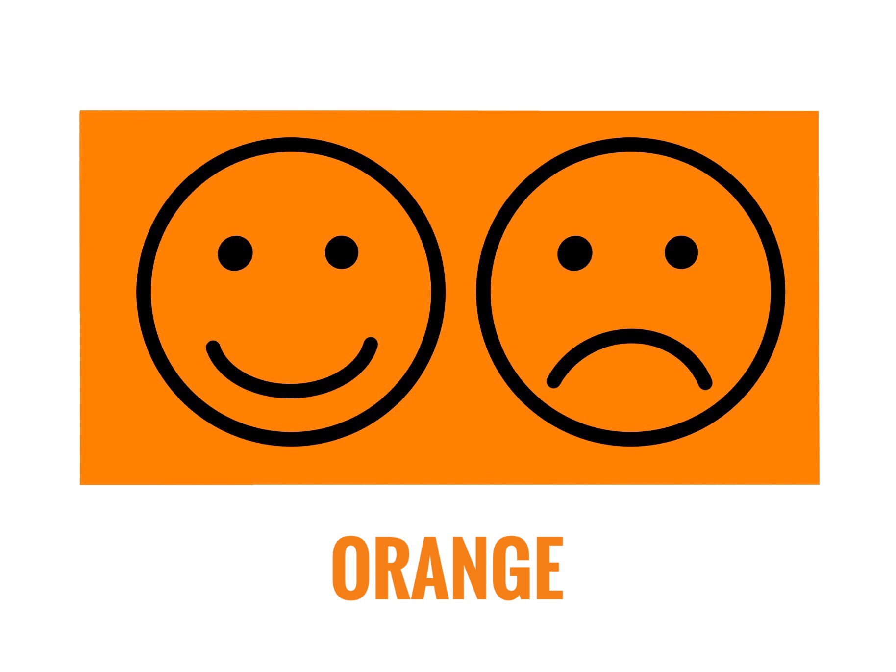
As a combination of red and yellow orange has similar emotions. Joy, Warmth, Sunshine, Energy, Creativity, Health. It is also a colour of movement and change.

On the negative side sometimes considered as superficial, aggressive, overpowering, rude and frivolous. Secondary meanings include its reference to fruits, vegetables or seasons.

Growth, Nature, Earth, Environment, Health, Good Luck, Harmony, Prosperity, Fertility.

On the negative side very often used to show jealousy and greed. Secondary meanings include its association as the colour of money. Often used in symbols for the environment or natural organic products. It is considered lucky in some and unlucky in some cultures. Green is also wisdom in some cultures.

Open Space, Freedom, Imagination, Trust, Loyalty, Intelligence, Wisdom, Flowing or Journey, Serenity, Stability.

On the negative side it means frozen or cold, unfriendly, suspicious, sad and depressed. Secondary meanings : Blue being the colour of the sky and water, it is a very popular colour worldwide. Most companies have their logos in blue. Blue is the colour for boys in some cultures.

Love, Kindness, Femininity, Romance, Youth, Charm, Sensitivity, Politeness.

On the negative side it represents lack of will power, lack of self – worth, over emotional. Magenta is a shade of Pink. Secondary Meanings : It is considered a girly colour.

Royalty, Wealth, Romantic, Wealth, Wisdom, Extravagance, Grandeur, Dignity, Nobility, Power, Independence, Beauty, Femininity,

On the negative side it is associated with pride, pompousness, mystery, sadness, frustration. Different shades have different meanings. Violet and lavender are also shades of purple. Secondary meanings : it is the colour of mourning in some cultures. It is also considered spiritual and magical in some cultures.

We don’t use any single colour for a particular meaning. It is a mix of colours and the shade also matters. How it is used and what is painted influences the message. All countries have different colours that are symbolic to them. For example Green is considered unlucky and associated with infidelity in China while red is considered as protective and lucky. Indigo is referred to as Japanese Blue because it is the most used colour in Japan. Red is auspicious while black is bad luck in Japan.

If we look at flags or national symbols of a country, we will understand their colours faster. Countries use colours they consider auspicious or representative of good luck on their flags. There is no one shoe fits all situation. We need to do our own homework and read up our bit.

The next time you are drawing or painting, think about the colours you are selecting. This is not an exhaustive list. You could even make your own list. I shared this because I felt just as this knowledge helped me make my art better, it could help you too. Have an Arty Week!

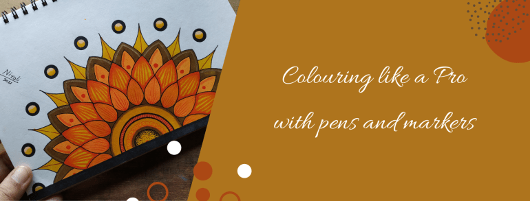
Colouring like a Pro with Pens and Markers

Two Artworks with the same sketch can look different only because of the colours, isn’t it? I have known people who cannot draw or paint that well but can colour amazingly well. In fact, their colouring is so good that they can turn it into a profession. Then how come nobody teaches us how to colour or why don’t we give much importance to it? “What is there to learn in that?” they say. I would say colouring is also an Art.

Everything from selecting the colours to the finished look has little things to understand. Once we know these, anyone can colour like a pro! Nowadays colouring is a popular hobby among both children and adults likewise. Art material brands offer free colouring pages. We can also download colouring apps or we can buy colouring pages online.

The drawing in colouring books have larger blocks to colour for younger kids and then as we progress to higher age groups, they have more intricate designs with small blocks to colour. Printed colouring books for children and adults are available at all book shops. It is a great activity for creative minds to do while waiting or travelling.

I have already done an elaborate post on selecting pens and markers before. In this post, I will share tips and tricks on colouring with them. Even today I try and learn new ways or designs to make my work better and faster.

I have worked with pens and markers by almost all popular brands. Professionals prefer using alcohol-based markers for their art and illustrations because of the finish. This includes 1) artists making greeting cards and stamping 2) illustrators making fashion illustrations 3) architects and interior designers making drawings 4) cartoonists, caricature artists, character designers and manga artists.

Watercolour artists use watercolour pens and markers for creating those effects in colouring. I like using oil-based markers for metallic colours. I also use permanent waterproof ink or archival ink pens for outlining, drawing patterns and for all my ink illustrations.

Beginners could buy a set of watercolour markers and waterproof ink pens to begin with. Then as the interest develops, it is a good idea to invest in alcohol-based markers and metallic markers. We also get acrylic markers or paint markers to draw on objects.

How to hold Marker Pens
Explaining how to hold different Markers and Pens

It is always a good idea to test the markers before buying. See the finish after drying and check if they come on to the other side of the page. If they do then we need to use a different paper for it. I have faced this problem with colouring books that don’t use good quality thick paper. Markers work differently on papers of different textures and thickness.

Colouring with markers
Look the alcohol marker ink came onto the other side.

Whenever we use alcohol-based markers we need to place a paper or protector below our paper to avoid colouring unwanted things. I mean the drawing board or the table or surface. Watercolour markers can be washed off from surfaces but not the others. Hence washable markers are best for kids.

Here are some methods or techniques for colouring. You could have a different style as long as it suits the kind of finish you wish to achieve.

Solid Colour – Colour in a single direction and use the pointed tip to fill the corners that may have been left out. Do not keep colouring the same place over and over. There will be colour blocking when the ink is wet. However once it dries, the colour automatically evens out in the case of most markers. When colouring larger blocks use the accented tip or the brush tip. If we use the round tip it will create a self texture in the fill; meaning we won’t get an even colour in the fill. Once again please note the direction is important or colour in tiny circles.

Highlights – Leave out the portion of the highlights. Do not colour it. The part where the light falls maximum is called highlight. It is a good idea to leave out a larger portion if you are not sure. The area can be coloured later. The white ink doesn’t work well to give highlights because the colour somehow shows through it. It isn’t even.

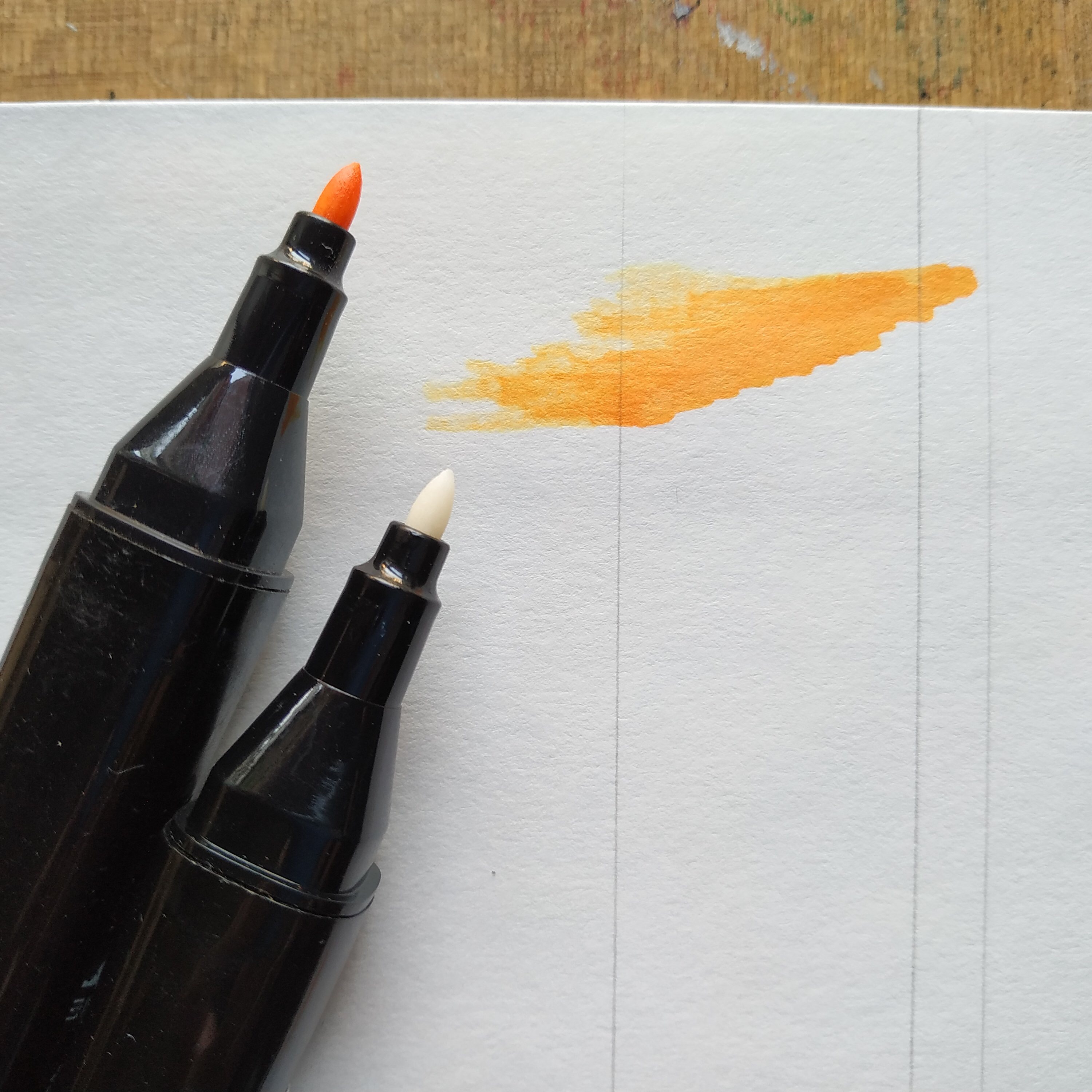
Blending Two Colours – Can we do shading with markers? Yes of course. Doesn’t matter which marker it is, watercolour and alcohol-based markers both can be used for shading. I recommend applying the light colour first and then the dark colour, so that just in case some of the colour comes on to the tip of the marker then a light colour marker may get spoilt. Many artists colour dark to light also but that is mostly with alcohol-based markers.

Single Colour Shading – The pressure applied is important here. We get colourless blenders for blending the colour. It is also a marker but the ink is colourless. Apply pressure and then lift the pen to create strokes for shading in single colour.

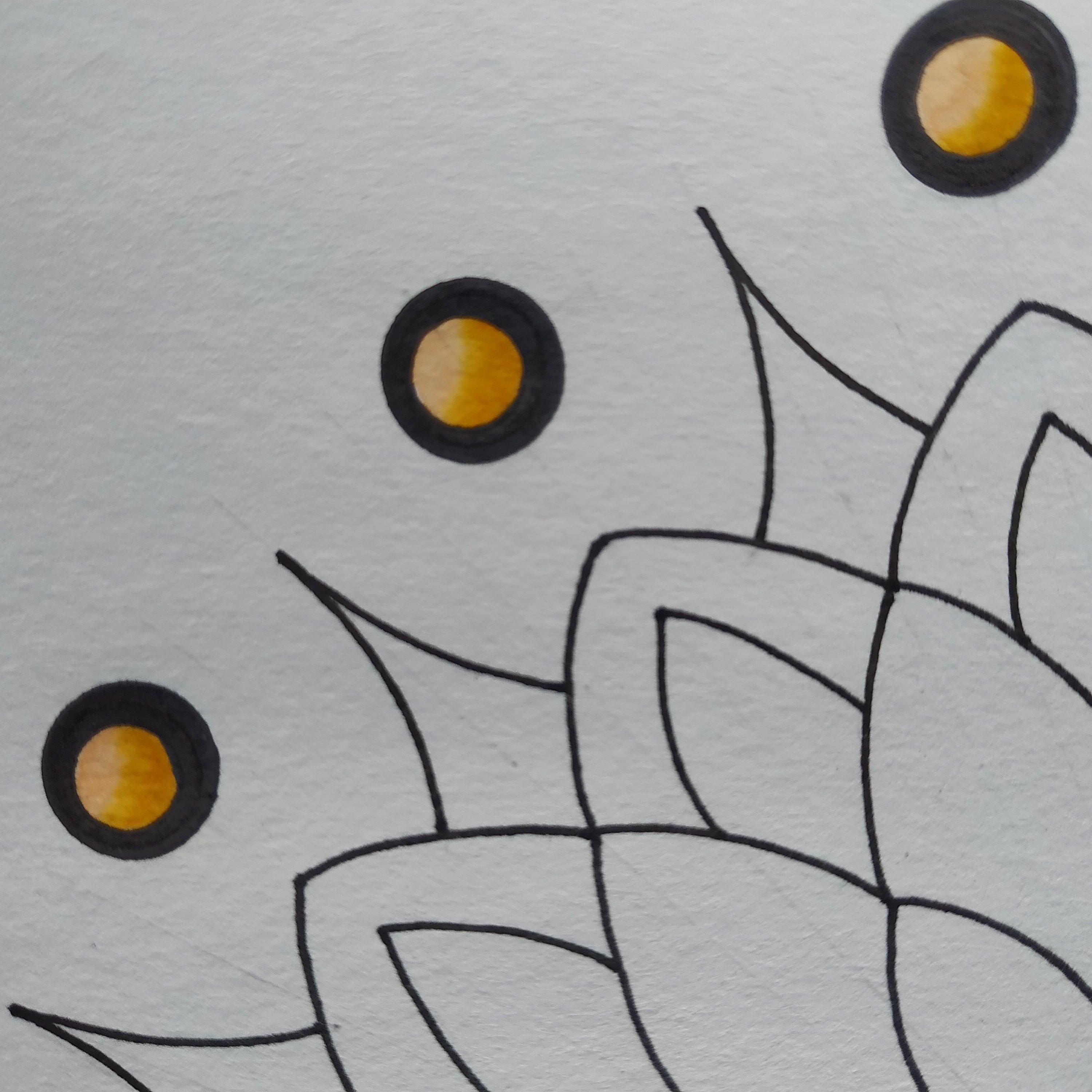
Darkening a Colour – If you apply another coat of the colour when the colour is wet, it will blend. So to create a dark line or make the same shade darker apply another coat after a few minutes. It will blend with the previous colour but will be darker. This works only for alcohol-based markers. For watercolour markers once dry the colour doesn’t blend. The green dot above has the dark colour done like that.

Creating Textures and Patterns – When we apply a stroke of two different colours next to each other, they blend. We can use these alternately and create fill textures. When we want the lines to stand out or want to create patterns without the colour blending. We can use a permanent ink marker before or after using the watercolour or alcohol-based marker. I use permanent ink pens for outlines during finish as well as my base sketch.

Colour Palettes – It is always better to think about the colour combinations beforehand. We get a lot of shades in the markers. Colour mixing isn’t possible. The paper can tear with excessive scribbling. This art has the yellow, orange, brown colour combination. Buying large boxes of markers is expensive, especially the professional or artist pens.

Selecting the right colour combination can make a huge difference to your artwork. If possible do a little research on the most popular colour palettes or international colour palettes frequently used before buying the markers. I recently bought a box of markers with the basic colours and then bought individual pens for the extra shades that I needed. It worked out to be cheaper than buying the larger box with colour shades that I didn’t need or wouldn’t use.

The colour combination in the artwork by artists of a particular region is influenced by the colours of their local surroundings. Further every colour conveys a meaning and emotion. For example, the colour red is considered auspicious in some cultures and it conveys love or anger as an emotion. I have done a post on understanding colours before this. You may want to take a look at it.

Watercolour Brush Pens
A close up of the artwork I recently did with watercolour brush pens

I normally draw my own sketches but you could print the colouring pages at home or with a printing service. Most of the large stores have a printing service. Do share your colouring experience with us. Have an Arty Week!


To see related previous posts please click on them here 1) Selecting Pens and Markers 2) Understanding Colours

5 Ways to Fine Tune your Art – Drawing, Painting and Sketching

Ever looked at your finished Art and thought something is missing. Somehow I am not completely happy with it. There could be something to improve but I just don’t know what? Further sometimes we don’t even know where to look, which part of it needs to be fine tuned. If we work on one portion, something else looks out of place. I know this feeling, it happens.

So do you know how to get it right? That is the question I am going to try and answer in this post. In this article when I say Artwork: it means Drawing, Painting and Sketching. And when I say object- it refers to whatever we are drawing, painting or sketching. I don’t have a checklist of any kind but I can definitely tell you the five ways to fine tune your Artwork in order to improve and make it better based on my learnings and experience.

These are also the observations we need to make when doing Art. If you observe these and are able to check them right, not only would you be good at Art but also find it easy to understand and learn different Art styles. This is more or less an exhaustive list. It does have sub topics or points. In a way it is also 5 mistakes to avoid while making Art.

It is like a grade meter, how much fine tuning is required for each of the parameters will have to be determined by you. That is because it is to your taste. Over a period of time with observation and experience you will be able to decide your own parameters for each of these. Perfection isn’t when all of it is present, it is when all of it is in the right quantities. So let’s begin listing them.

1. Shapes and Patterns

Everything has a main outer shape and maybe more smaller shapes. It is important to observe this. First we draw this main shape and then do the details. Consider it as rough work to your final answer. This also helps decide the placement for various objects in the Picture. You can also take them as a marking of the space each object can take on the canvas. It is important to place things evenly or rather correctly space them out on the canvas. Most people make the mistake of skipping this step and begin to draw directly.

Let’s consider drawing something like ‘My House’. If you are drawing this landscape, make the large main shapes of the tree, the fence, the house, the sun or sky, the human with his pet, the ground and so on. Then add the details. Erase the rough work. It is the correct method to draw.

Some videos on the Internet will show super awesome Artists who complete one particular corner of the art with full finished details while the rest of the canvas is blank. Wow! They are super humans but we are normal humans and this is how we draw. It is mostly a digitally edited video, very rarely can anyone draw like that. They need to get into the book of records for such exemplary skill if they really can. For the rest of the normal people this is the first step for drawing anything.

Everything in nature has a pattern. So for example when you draw a flower. Look for this main shape of a circle or an ellipse. See the pattern of the petals are they – above or below, in odd numbers or even. See the shape of the petals – pointed or round, long or circular. Further see the centre of the flower and look for a shape there. The pollens will have a pattern – are all of them in the same direction, how many turn right or left. These things we need to observe and then when we draw, we match it with our reference.

2. Proportions and Scale

Many people confuse these terms. So in another words it is the size and ratio of the objects drawn. So in your landscape a bird cannot look bigger than the tree, that is scale. Now how much space of the tree is the branches and how much the leaves – that is proportion. That is what we need to observe. How the object looks in context with the other objects in the picture and what are the proportions of its own parts. When drawing a human face you would note the proportion of the eyes to the eyebrows, the nose and lips. The scale would be the size of the actual face. They are connected and not used in isolation.

3. Perspectives and Backgrounds

Which angle or point are you looking at it from? Top or bottom, right or extreme right. The distance- up close or far away. The objects which are closer are detailed, while the objects farther away at a distance in the background may not have all the details. If you draw details of all the objects in a picture, it is like keeping everyone in the front row. It will look like everyone is shouting for attention. The focus is always on some objects in the front and less on those in the background. Artworks with backgrounds look complete.

Perspective adds depth. The third dimension or 3D. This makes the object look natural as against flat image. 3D means 3 axis – X axis, Y axis and Z axis. Length, width and depth or thickness. The most common example is if you draw a rectangle. Now try imagining this as a box, as that of the wall of a house or this wall Humpty is sitting on.

Your position while looking at the object determines how it is visible to you. For example four different people looking at a car from four different spots – the top, from the right, the left and the bottom will all draw it differently based on what they see. Correct? What your view is, is your perspective. This brings about a balance in the picture.

4. Light, Shadows and Highlights

In one picture there can be one source or two sources of light. Two when there is one natural source like the Sun and two when there is a light fitted or the created source. The light coming from any point does not fall equally on all the objects. The rays fall in a straight line and not in curves. So the whole picture has be in sync with it. The Shadow of an object is determined by the direction of the light and also falls straight. Depending on the position, the size of the shadow will change. There could be a situation where the shadow of one object also falls on another.

There is something called highlight – when a significant portion of the light falls at a spot and it almost looks white. We colour or shade from light to dark or dark to light and then add the shadows and highlights. This adds depth to the painting. Also observe how an object reflects the light. The texture and surface of the object determines that.

It really looks funny when all objects have different sources of light and random shadows. There has to be a flow in the picture.

5. Colours, Shades and Tones

Tones is Dark, medium and light. This is determined by the source of light in your picture. When you do an artwork in black and white it will still have these. The gradient is smooth and blending it is important. Where we want to show it as blocks, we make sure the edges are crisp. When we colour the objects, we can try as much as possible to match the exact colour to the real object. Mixing of colours to make various tints, tones and shades can be understood with the help of the colour wheel.

There should be a contrast between the dark, medium and light tones otherwise the image will look flat. Meaning how dark the colour looks against the medium tone colour. Whether the difference is significant or very little. Sometimes all you need to do is make the dark shade a bit darker. A pro tip here is not all colours can be made lighter by adding white or darker by adding black. When you observe an object see the dark colour, does it have traces of other shades. For example the dark colour could be brown with little of green and not always necessarily black.

These topics need to be studied in detail. The only way to understand these is to observe and try it out practically. Now that you have basic information about these, the next time you are drawing, sketching or painting look and observe these things in your Artwork. Whatever you are drawing – be it a portrait, a landscape, an object, nature or design. Check for these and mark the difference with your Art as against your reference. Your artwork will show significant improvements.

If possible, take an object like a flower or a vase or a pen or a bottle or a landscape picture, keep in it front of you and then read this article once again while observing these and mentally making a marking of each. Then begin to draw. It isn’t a one time exercise, you keep going back and forth. I am sure you will be pleased with the outcome. There is a possibility that after years of practice some artists can do a mental calculation of these. After all Art is about being able to imagine that object on your canvas, so that you can draw and paint it.

Have an Arty Week!

Understanding Colours

How is understanding colours going to help me? It is always helpful to know about the Colour Wheel for any common person as well as a professional. Clicking and posting pictures, decorating your home, choosing what to wear or working on good display and print graphic ; knowing your colour wheel will definitely give you an advantage over the others.

I did this story on Instagram and It was loved so much that my Insta friends wanted me to do another one on similar lines. Information on what is a colour wheel is readily available on the internet so this article is about understanding its relevance or where and how to apply this knowledge. Further instead of looking it up at different places this time you would have the information all on the same page.

Primary Colours : Red, Yellow, Blue are a set of colours that are used to mix and obtain other colours.

Secondary Colours : Orange, Green, Purple or Violet are obtained by mixing two primary colours.

Tertiary Colours : Yellow-Orange, Red-Orange, Blue-Green, Yellow-Green, Red-Violet, Blue-Violet are obtained by mixing primary and secondary colours.

RGB (Red Green Blue) the primary colours of light are used by monitors and screens of gadgets. Take a projector light, cover the screen with a translucent paper of a primary colour and cover it. Now project these coloured lights on to a white wall. You will see a secondary colour when two lights are projected at the same spot. Try it!

CMYK (Cyan Magenta Yellow Black) are primary colours of pigment. These are used in printers. See your print cartridges labelled in these. Now suppose you ask the printer to print a picture with multiple colours, the print machine prints using combination of these primary colours to get more colours.

A combination of RGB creates white while CMYK creates Black. That is why colours differ a little bit when you see them on screen and in print.

A colour box that contains primary colours and neutral colours Black and White is enough to mix and get other colours. Neutral means without any colour : Black, White, Grey. A colour mixed with white is called ‘Tint’, a colour mixed with grey is called ‘Tone’ and a colour mixed with Black is called a ‘Shade’. That is Tint, Tone, Shade of a Colour.

This should help you select colour schemes when painting your next masterpiece. So for summers if your designer says the collection is in Pastels or tints of various colours you will know it right away.

Contrasting colours are colours that are opposite on the colour wheel, that is they cancel each other and result in black or white when mixed. They are the most contrasting colours. So Red-Green, Orange-Blue, Yellow-Violet are contrasting colours. Oops! Did you get a very red pimple or scar on your face? Don’t fret, use a green colour corrector before applying the foundation. This should do the trick!

This was a quick, short tutorial on understanding colours. You must try some practical exercises or games with these concepts and you will never forget this basic understanding of colours.