Oops! I made a mistake .. Eraser Stories

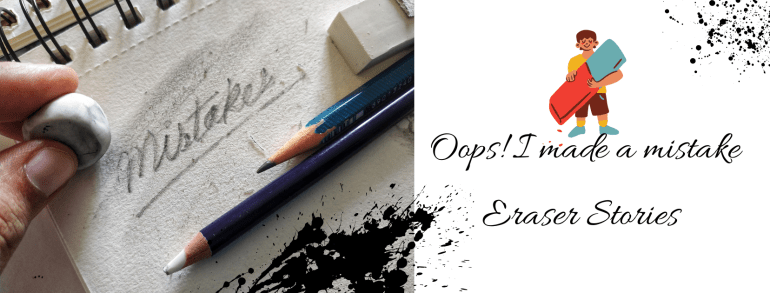
‘Life is the Art of Drawing without an Eraser’ I am sure you have heard this one before. But the truth is most of us cannot draw that well. We all make mistakes at some point in time. Nobody is born knowing it all. What we do after that .. how we correct it .. what we learn from it .. is important. Think! What is it that we could do differently so that the mistake is not repeated? We learn by asking questions and making mistakes. We grow as we learn. It is a part of the process.

People can be a bit too hard on themselves. They discard things with the slightest flaw or even a single mistake. In Art, we can either incorporate the mistake into the design or erase it. Then it is about how big or small the mistake is. My Art teacher always said, “It is ok to make a mistake. What you should also know is how to correct it. You cannot keep throwing away everything or stop painting altogether because of them.”

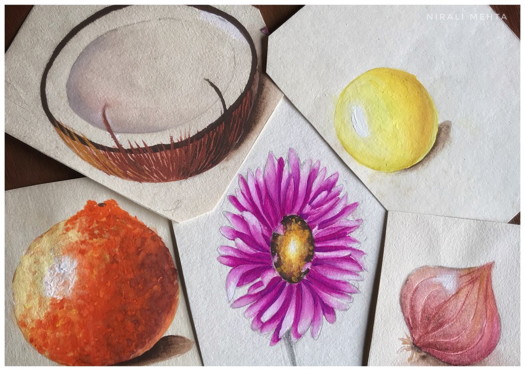
Reflecting, I realised I had made mistakes on my art journey as well. Sharing them with you could help you avoid them, rectify them or at least feel that you are not the only one. Here’s a list of the ones I could recollect.

  1. If one uses a very sharp pencil or a hard graphite pencil on paper, it creates a dent. The pencil graphite can be erased but the dent or mark will stay.
  2. Excessive erasing can peel off the paper. Hence it is important to select a good eraser as per our use.
  3. Erasing when the paper is slightly wet will erode the paper. Literally!! There will be a hole. This happens if we use pencils along with watercolours. It is best not to draw with a pencil before using watercolours. If at all we do use them, make sure it is very light and will get covered in paint. We won’t have a problem if we use gouache colours because they are thick and opaque.
  4. Drawing with a pencil on a canvas and erasing it is a big no-no. The graphite will mix with the paint and the colour will change to dull and dark. It is a good idea to draw with a paintbrush on a canvas. We can use a very light shade (almost white but visible to the naked eye) for drawing or making the markings. This will get covered up when we paint on it thereafter.
  5. We do get ink erasers. Pencil erasers can be used for colour pencils too. I tried erasing a little pencil mark when the paper was almost dry but not completely dry and the paper peeled. This was because of the moisture in the marker. The idea is that once we paint or colour on the paper, the pencil mark goes under it. Hence it cannot be erased even after drying. Whether we use pencils, markers or paints it is best to erase all the extra markings before painting. We can always keep the outlines that will get covered with thicker outlines or enhanced after painting.
  6. This is one of my favourites – Give a light wash in the background and then detail and then more detail. Same way in pencil shading. Do the light tone, then darker and then darker as and where necessary. Work on the whole piece simultaneously, so that the colours of the artwork mix and match well. Also, there is a complete flow in the picture. By any chance, if we make any mistake or want to make changes after doing the other portion we will be able to correct it. Once the dark or final touch is done, it becomes a lot more difficult to correct it. That is why it is always better to work in layers.
  7. Spilled a colour and ruined the spot? Lighten the colour by removing the pigment by lightly dabbing on that portion. Let it dry completely and then paint over it. That is what I meant by it can be easily corrected in the beginning. That is why nobody paints one part of the art to the finish while the other part doesn’t even have a base wash. That’s 99% a digital edit.
  8. Want to remove dried paint? Acetone works well to remove Acrylic paint on surfaces like glass or plastic. I have used it on canvas too. The cotton in the canvas will have to be treated with gesso once again before painting.
  9. The paint water glass tipped and dripped water onto the paper. This happens a lot when we work in small spaces or a hurry. Especially during art exams. For many of us, it can even be a horrifying experience. Don’t worry this can also be corrected. Take a dry cloth and lightly dab on the paper to soak up the excess water. Some paint will come onto this cloth. It will be back to the light wash stage. Let it dry and repaint only that portion.
  10. Last and very important – In the process of correcting the mistake, don’t try too hard. Sometimes people focus so much on the mistake that it ends up becoming the highlight instead of blending or fading away in the picture.

One thing I clearly understood is most of the times we are the only ones to know what the mistake is and where. The onlooker doesn’t know it unless we specifically point it out or highlight it or in any way make it very obvious. If we manage to blend it and make it flow along with the rest of the painting it can add to the beauty. Yes! Some mistakes can be beautiful. A little here or there adds to the beauty of handmade. It makes it different and unique. It makes it special.

What if none of these methods works and we have to do a re-do? Then think of what Thomas Edison said ‘I haven’t failed, I just found 10,000 ways that won’t work.’ We are all human. To err is human. I like to wear my bruises as my badges of honour. So if at all we make a mistake, there is nothing to worry about. It is ok to make mistakes.

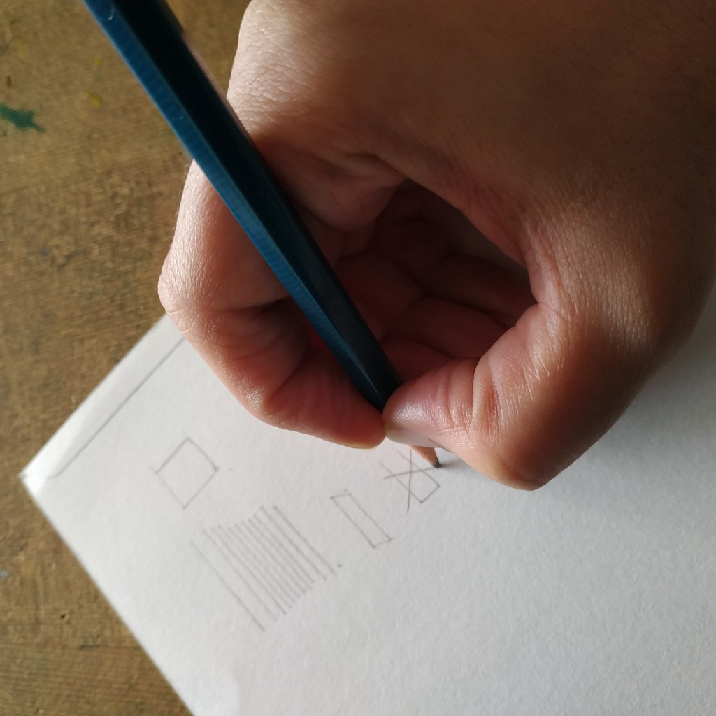
Fortunately, we have erasers for art. And there are different types of erasers too. Hehe.. Yes! There are different types of erasers. And no please don’t call it rubber. It is called an eraser. We all have this one vinyl eraser or a regular soft eraser (with a brush to clean the dust) for regular use. This can be used for Art as well. A pencil eraser for erasing precise lines (this is an eraser pencil, see the picture) and a kneaded eraser (magic eraser as I call it) that absorbs graphite and charcoal is something every artist should include in their toolbox.

Erasers
Different types of erasers that I use for my Art Projects

Having a good eraser and more so the right ones can be very helpful in drawing and painting. I don’t use erasers that are hard on the surface such as the sand eraser and the pink eraser. An eraser mounted on the pencil is a big no for me. It is not for drawing or sketching. One can use it for regular writing work. We also get changeable erasers and electric erasers in the market. These erasers are more pricey and better suited for specialists or professionals.

Do you also have eraser stories? Feel free to share them. We could all learn from them. Have an Arty Weekend!

Drawing without using a Scale or a Ruler

“My son draws well. Look! At five he can draw so well. I couldn’t even draw a circle at his age. Do you think I should encourage him to take up Drawing? Enrolling in classes isn’t happening any time soon. But I don’t want him to waste this time either. What should I do?”

This is a common query I received, more so in the last year. There is a possibility that the parent was not all that good at Art but the child is blessed and talented in Art. With home schooling ‘Art or Drawing’ as a subject is often neglected. The concentration is more on the other book and score subjects. But if your child is good at Art, how can you help him sharpen his skills? Even if you are not very good at it yourself!

Pottery
Shaping the earthen Pot

Have you seen a potter make his earthen pots? He shapes them, bakes them and once it’s dry : the shape is fixed, it’s strong and sturdy. It is the same with any sort of training. Same with Art too! We have to ‘train the hand.’ A child’s hand at Art is exactly like that soft mud of the earthen pots that can be shaped. It then becomes important to shape it correctly. Otherwise the pot might not turn out they way you wanted it to, even if the mud was suitable and perfect for making pots. I hope you get the point. Once we learn to draw using instruments we cannot unlearn and draw without them. Most Art schools do not allow the use of scale or rulers or any instruments for that matter.

The most easy access these days is video tutorials on Art. I like them, some of them are really good. My only issue is the foundation. Online tutorials are good for additional inputs or bettering something you already know. On the other hand if you were to learn something you don’t know anything about, I’m afraid the online videos would mean learning in a haphazard manner. Skipping steps and jumping because this system of learning is about convenience and many times they don’t show all the steps.

Besides when we do something by ourselves : we do more of the stuff we like over and over again while we leave out the parts we find difficult. No! Please don’t mistake that as practice. Practice is doing anything we are learning again and again to be better at it.

If you have a good foundation and learn the basics, then learning from anywhere including video tutorials will be very quick and easy. For my calligraphy class we practiced lines and curves for a month, till I got them right. My teacher taught me how to hold the pencil while drawing by actually clasping my fingers and making me do those lines again and again for months until I could draw them fluently.

That comes naturally to me now, like it’s a part of my movement. Just like the hardened earthen pot. My hand has taken shape. No doubt it takes time and practice. And every teacher has a different method of teaching. In this post I am trying to tell you what these foundation materials are. So when your child learns to draw you can make sure they begin from step 1 and build a strong foundation. These things can be taught only in person, so it puts the onus on the parent.

It may be boring but when a drawing teacher makes the child draw lines and shapes for the first few classes, don’t be in a hurry for them to begin drawing actual meaningful stuff. It’s like running even before your learn to walk. First learn to stand, then walk and then run. In the same way draw lines, curves, shapes neatly in clear strokes. In future for anything we draw we first draw rough lines and curves and then the final shape.

Pro Tip here: Use a 2B pencil slightly blunt to draw. Use a regular pencil and not the pen-pencil or changing points fancy pencil as your first drawing pencil. Even if you use them select a 2B lead. HB lead is for writing dark and legible- not for drawing. Strokes drawn with a 2B pencil are light and can be erased easily.

Learn to draw 1
Pic 1 : Holding the Pencil and Drawing lines
Learn to Draw 2
Pic 2: This is to write. Wrong way to hold for Drawing

Consciously make a note and see how you hold the pencil when you draw. Holding it like shown in the second picture will give hard dark lines that are difficult to erase and restrict movement for large strokes. Try it! While in the first one you will be able to move the pencil freely, drawing long lines in a single stroke without lifting the pencil. We can also see what we are drawing. Can draw by lightly touching the paper and strokes can be erased without leaving any marks.

Learn to draw 3
Pic 3: Drawing different Shapes

Practice drawing different shapes. Here in one of the pictures I have drawn the axis and then the circle showing a glimpse of how we use reference lines for drawing. Next to that is circles directly drawn. The axis have to be straight because the rest of the drawing depends on it. Further most drawings are combinations of basic shapes. Practising these ensures training the hand for free movements to draw.

Learn to draw 4
Pic 4 : Drawing a straight line with help of edge

I am holding the pencil differently to draw this border without the use of a scale. It measures to about half inch border on all sides. I take the help of my drawing board or book edge to lock my fingers and steadily draw a line parallel to it. Warning!! Please be careful the edge of a new paper is sharp enough to cut your hand. Try this only under supervision of an expert.

This is about drawing lines without using a ruler or a scale. Below I am showing ‘How to measure and draw symmetrical drawings without using a ruler or scale’ or any other measuring instrument.

Pic 5 : Drawing Symmetrical Objects

I am using the drawing pencil to measure and make markings to draw a symmetrical object. Here one half side is drawn and I have to match the other side to complete the object. Following the steps :-

  • Half side is drawn and I have made axis at major turning points.
  • Measuring the distance of the intersection point on drawn side with the pencil.
  • Making the same intersection markings on the other side.
  • See all the marked points. Can make points for the length and width as required.
  • Join all the points to match the drawn half.
  • Erase or add markings and corrections till they look visually same.

This method of measuring is also used while drawing live in person. That is when the subject you are drawing is in front on you. When we draw from a picture we make a similar grid and then match points to draw alike. They say the measuring tools are in the eyes of the artist. However not everyone is so good at it and so these other methods can be helpful.

Drawing this vase also demonstrates how we use lines and curves while drawing. These are basics and the foundation to drawing. Once you learn to draw like this, I am sure you will be able to draw most of the things. Have an Arty Weekend!

5 Ways to Fine Tune your Art – Drawing, Painting and Sketching

Ever looked at your finished Art and thought something is missing. Somehow I am not completely happy with it. There could be something to improve but I just don’t know what? Further sometimes we don’t even know where to look, which part of it needs to be fine tuned. If we work on one portion, something else looks out of place. I know this feeling, it happens.

So do you know how to get it right? That is the question I am going to try and answer in this post. In this article when I say Artwork: it means Drawing, Painting and Sketching. And when I say object- it refers to whatever we are drawing, painting or sketching. I don’t have a checklist of any kind but I can definitely tell you the five ways to fine tune your Artwork in order to improve and make it better based on my learnings and experience.

These are also the observations we need to make when doing Art. If you observe these and are able to check them right, not only would you be good at Art but also find it easy to understand and learn different Art styles. This is more or less an exhaustive list. It does have sub topics or points. In a way it is also 5 mistakes to avoid while making Art.

It is like a grade meter, how much fine tuning is required for each of the parameters will have to be determined by you. That is because it is to your taste. Over a period of time with observation and experience you will be able to decide your own parameters for each of these. Perfection isn’t when all of it is present, it is when all of it is in the right quantities. So let’s begin listing them.

1. Shapes and Patterns

Everything has a main outer shape and maybe more smaller shapes. It is important to observe this. First we draw this main shape and then do the details. Consider it as rough work to your final answer. This also helps decide the placement for various objects in the Picture. You can also take them as a marking of the space each object can take on the canvas. It is important to place things evenly or rather correctly space them out on the canvas. Most people make the mistake of skipping this step and begin to draw directly.

Let’s consider drawing something like ‘My House’. If you are drawing this landscape, make the large main shapes of the tree, the fence, the house, the sun or sky, the human with his pet, the ground and so on. Then add the details. Erase the rough work. It is the correct method to draw.

Some videos on the Internet will show super awesome Artists who complete one particular corner of the art with full finished details while the rest of the canvas is blank. Wow! They are super humans but we are normal humans and this is how we draw. It is mostly a digitally edited video, very rarely can anyone draw like that. They need to get into the book of records for such exemplary skill if they really can. For the rest of the normal people this is the first step for drawing anything.

Everything in nature has a pattern. So for example when you draw a flower. Look for this main shape of a circle or an ellipse. See the pattern of the petals are they – above or below, in odd numbers or even. See the shape of the petals – pointed or round, long or circular. Further see the centre of the flower and look for a shape there. The pollens will have a pattern – are all of them in the same direction, how many turn right or left. These things we need to observe and then when we draw, we match it with our reference.

2. Proportions and Scale

Many people confuse these terms. So in another words it is the size and ratio of the objects drawn. So in your landscape a bird cannot look bigger than the tree, that is scale. Now how much space of the tree is the branches and how much the leaves – that is proportion. That is what we need to observe. How the object looks in context with the other objects in the picture and what are the proportions of its own parts. When drawing a human face you would note the proportion of the eyes to the eyebrows, the nose and lips. The scale would be the size of the actual face. They are connected and not used in isolation.

3. Perspectives and Backgrounds

Which angle or point are you looking at it from? Top or bottom, right or extreme right. The distance- up close or far away. The objects which are closer are detailed, while the objects farther away at a distance in the background may not have all the details. If you draw details of all the objects in a picture, it is like keeping everyone in the front row. It will look like everyone is shouting for attention. The focus is always on some objects in the front and less on those in the background. Artworks with backgrounds look complete.

Perspective adds depth. The third dimension or 3D. This makes the object look natural as against flat image. 3D means 3 axis – X axis, Y axis and Z axis. Length, width and depth or thickness. The most common example is if you draw a rectangle. Now try imagining this as a box, as that of the wall of a house or this wall Humpty is sitting on.

Your position while looking at the object determines how it is visible to you. For example four different people looking at a car from four different spots – the top, from the right, the left and the bottom will all draw it differently based on what they see. Correct? What your view is, is your perspective. This brings about a balance in the picture.

4. Light, Shadows and Highlights

In one picture there can be one source or two sources of light. Two when there is one natural source like the Sun and two when there is a light fitted or the created source. The light coming from any point does not fall equally on all the objects. The rays fall in a straight line and not in curves. So the whole picture has be in sync with it. The Shadow of an object is determined by the direction of the light and also falls straight. Depending on the position, the size of the shadow will change. There could be a situation where the shadow of one object also falls on another.

There is something called highlight – when a significant portion of the light falls at a spot and it almost looks white. We colour or shade from light to dark or dark to light and then add the shadows and highlights. This adds depth to the painting. Also observe how an object reflects the light. The texture and surface of the object determines that.

It really looks funny when all objects have different sources of light and random shadows. There has to be a flow in the picture.

5. Colours, Shades and Tones

Tones is Dark, medium and light. This is determined by the source of light in your picture. When you do an artwork in black and white it will still have these. The gradient is smooth and blending it is important. Where we want to show it as blocks, we make sure the edges are crisp. When we colour the objects, we can try as much as possible to match the exact colour to the real object. Mixing of colours to make various tints, tones and shades can be understood with the help of the colour wheel.

There should be a contrast between the dark, medium and light tones otherwise the image will look flat. Meaning how dark the colour looks against the medium tone colour. Whether the difference is significant or very little. Sometimes all you need to do is make the dark shade a bit darker. A pro tip here is not all colours can be made lighter by adding white or darker by adding black. When you observe an object see the dark colour, does it have traces of other shades. For example the dark colour could be brown with little of green and not always necessarily black.

These topics need to be studied in detail. The only way to understand these is to observe and try it out practically. Now that you have basic information about these, the next time you are drawing, sketching or painting look and observe these things in your Artwork. Whatever you are drawing – be it a portrait, a landscape, an object, nature or design. Check for these and mark the difference with your Art as against your reference. Your artwork will show significant improvements.

If possible, take an object like a flower or a vase or a pen or a bottle or a landscape picture, keep in it front of you and then read this article once again while observing these and mentally making a marking of each. Then begin to draw. It isn’t a one time exercise, you keep going back and forth. I am sure you will be pleased with the outcome. There is a possibility that after years of practice some artists can do a mental calculation of these. After all Art is about being able to imagine that object on your canvas, so that you can draw and paint it.

Have an Arty Week!

Year in a Review

In the Holiday mood, I am also going to take a break next week. Most people have already signed off till New Years. As a shop owners, we are busy making products, posting on social media, settling accounts, packing, shipping and making new and the cycle continues year round. That makes us use our phones for long hours at work. A little digital detox to spend time with yourself, family and nature can rejuvenate us.

My Desk
My Desk! It’s Christmas 🎄

And we can come back in the New Year refreshed and charged up for another year ahead. Many people also use this time to upgrade their skills, read up on books they always wanted to. I started my Blog this year in September 2020. I have 17 Posts by now. The response to the Blog has been overwhelming. It’s been a good journey with your love, support and encouragement.

So I thought I would do this year in a review post. Helps me connect with the new followers too! Here is a list of the posts I have done on Arts and Crafts so far. You may click on the title to go to the post. All these are listed on my Blog page – ‘The Art Life’

So just in case you missed out on reading any of them, you still can. Please note the Blog page shows only the last 10posts and so to see the previous ones you may use the links above or scroll to previous posts.

If you like reading my posts and wish to continue our association, you may click follow or subscribe to the Blog. This will make the posts come to your Email Inbox and you may read them at your convenience.


Wishing everyone a Merry Christmas and a Happy New Year!

December Calendar with a Christmas Wreath that I created Digitally

This is an Instant Digital Download (JPEG) File that can be purchased at my Etsy Shop NMARTWORKS Picture Format opens with any Photo Editing Software. Once you pay, you can instantly download and use.

Serious about Art : The way ahead

In early times, people did Art to decorate their homes and objects of everyday living. It could be an individual or a group of people collectively working on something. It was mainly Designs and Patterns that could be done by more and more people. Then we came to know of better ways and did more realistic Paintings that conveyed stories. Sculpting, Photography and now Digital Art ; there is always something new and trending. Art is a way of expression. People express their feelings and experiences. Arts and Culture influence each other to a great extent. It is like they are interwoven. Internet and Globalisation made it a boundary less world. This opened up infinite opportunities in Art as well. For a creative person it is like a vast ocean. There is always so much too learn and do. I like to read up, see, learn and better my skills everyday. We are truly blessed to be able to have easy access to so many resources now.

“To practice any art, no matter how well or badly is a way to make your soul grow. So do it” – Kurt Vonnegut

Art is my passion, it’s Life. Your reason could be different : a stress buster, a hobby, a way to be social, helping your child with art at school, being a professional artist or having a part time or full time career. However if you are serious about Art, it is always better to take up formalised training. You have the talent, that’s super. Now all you need is the wisdom. I see many people write ‘Self Taught’ in their bio. It’s great! But just imagine! if you are so good when you learnt only by looking, how awesome will you be if you have a mentor, a guide or a teacher formally teach you!

I would say it is like a Tree. I was born with a liking, aesthetic sense, creativity and a good hand for Art – that would be the seed. I have to water it everyday – that would be practice. I have to add manure, fertilisers or food – that is knowledge. What I gain from this journey or growth over the years is wisdom. That makes me a full grown Tree. Don’t be in a hurry to monetise your work. Learn whatever you can, try your hand at different Art Styles. My friend told me ‘My daughter is really good at doing a flower, she keeps doing it.’ I think that’s absolutely ok but at least try the other things. How do you know if this is your best work or if you can do better unless you try?

By all means make as many mistakes as you can in the learning phase. You know what they say right ‘I didn’t make a mistake, I learnt a 100ways it could go wrong.’ It is True. Besides, being an Artist is also about letting go of the fear of being wrong. For an Artist, what makes him or her different from another Artist is himself. It is difficult to separate an Artist from his work. I could put it as ‘that one special move that you are so good at, makes your work different from the others’. That is why I feel if you are serious about Art, you would invest in yourself.

My artworks during school days

Most Art Schools and Universities have a system of grading and examinations. The format is similar for most Art Institutes. Knowing this early on can help prepare for the way ahead. Broadly these are five subjects. We can’t be selective and be very good at just one of them. Need to be relatively good at all of them. The subjects are:-

1) Nature Drawing – Drawing and Painting Flowers or Nature. They give flowers in the exams because they have to give something easily available, as there to so many students. It is about actually seeing these flowers in real and painting them. Use Watercolour. The more realistic it is with shadows and highlights, the more points you can score.

Preparing for the Art Exams

2) Object Drawing – Painting daily life Objects. Each material has a texture. Example the skin of an orange vs that of a coconut. Note and observe these details to make it look more realistic. Another way to score better is getting the right perspective. Were you looking at the objects from the front, right side, left side or extreme corner – your artwork should reflect that.

Memory Drawing – Fishermen

3) Memory Drawing – Drawing People and Places. It is called memory drawing because we are expected to draw what we saw by recollecting the memory. Select a topic which is something you have experienced or seen in real life. Obviously it becomes easier to draw that rather than something you just saw someone else draw. It will make your work more real and different. Creatively highlight your strengths by drawing what you draw best. Complete the background. A complete picture always makes a better impression.

4) Design – The combinations and possibilities in Patterns and Designs are endless. Showing usability of a design or object you are designing scores a brownie point. Commercialisation and mass production of a Design is something most people look out for. For ‘Freehand Drawing’ you are given a design and asked to recreate it. Matching the colours, lines and curves becomes important. Basically the examiner wants to know how well you can replicate the design given to you.

Designs and Lettering

5) Geometry and Lettering – Geometry is about precise measurements. How well can you convey the meaning of the word, keeping it easy to read while having a unique font style? Lettering and Good Type done by hand requires a lot of handwriting practice. Commercialised version we all know as ‘Logos’. This is different from Calligraphy.

Designs and Lettering now most often are done digitally in the Industry for precision. However they will teach you to do these by hand first. It is always better to learn both methods – doing it by hand and digital.

Information is readily available on these subjects. So I thought I would share some additional tips which can help you score a few brownie points in these subjects. Use Gouache Colours for a nice neat look. Make sure you can complete your artwork in the given duration. Last but not the least practice. Try to do better than yourself each time. Taking up work that challenges you makes the learning interesting.

One request, please don’t use help from the digital tools – they will only get you followers on social media, nothing else. During my school days we were not allowed to use any measuring tools like ruler or compass except for Geometry and Lettering. We learnt how to draw without using these. There are methods how artists keep a scale with their eyes, which your teacher should be able to teach you.

I cleared my Intermediate Grade Exams in Art scoring a ‘Grade A’ and merit rank. Intermediate Grade Exams are senior level Art Exams conducted by the Maharashtra State Board and lakhs of students appear for it every year. You may or may not appear for the same exams but training in all these subjects surely helps. I scored ‘Grade B’ in the Elementary Exams (Junior). Then I had my teacher train me. The results you can see.

I also feel this system of training is holistic which creates a good base for taking up any specialisations in Visual Arts and Allied Arts. Once we know these, it becomes easier to pick up any new trends in Art. Further even to get into a good Art Institute we have to submit an Art portfolio on these lines or appear for entrance exams on these lines. So if you are serious about your Art, this is the way ahead! Have an Arty Weekend!

Please Note: All the artwork shared is my actual artwork I had done during my school days when I took these exams. Our references were books and previous years question papers.

My first Art

“What is the easiest drawing to begin with? I want my child to learn drawing, where and what should I start with?” This is a question I am asked often. In this article I will share two different drawings that are simple and easy for a child to begin with. These were the first pictures I learnt to draw and colour as well. Yes! I said colour and not paint. That brings me to the selecting the Art material.

Paper: Use large sheets. Drawing a small circle for an adult is often a big circle with the movement of hand for children. They tend to fill up colours better in larger drawings. Further use a sheet of paper that is prone to high erasing. I often used box board (white duplex board) sheets as my drawing paper during my earlier days of learning.

What else do I need? A good pencil and a good eraser. A new pencil that is big is better for grip. If they are still learning to hold a pencil it is all the more important to have a pencil the child would be comfortable using. Use a slightly rounded tip pencil, meaning don’t sharpen it to a very pointed tip. This would ensure the paper doesn’t have dents after erasing the extra lines. Now for the Colours – I recommend using Oil Pastels. I didn’t say crayons nor did I say paint. Oil pastels of any good brand but a large number of colour shade options. The more colourful picture they can make the better. Since they don’t know much about mixing shades, having more shades in the colour box helps the child make a nice attractive drawing. Now that you are ready with the materials let’s decide a topic.

1. Under the Sea

2. My Home

Under the Sea Drawing for Kids
My Home drawing for kids

I have shared a drawing for each topic. You may use it as a reference or idea to begin with. Once the pencil sketch is ready, colour it in your own way. Sounds easy! So let’s begin to draw 😀 Do share your finished Art piece with me, I would be happy to see it.